Preview image. Unlock full-res
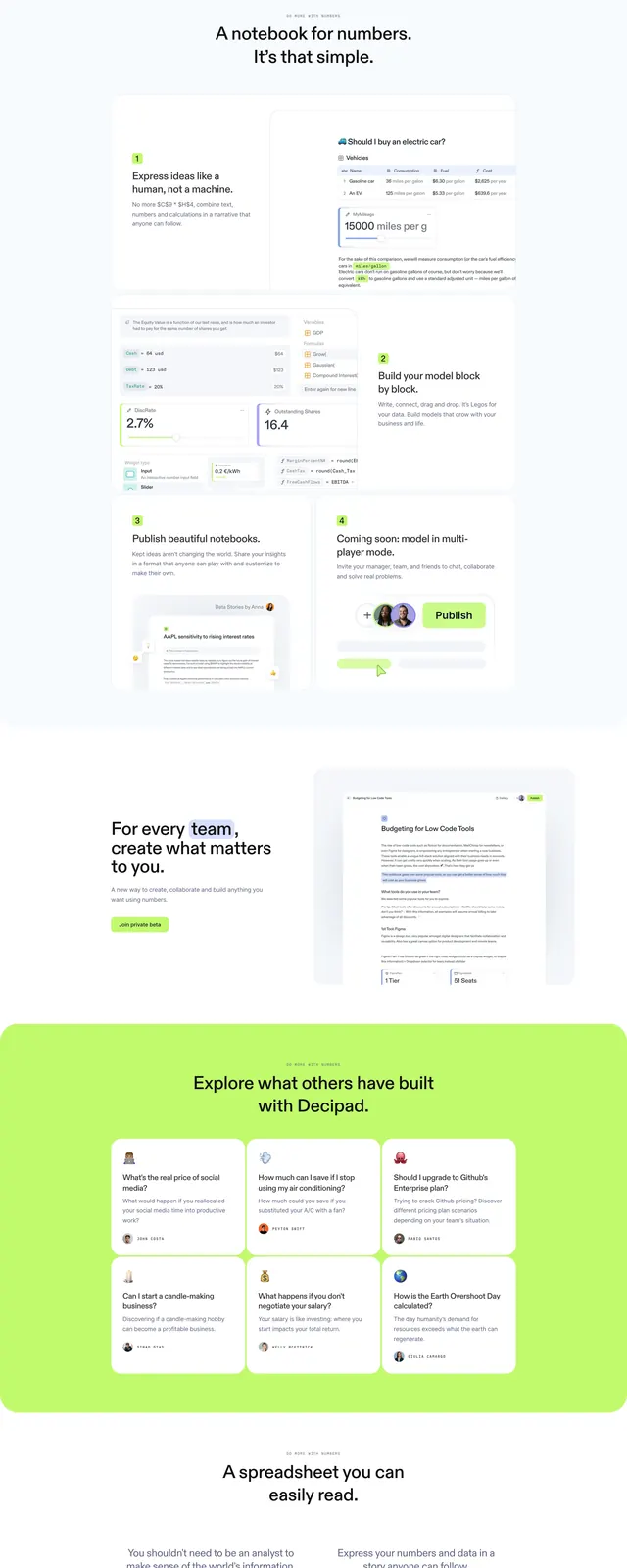
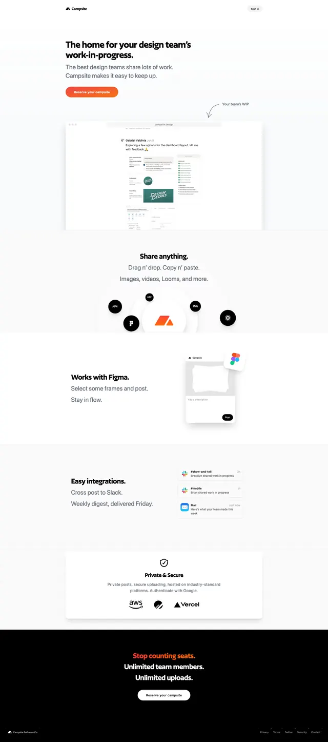
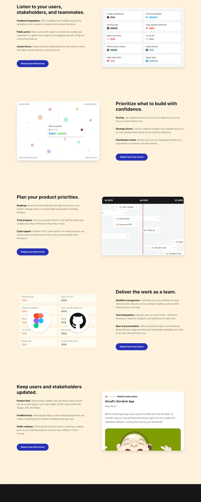
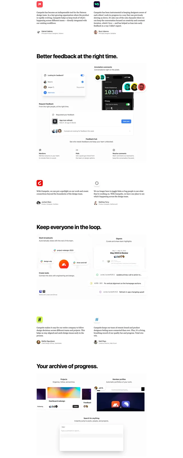
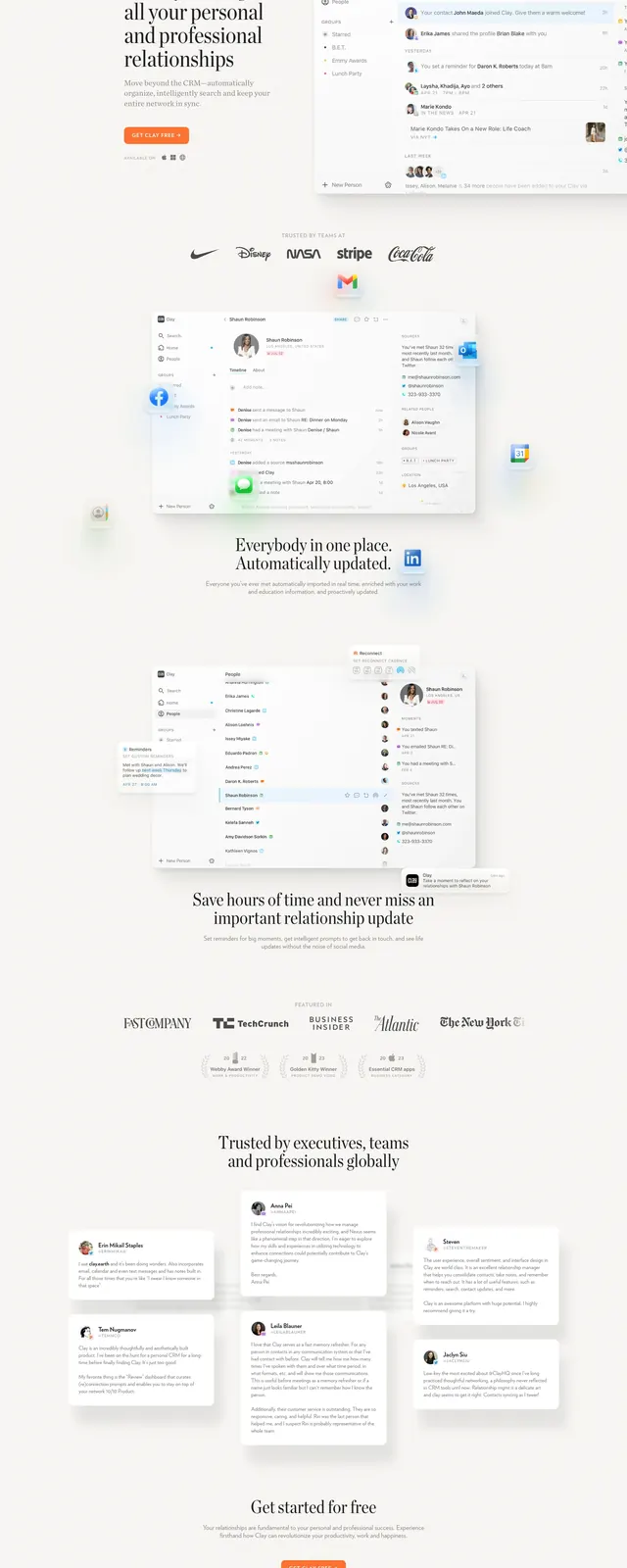
A light, editorial SaaS landing page for a personal relationship management app with oversized serif headlines, soft whitespace, and product screenshots throughout.
Summary
A light, editorial SaaS landing page for a personal relationship management app with oversized serif headlines, soft whitespace, and product screenshots throughout.
Visual description
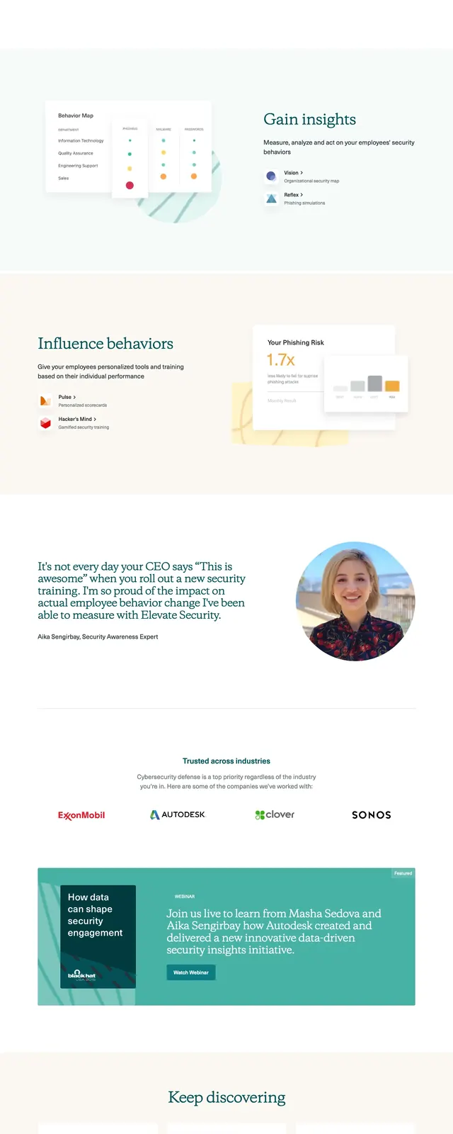
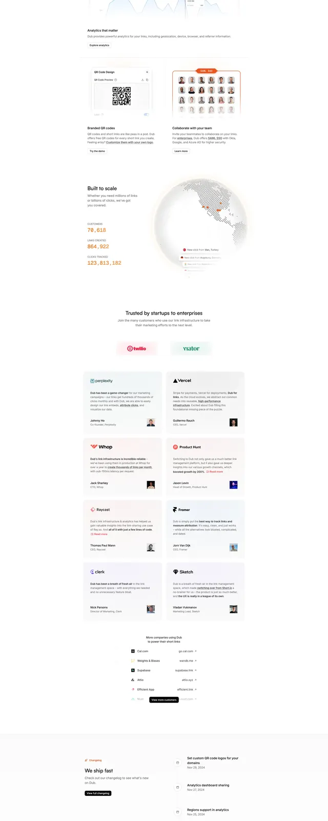
The page uses a bright off-white background with a thin top navigation and a left-aligned hero block beside a large app screenshot on the right. The hero headline is set in a high-contrast serif, while supporting copy and controls use a small, restrained sans-serif. Lower sections stack vertically with centered logo rows, additional product mockups, a testimonial card grid, and a final centered call to action. Soft shadows, pale borders, and generous spacing keep the interface airy and understated.
Key takeaway
The main reusable move is the editorial SaaS treatment: oversized serif messaging paired with calm whitespace and realistic product screenshots. The layout also shows how to combine logos, feature proof, testimonials, and a closing CTA without breaking the premium minimal feel.
Reuse notes
Use this pattern for productivity or consumer SaaS products that need to feel polished and trustworthy rather than aggressive. It works best when you have strong UI screenshots and social proof; it will feel empty if the product visuals are weak.