Preview image. Unlock full-res
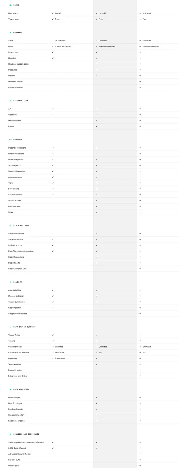
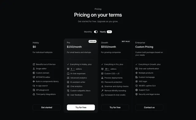
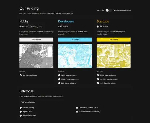
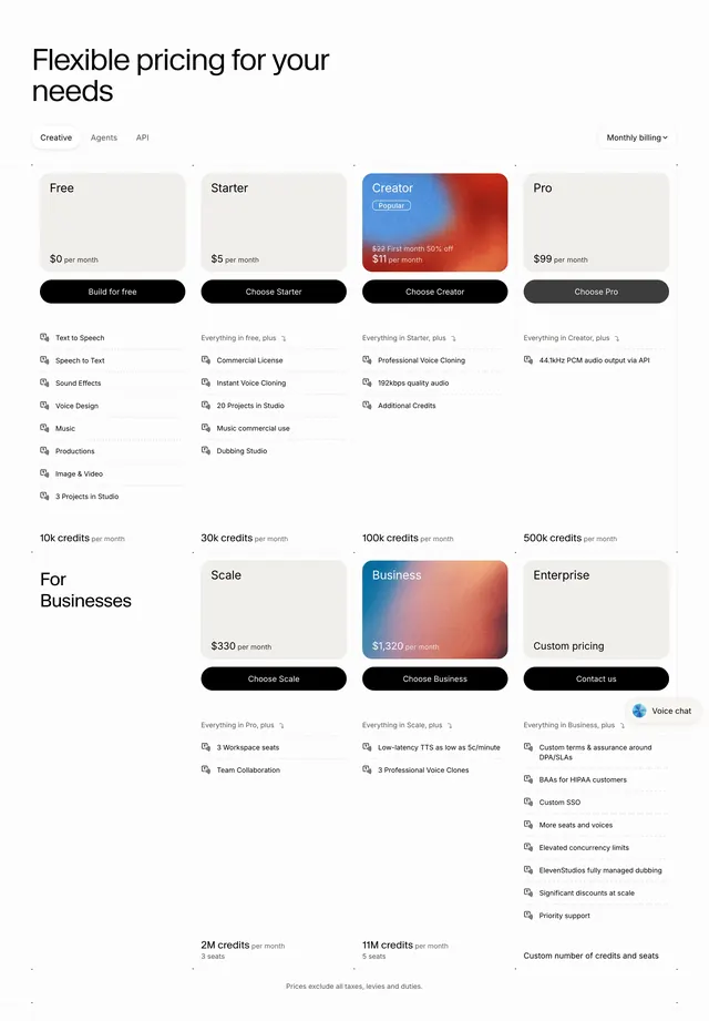
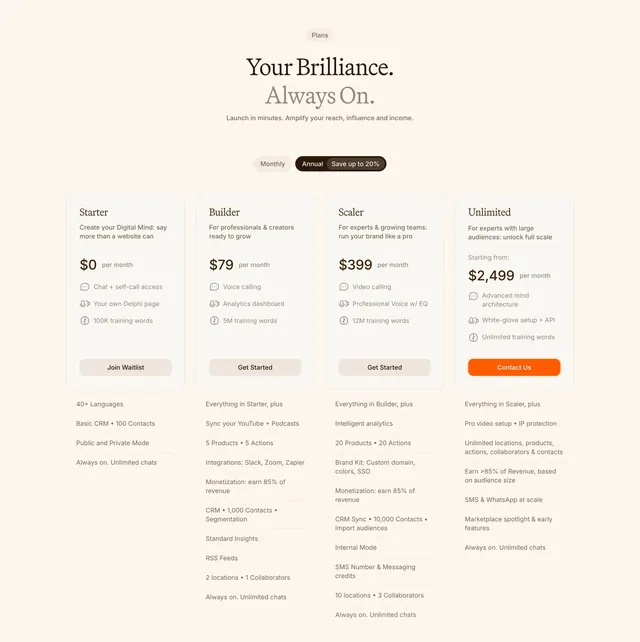
Light four-column pricing table on cream with a serif headline, a monthly/annual toggle, tiered cards, and a long per-tier feature list below each.
Summary
A light four-column pricing table with a centered serif headline, a monthly/annual billing toggle, and four tier cards where only the top tier's CTA is highlighted in orange. Long per-tier feature lists run in aligned columns beneath the cards.
Visual description
Cream background. A "Plans" pill badge sits above a centered serif headline ("Your Brilliance. Always On.") with the second line in lighter grey, then a line of sub-copy. A pill segmented toggle switches between Monthly and Annual, with Annual selected (dark) and a "Save up to 20%" note. Four pricing cards sit in a row: Starter ($0), Builder ($79), Scaler ($399), and Unlimited ($2,499), each with a name, short audience line, a large price, and three included items with small icons. Three cards carry neutral grey buttons (Join Waitlist, Get Started, Get Started) while Unlimited's "Contact Us" button is filled bright orange. Below each card, a long aligned list of additional features extends down the column.
Key takeaway
Highlighting only the highest tier's CTA in brand orange, rather than the usual "most popular" middle card, steers attention to the enterprise plan. Moving the long feature comparison into aligned columns beneath the cards keeps the card row clean while still exposing full detail in one scroll.
Reuse notes
Good for a product with a real free tier and a wide price ladder up to enterprise. Four columns plus long feature lists need ample width and will compress hard on mobile, likely stacking. The serif-on-cream styling keeps it from feeling like a generic SaaS table, so match it to an editorial, premium brand.