Preview image. Unlock full-res
A bold educational landing page with a split hero, dark course sections, and repeated community CTA blocks in a red-and-black visual system.
Summary
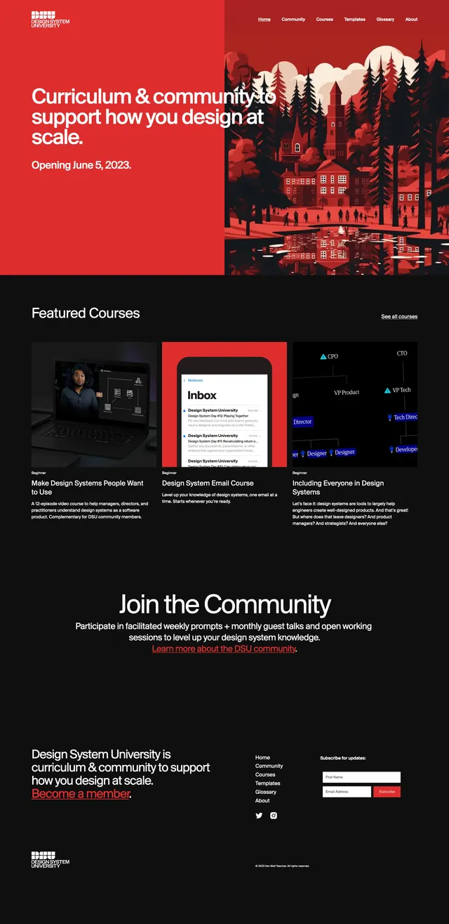
A bold educational landing page with a split hero, dark course sections, and repeated community CTA blocks in a red-and-black visual system.
Visual description
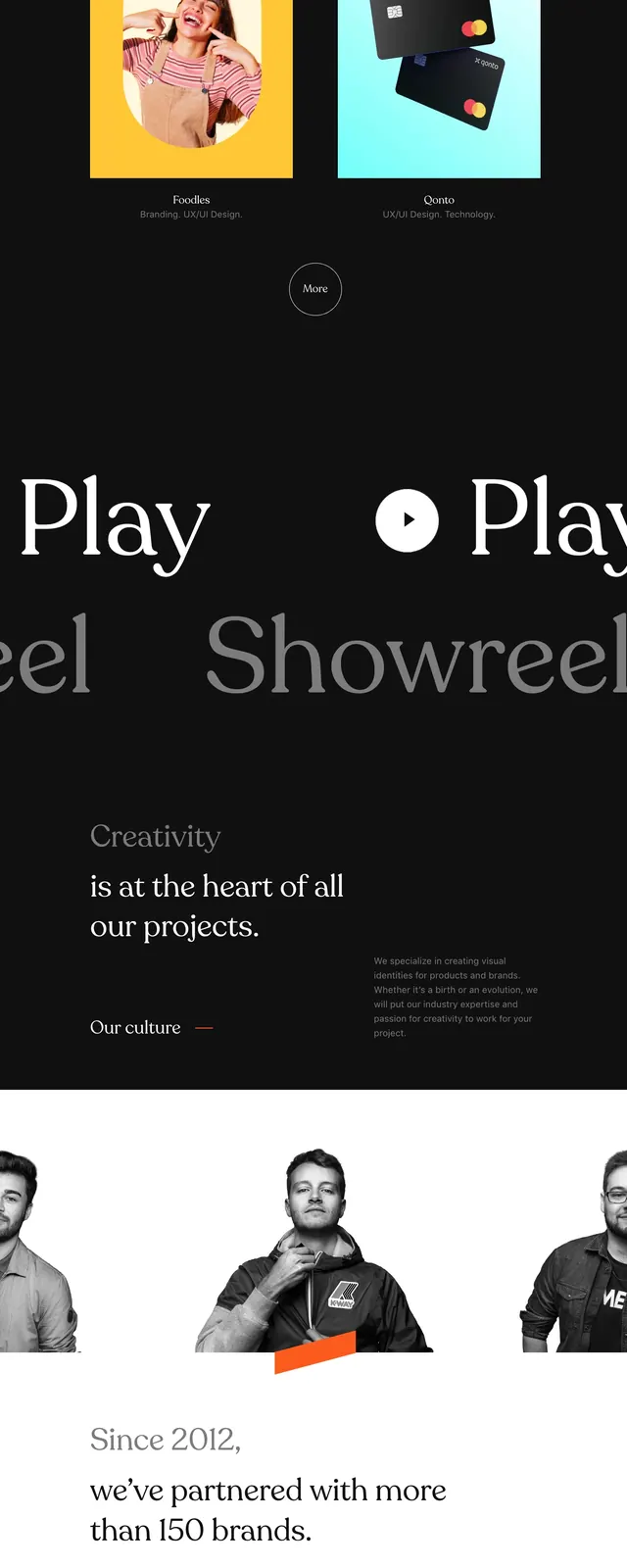
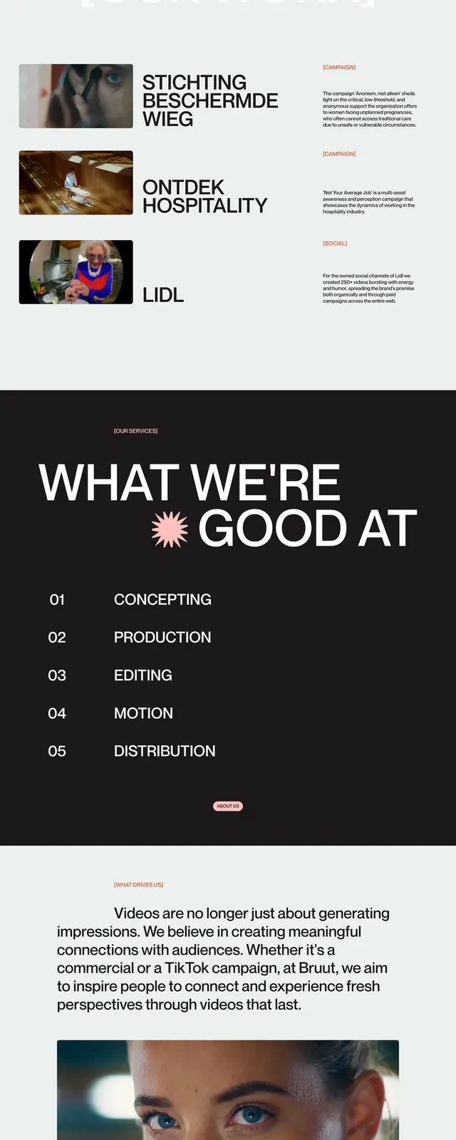
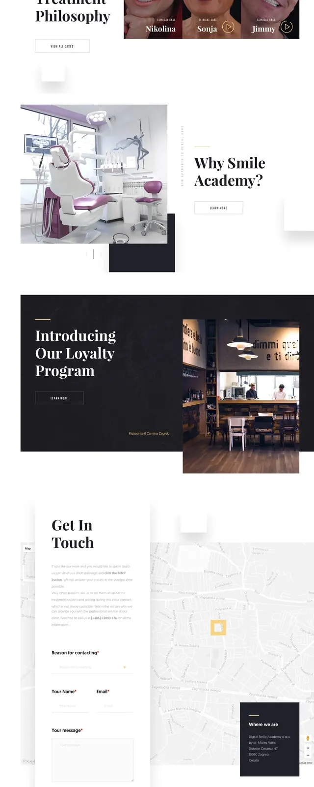
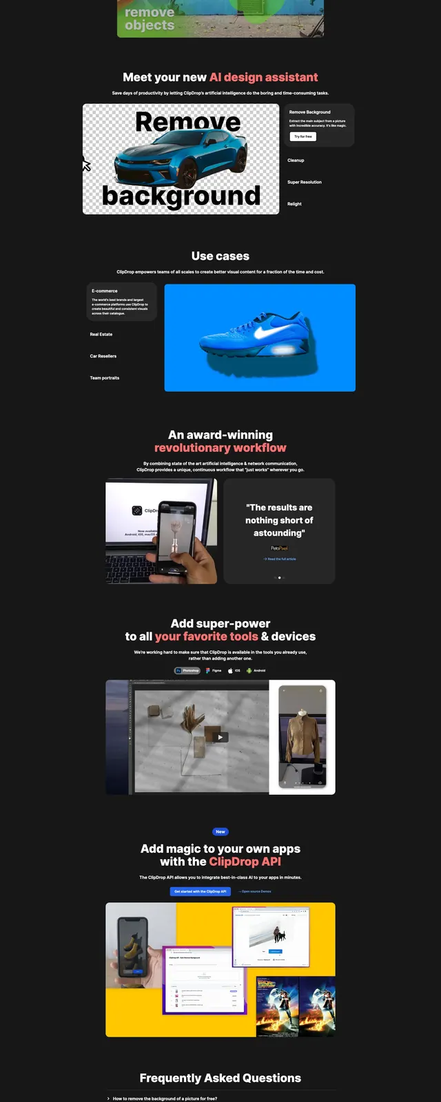
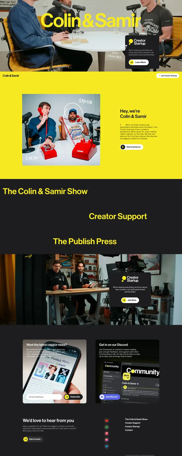
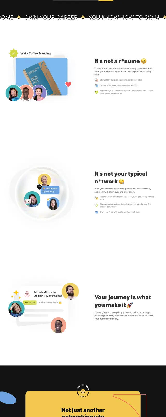
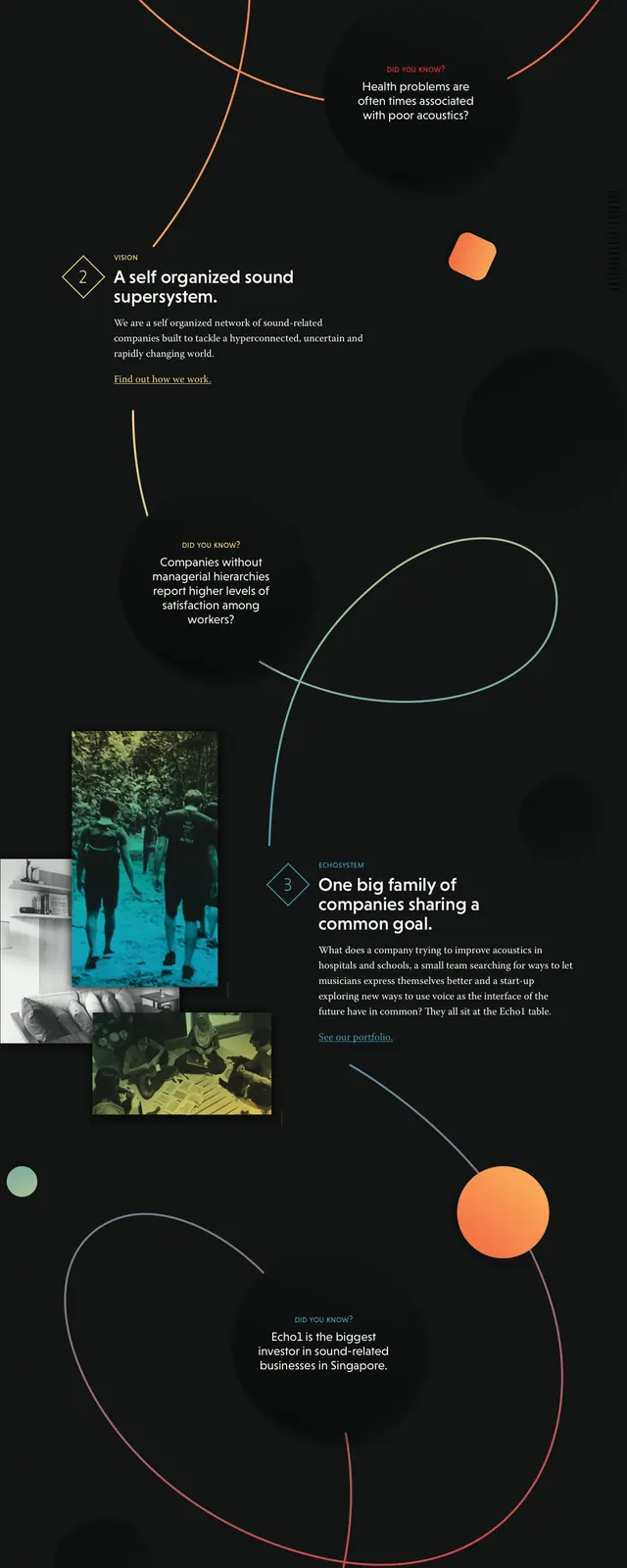
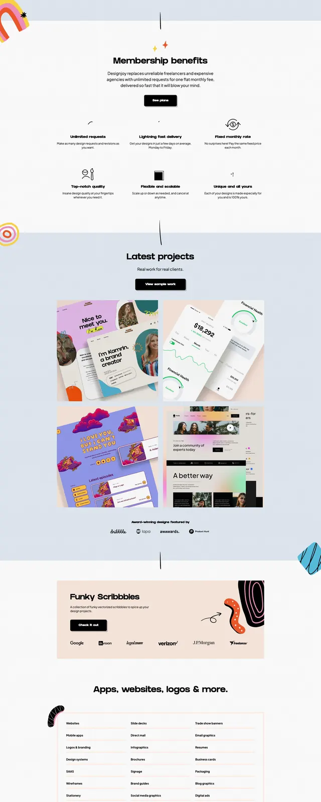
The page opens with a split hero: a solid red text panel on the left and a large illustrated scene on the right, with a compact top navigation and small logo in the corner. Below, dark full-width sections present featured courses in a three-card grid, combining video or mockup thumbnails with short titles and descriptions. A centered community CTA appears more than once, using oversized white text on black with a single red link-style accent. The footer continues the minimalist dark theme with navigation links, a small signup form, social icons, and a compact logo lockup.
Key takeaway
This layout uses a strong red-and-black palette, oversized typography, and a clean editorial structure to make a design education brand feel authoritative and modern. The reusable pattern is a split hero followed by card-based content and a high-contrast CTA.
Reuse notes
Useful for course, community, or educational landing pages that need a confident visual identity and simple content hierarchy. The hero, featured-card grid, and centered CTA blocks are the most reusable sections.