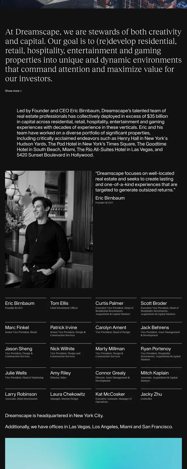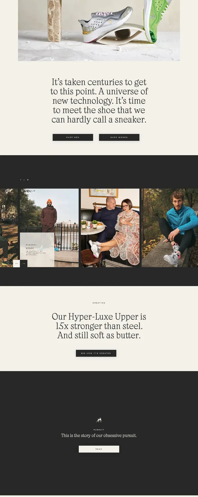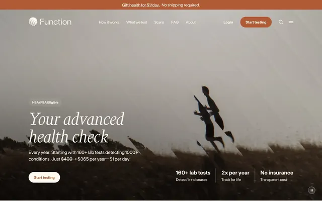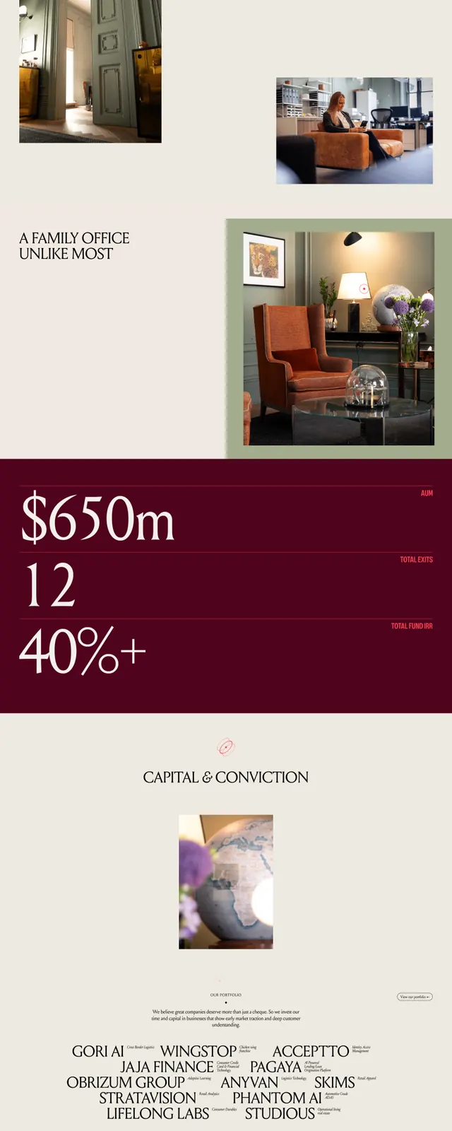
Preview image. Unlock full-res
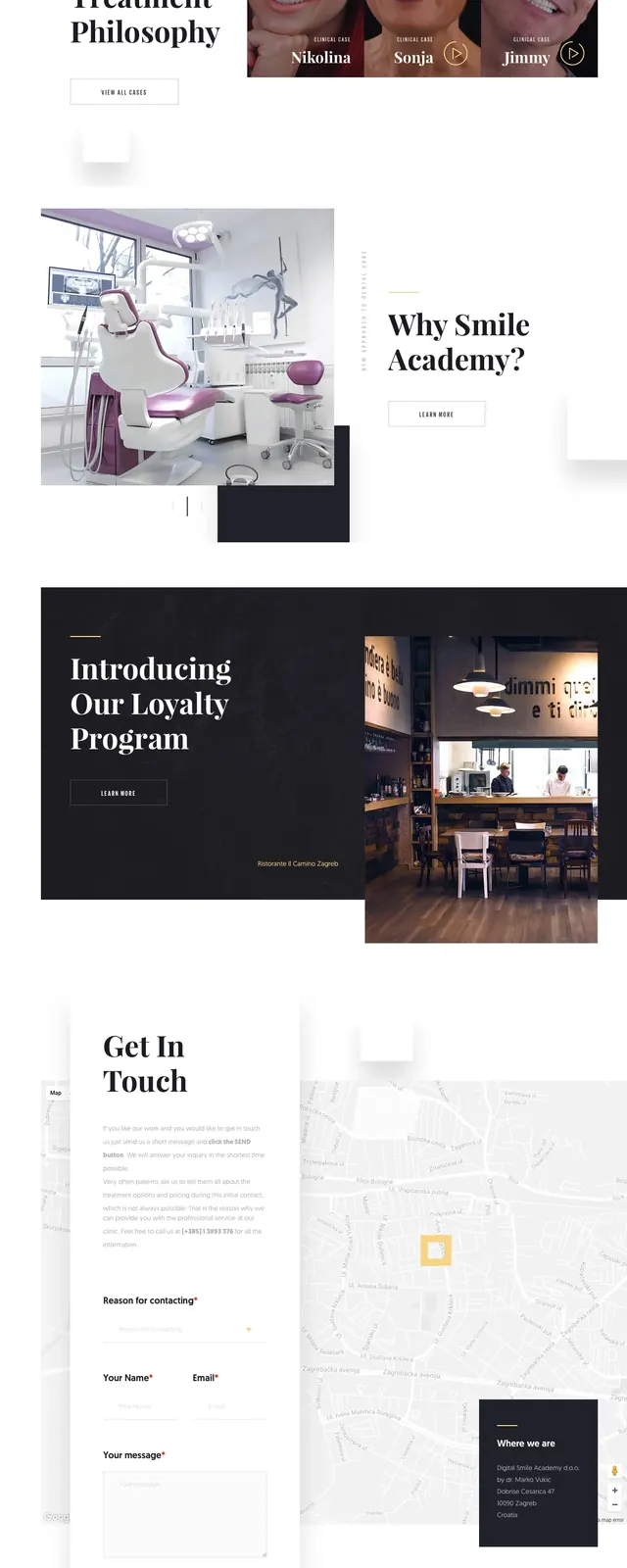
A dark, editorial-style dentistry landing page with oversized serif headlines, floating white content cards, and high-contrast promotional sections.
Summary
A dark, editorial-style dentistry landing page with oversized serif headlines, floating white content cards, and high-contrast promotional sections.
Visual description
The page opens with a full-width dark hero featuring a close-up dental image under a heavy overlay, a small logo and navigation at the top, and a large serif headline on the right. A white appointment card overlaps the hero and the white section below, creating a layered magazine-like composition. Further down, there is a dark promotional block with a large serif headline and an interior photo on the right, followed by a stats row, a centered newsletter signup, and a final dark call-to-action banner. The palette stays mostly black, white, and warm beige with strong contrast and generous whitespace.
Key takeaway
The strongest move is the overlapping card system: bright content panels floating over dark photographic sections. The combination of oversized serif typography and minimal controls gives the page a premium clinic feel.
Reuse notes
Use this pattern for high-end healthcare or service brands that need to feel polished and authoritative. It works best when the layout can alternate between dark photographic hero blocks and clean white utility sections.