Preview image. Unlock full-res
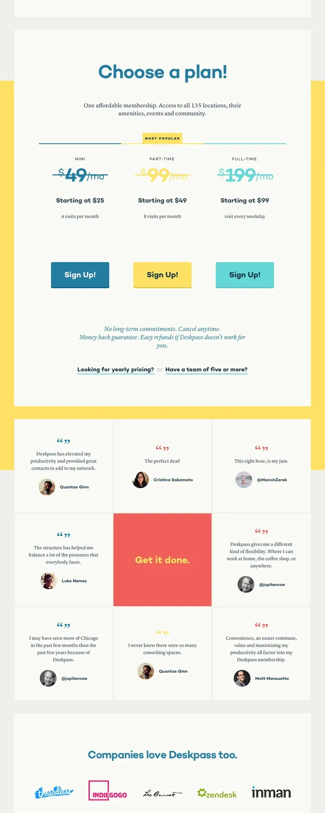
A bright, subscription-focused landing page for Deskpass with a large hero, centered pricing callouts, testimonials, and a dark footer.
Summary
A bright, subscription-focused landing page for Deskpass with a large hero, centered pricing callouts, testimonials, and a dark footer.
Visual description
The page opens with a mustard-yellow hero area, a compact top navigation, and a large bold headline centered on the page. A wide white panel overlaps the hero and contains supporting copy, location/search cues, and three prominent sign-up buttons in different colors. Below that are testimonial cards in a multi-column grid, followed by a contact CTA block and a dark footer with grouped links and brand information.
Key takeaway
The design relies on strong color blocking, simple typography, and large whitespace to make the subscription offer feel clear and approachable. The stacked landing-page sections are easy to reuse for a coworking or membership product.
Reuse notes
Reuse the overlapping card-on-hero layout for pricing or lead-gen pages where the primary goal is immediate conversion. The testimonial grid and high-contrast footer can be adapted directly into other service or subscription sites.