Preview image. Unlock full-res
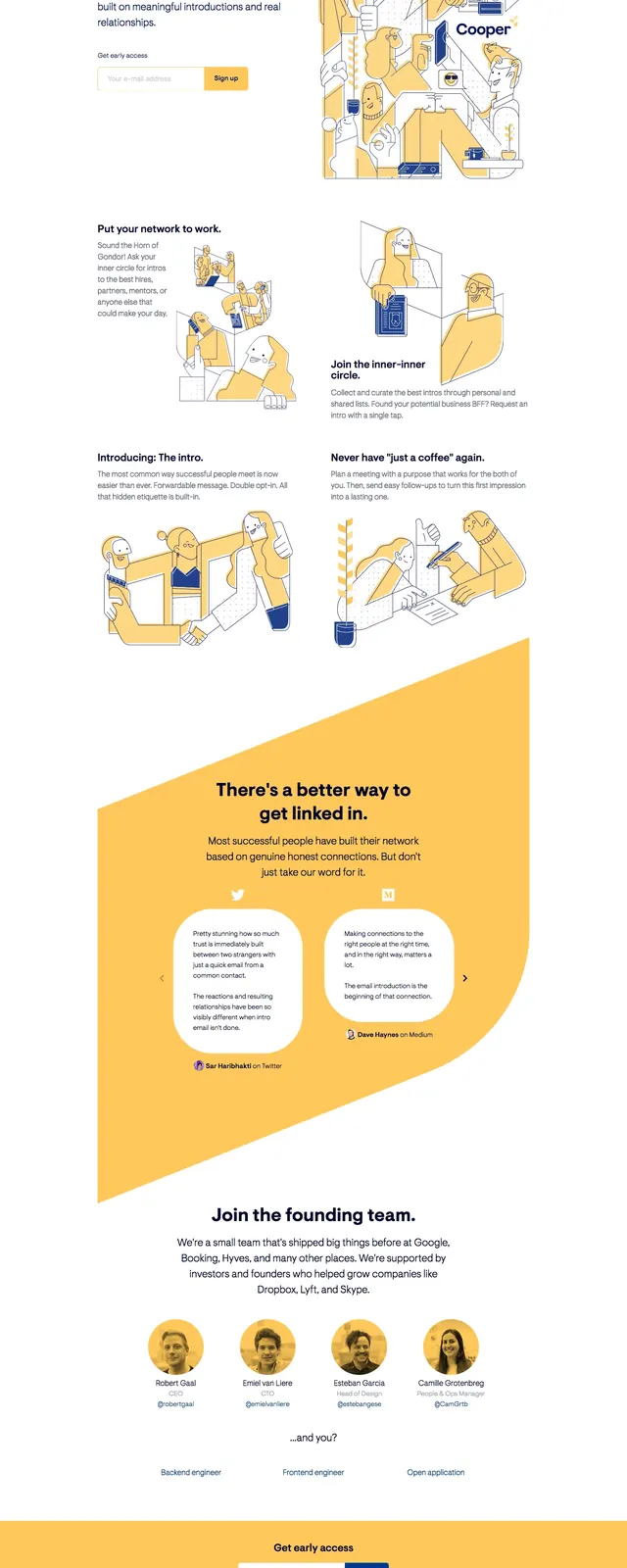
A playful, illustrated SaaS-style landing page for Cooper built around a split hero, large claim-driven headlines, and warm yellow accent blocks.
Summary
A playful, illustrated SaaS-style landing page for Cooper built around a split hero, large claim-driven headlines, and warm yellow accent blocks.
Visual description
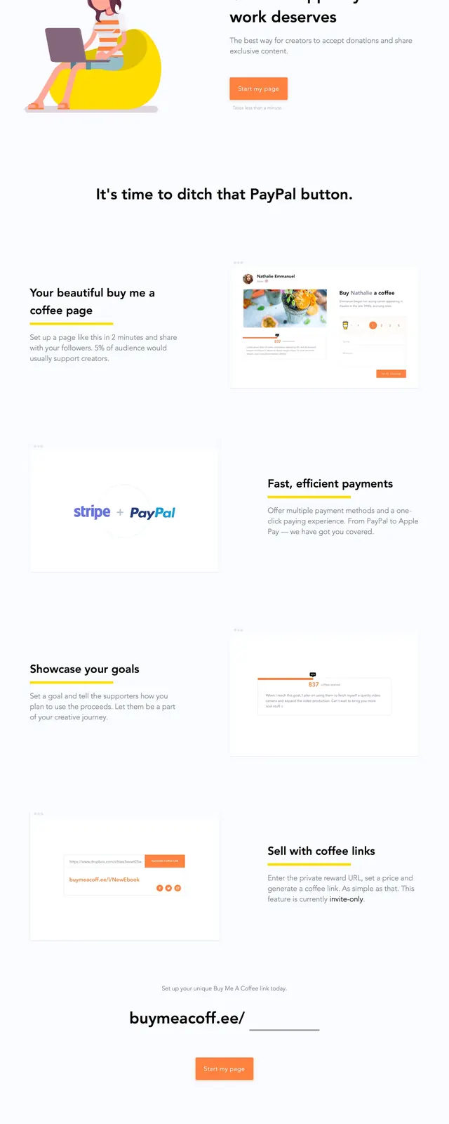
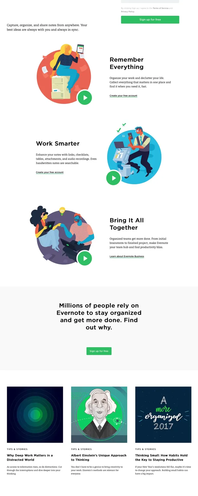
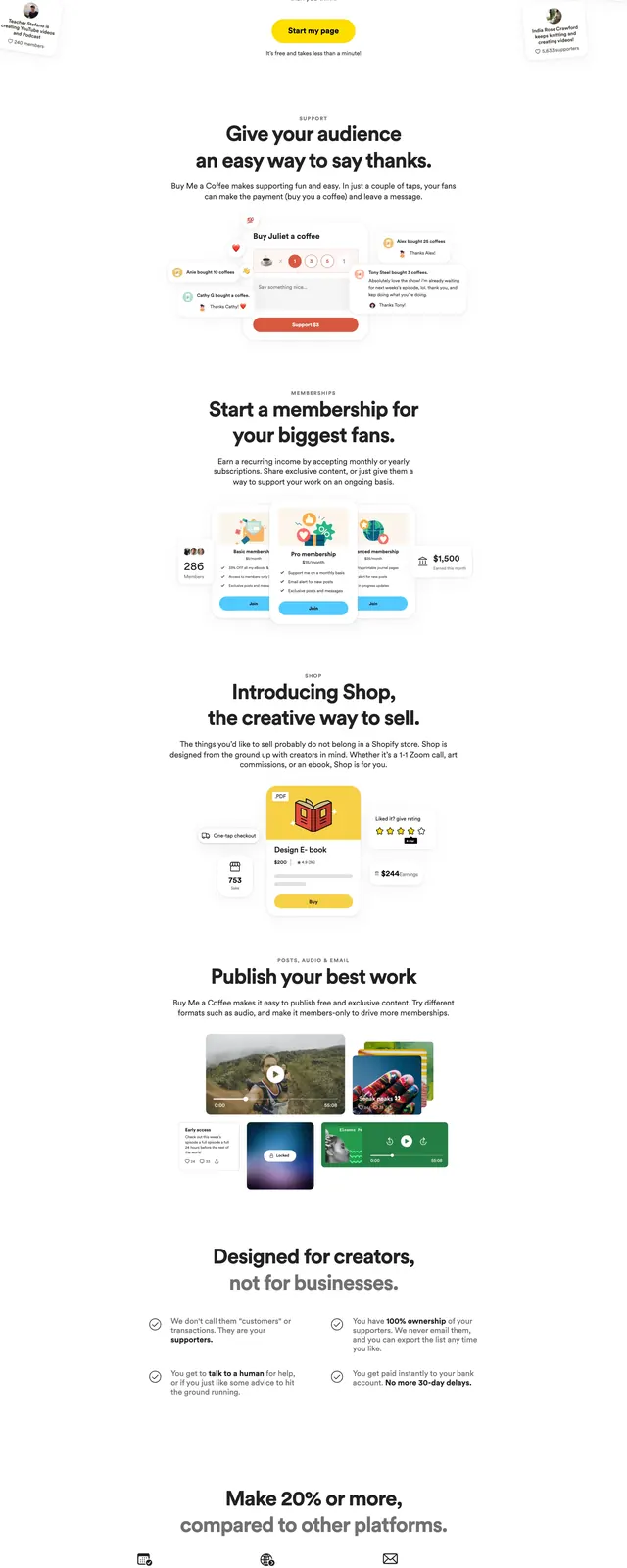
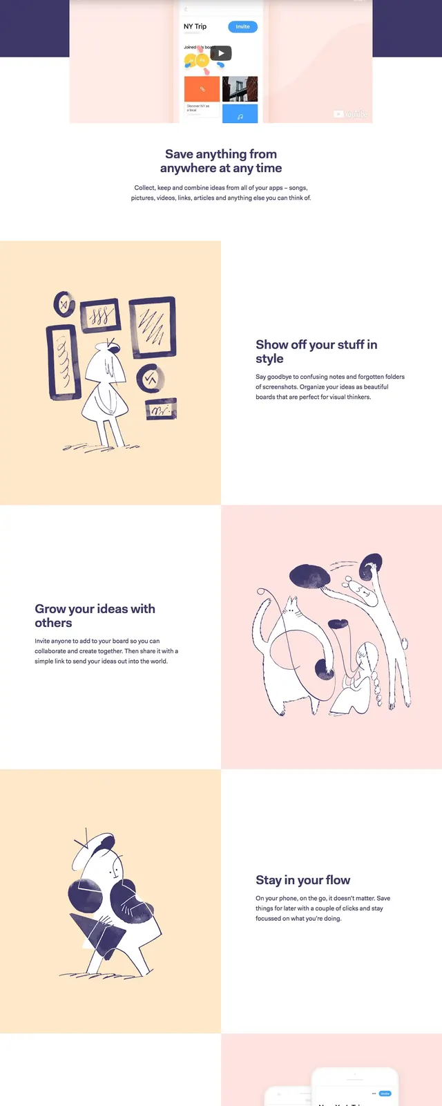
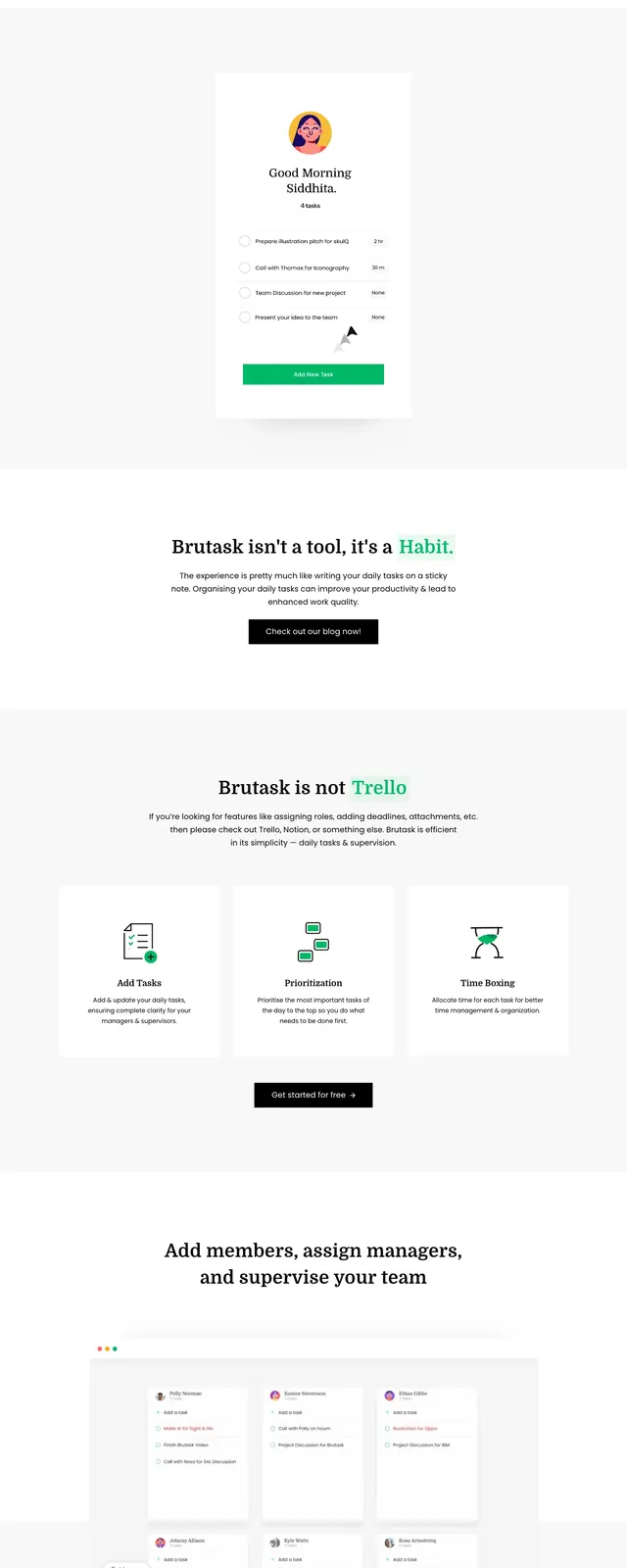
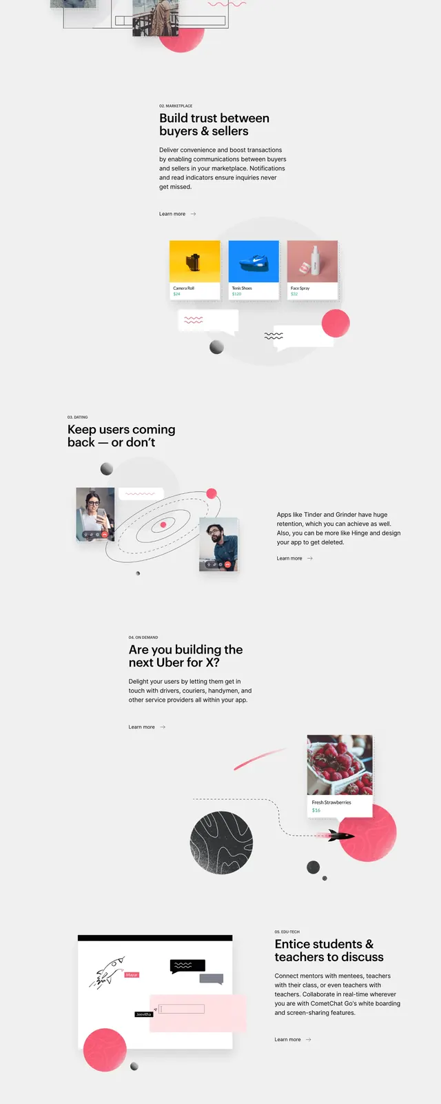
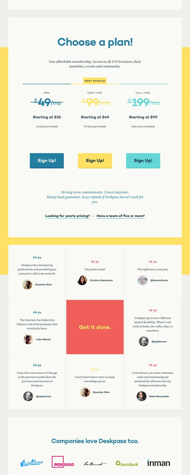
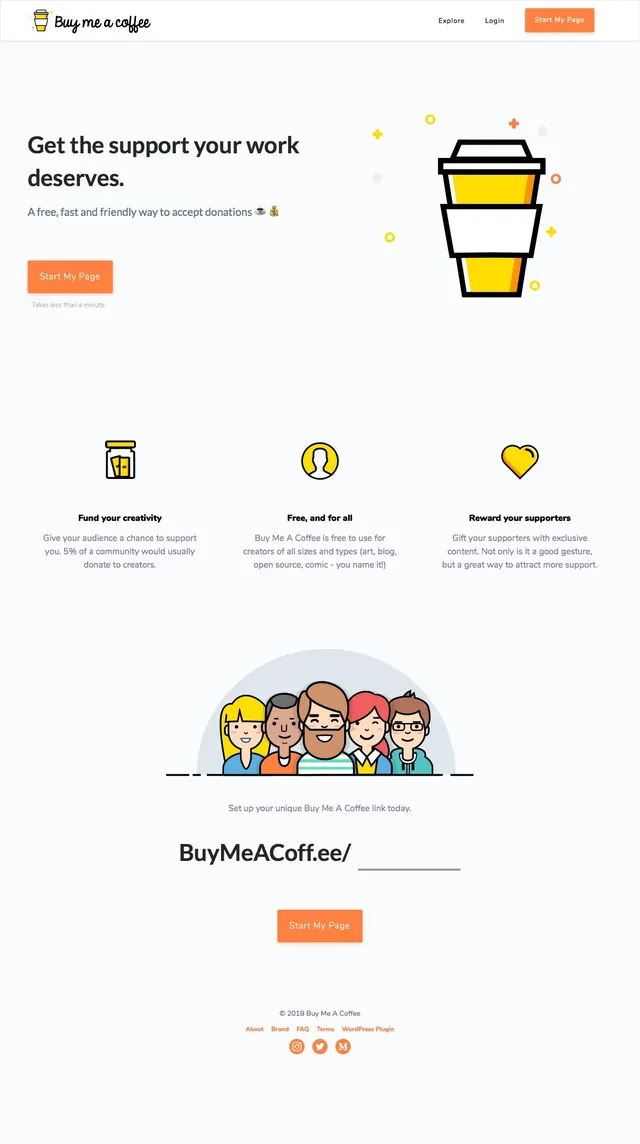
The first screen uses a split layout with bold left-aligned copy, a short supporting paragraph, and an email sign-up field paired with a yellow button. The right side is dominated by a tall, hand-drawn illustration in warm yellow, blue, and white tones with the Cooper wordmark embedded in the artwork. Lower sections continue with generous white space, small illustrative feature blocks, a large angled yellow testimonial panel with rounded quote cards, a team section with circular headshots, and a bottom signup band above a simple footer.
Key takeaway
The strongest move is the contrast between spacious white layouts and dense hand-drawn illustration, which gives a professional product page a friendly, human feel. The angled yellow section break and rounded quote cards create a memorable rhythm without adding visual clutter.
Reuse notes
Use this pattern for early-access, referral, or relationship-driven products that need trust and personality. It works best when the brand can support custom illustration and a restrained two-color accent system.