Preview image. Unlock full-res
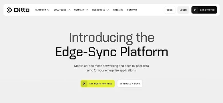
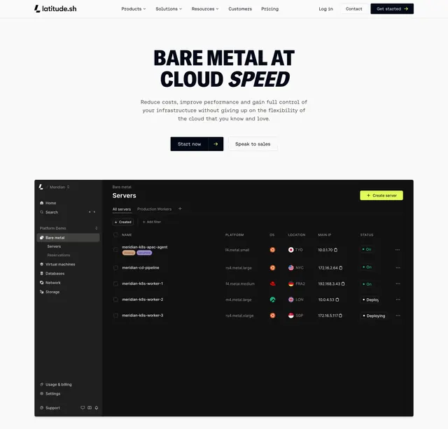
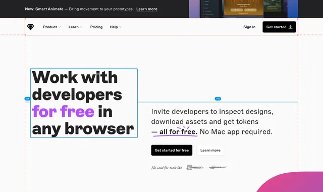
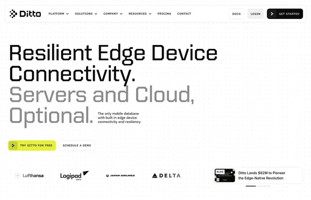
Light left-aligned hero with a huge two-tone display headline, dual CTAs, navbar, and a customer logo row.
Summary
A light, left-aligned hero dominated by an oversized two-tone display headline, with a navbar above and a row of airline customer logos below.
Visual description
White background with a faint dotted texture. The top navbar carries the Ditto wordmark with a pixel-block icon, dropdown links (Platform, Solutions, Company, Resources), Pricing and Contact, plus Docs, a Login pill, and a black "GET STARTED" button with a small glyph. The headline fills the left two-thirds at very large size in a wide technical display face: "Resilient Edge Device Connectivity." in black over "Servers and Cloud, Optional." in light grey. A short three-line subhead in dark sans-serif sits to its right. Below, a filled lime "TRY DITTO FOR FREE" pill sits beside an outlined "SCHEDULE A DEMO" ghost button. A muted logo row (Lufthansa, Logipad aero, Japan Airlines, Delta) runs along the bottom, with a small rounded blog card ("Ditto Lands $82M to Pioneer the Edge-Native Revolution") and a slider dash indicator on the far right.
Key takeaway
The two-tone oversized headline, splitting the message into a solid black claim and a greyed qualifier, so a long statement keeps one clear emphasis. Tucking a logo row and a news/blog card into the lower band turns the hero into instant proof and momentum.
Reuse notes
A strong default hero for a technical or developer SaaS that has recognizable customers and big claims to make. The lime accent and dotted grid tie it to the rest of a tech-forward brand. The headline must be short and punchy to survive at display size; the airline logos do the trust work, so swap in equivalents.