Preview image. Unlock full-res
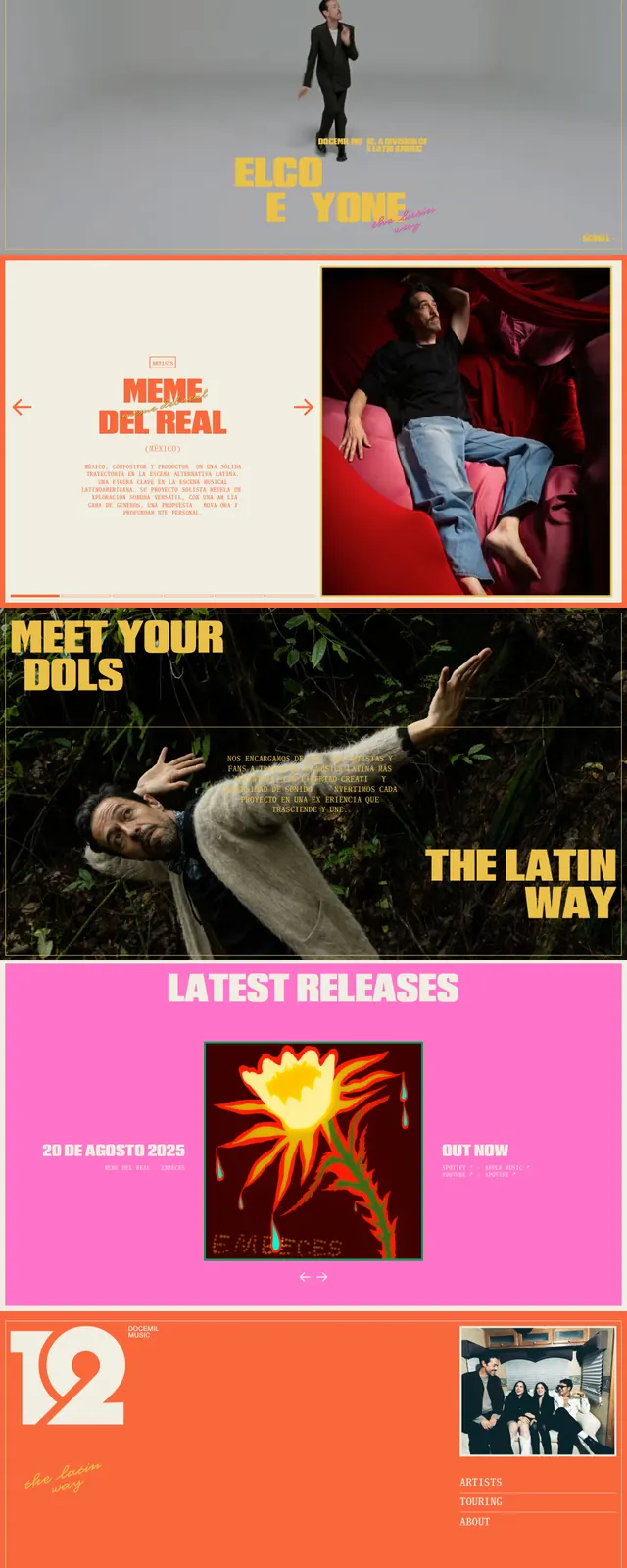
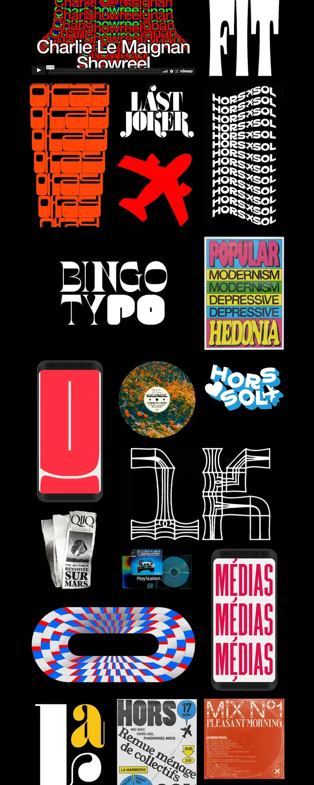
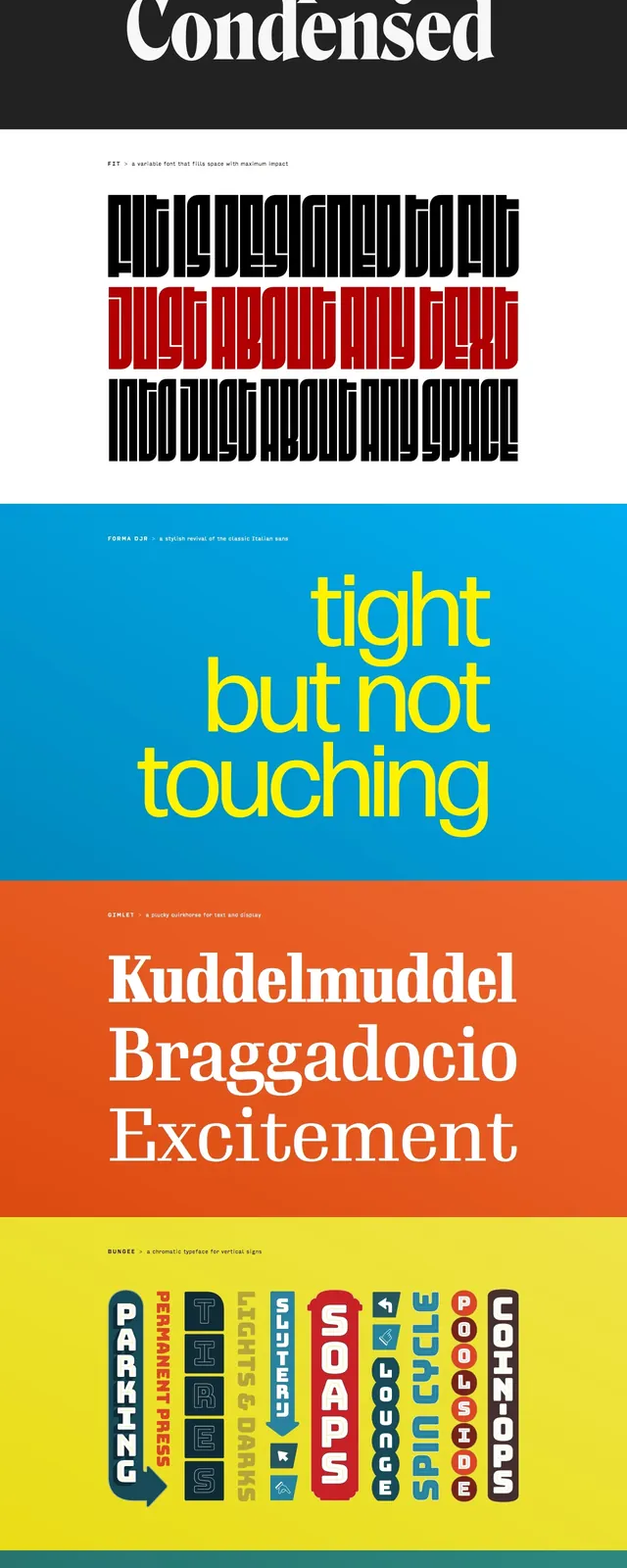
A typography-forward landing page for Djr with bold, poster-like section breaks and vivid color blocks showcasing featured typefaces.
Summary
A typography-forward landing page for Djr with bold, poster-like section breaks and vivid color blocks showcasing featured typefaces.
Visual description
The page opens with a thin top navigation and a small logo area above a large editorial headline set in ornate blackletter type. Below, the content is organized into stacked full-width panels, each using a different saturated background color and oversized type specimens or short statements. The layout feels like a series of poster slices, with minimal UI chrome and strong emphasis on typography as the primary visual element.
Key takeaway
This design turns typography samples into a high-impact scrolling experience through bold color blocking and oversized type. The reusable pattern is a simple editorial hero followed by alternating full-bleed feature panels.
Reuse notes
Use this approach for font libraries, type foundries, or any brand that wants the page itself to feel like a printed specimen sheet. Keep the structure simple and let type scale, color shifts, and spacing do most of the work.