Preview image. Unlock full-res
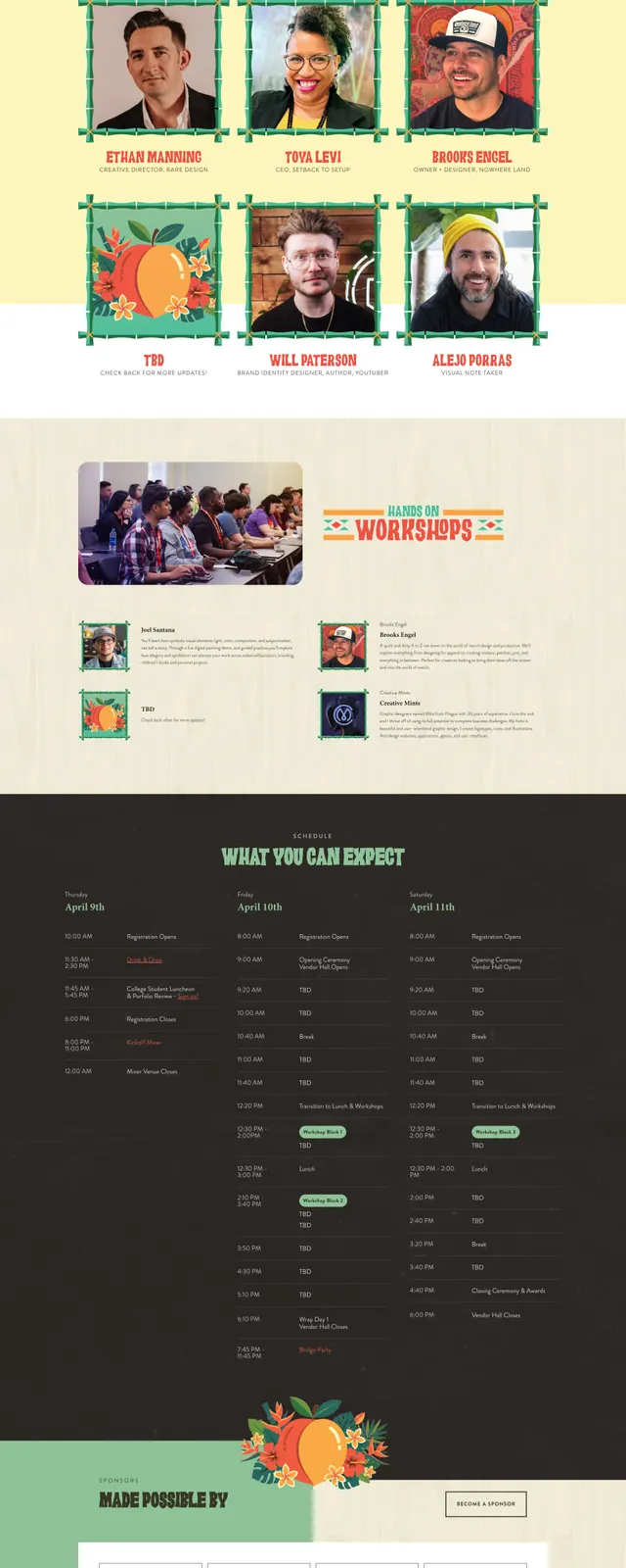
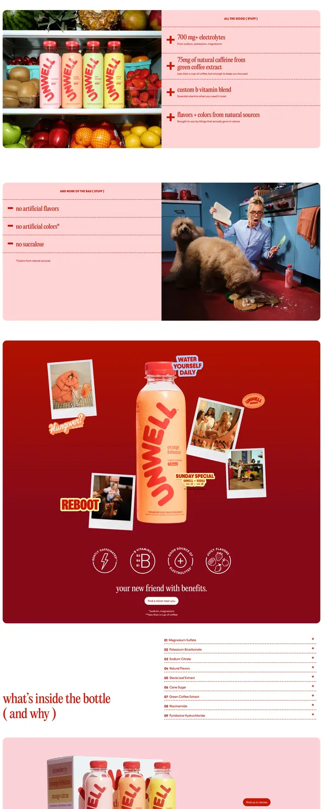
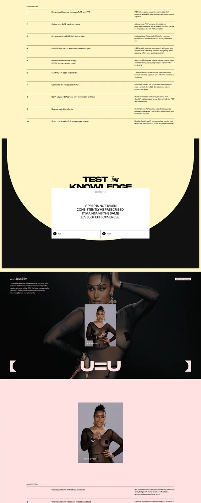
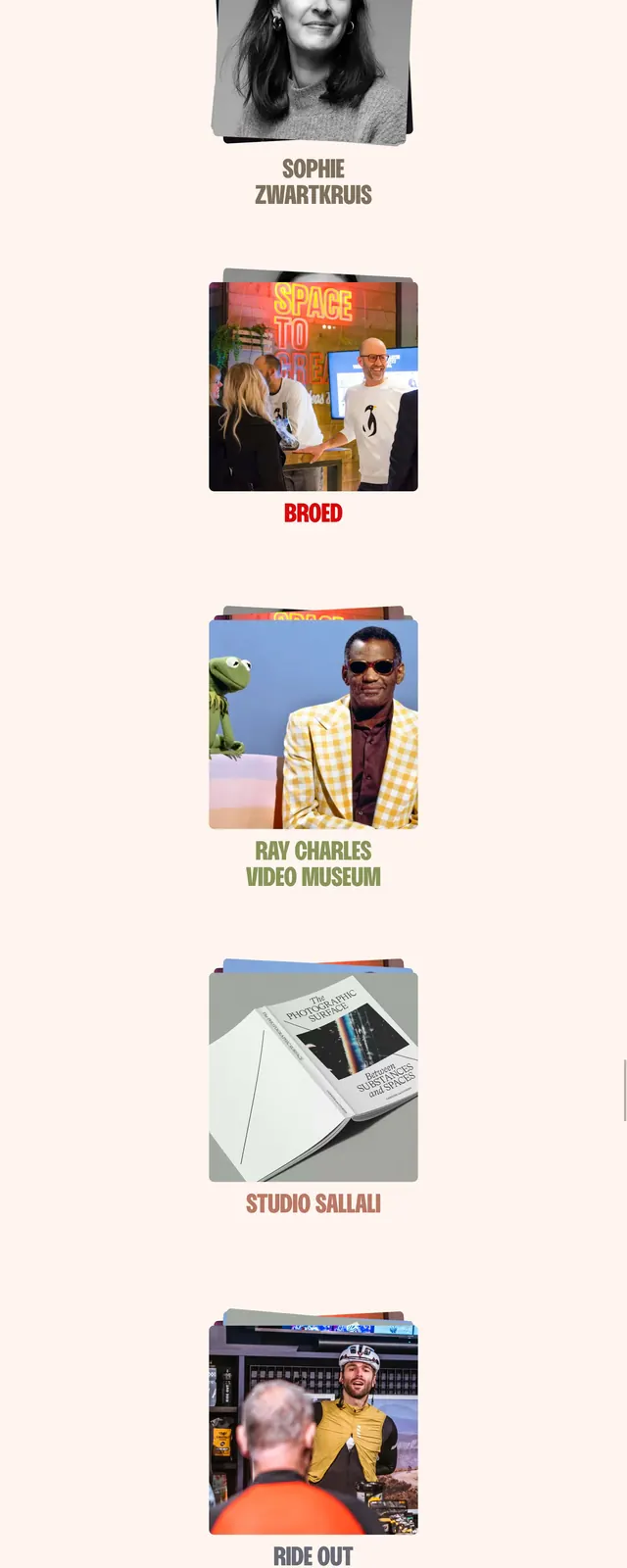
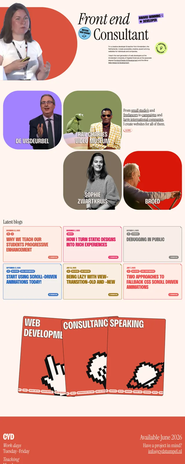
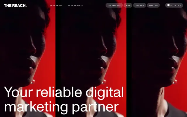
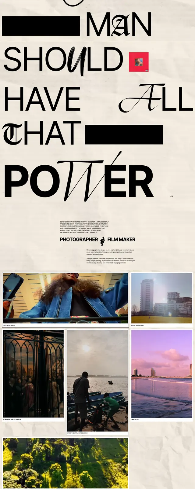
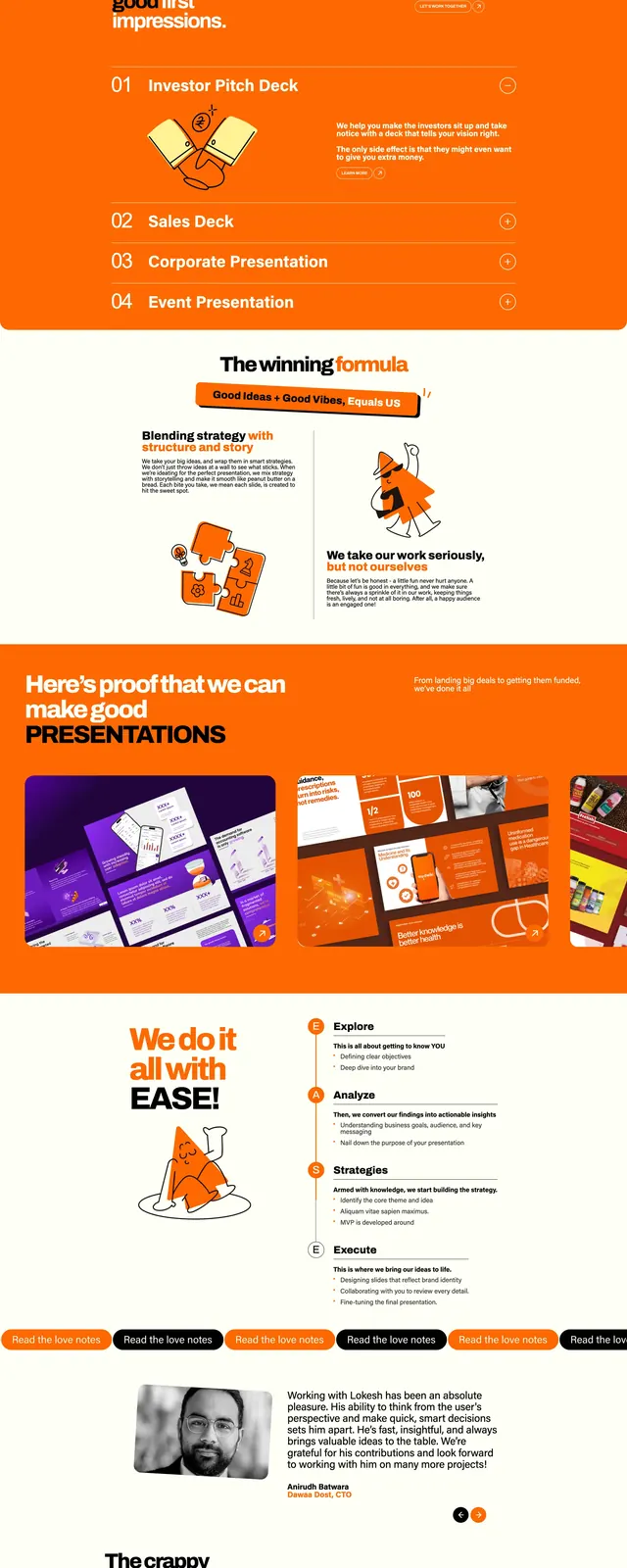
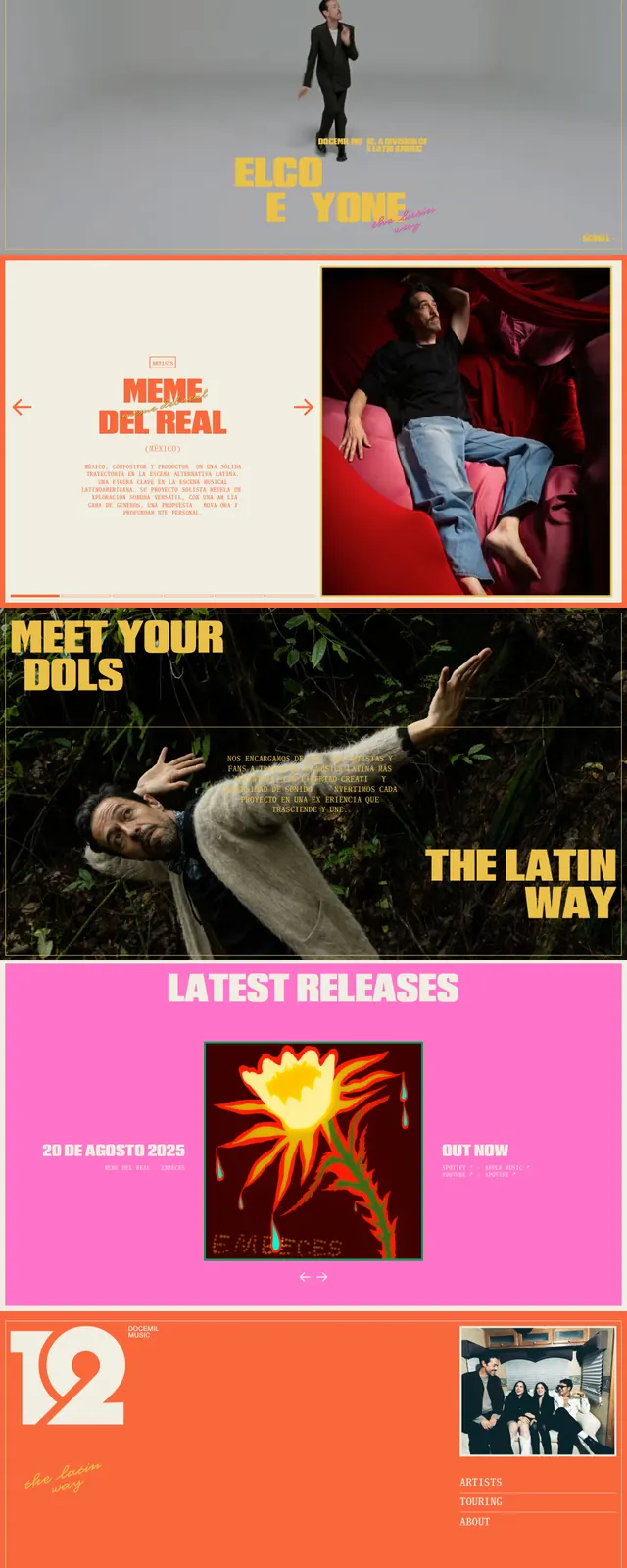
A bold music label homepage with oversized typography, vivid color blocks, and full-bleed artist photography.
Summary
A bold music label homepage with oversized typography, vivid color blocks, and full-bleed artist photography.
Visual description
The page uses stacked full-width sections with large, expressive headings and strong editorial spacing. The top hero is minimal and centered with a single figure against a gray background, while later sections pair cream, black, hot pink, and orange panels with vivid artist imagery. Several areas use oversized all-caps text, thin border lines, and simple navigation arrows to reinforce a poster-like music brand aesthetic.
Key takeaway
The design leans on bold color contrast, oversized type, and photography to feel like a modern music zine or artist campaign site. It works well for brands that want a youthful, expressive, and highly visual landing page.
Reuse notes
Reuse the formula of a sparse hero followed by alternating editorial feature blocks with heavy typography and image-led storytelling. Keep the navigation simple and let color shifts separate sections clearly.