Preview image. Unlock full-res
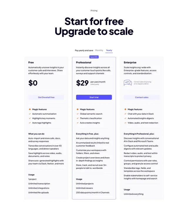
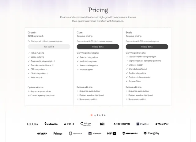
Centered three-column pricing table with a monthly/yearly toggle and a highlighted middle Professional plan.
Summary
A standard but well-executed three-tier pricing table: a centered headline and billing toggle on top of Free, Professional, and Enterprise columns, with the middle plan boxed and badged to steer choice.
Visual description
A small "Pricing" eyebrow sits above a large centered two-line headline ("Start for free / Upgrade to scale"). A "Pay yearly and save" toggle with Monthly and Yearly options (Yearly active in violet) centers below it. Three columns follow: Free ($0), Professional ($29 per user/month, billed yearly), and Enterprise (contact for pricing). The Professional column is outlined in a subtle border with a violet "Save 25%" badge on its top edge and a solid violet "Start trial" CTA; Free and Enterprise use pale-violet tonal buttons ("Get Dovetail free", "Contact sales"). Each card lists a "Magic features" group with orange plus icons and checkmarked items, then "What you can do" and "Usage" sub-lists. Clean black-on-white with violet and orange accents.
Key takeaway
Boxing and badging only the recommended middle tier is the classic nudge, done cleanly here with a thin outline rather than a heavy fill. Splitting each plan into Magic features / What you can do / Usage groups makes long feature lists scannable instead of one undifferentiated column.
Reuse notes
A reliable default for a freemium SaaS with three tiers and yearly-discount pricing. The monthly/yearly toggle implies two price states, so wire both. Keep the accent (orange feature icons, violet CTAs) consistent with the rest of the brand.
More pricing table sections
See all


More like this

Keep what you find
A free account saves references to boards and can send you a weekly email of picks based on what you save.
To see every result, go Pro.