Preview image. Unlock full-res
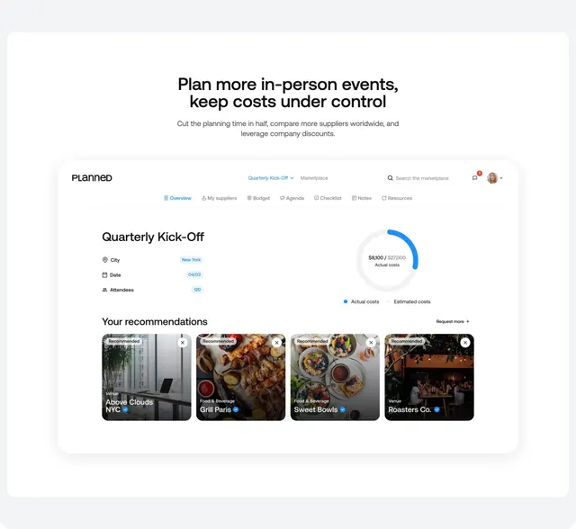
Centered headline above a full-width event dashboard mockup with budget chart and supplier recommendation cards.
Summary
A feature section leading with centered copy then a large Planned app window showing event overview, budget donut chart, and photo recommendation cards.
Visual description
Light gray page background. Centered bold headline "Plan more in-person events, keep costs under control" with gray subcopy about cutting planning time and comparing suppliers. Below, a large rounded dashboard window with drop shadow. Navbar inside shows PLANNED logo, event dropdown, Marketplace link, search field, notification bell, and avatar. Tab row includes Overview (active in blue), My suppliers, Budget, Agenda, Checklist, Notes, Resources. Main panel titles "Quarterly Kick-Off" with pill badges for City, Date, Attendees. Right side donut chart compares $8,100 actual to $27,000 estimated costs. Bottom section "Your recommendations" with Request more link and four vertical photo cards for venues and food suppliers, each with Recommended badge, category label, verified name, and dismiss X.
Key takeaway
One full-app screenshot communicates breadth better than icon grids. Centered marketing copy above the UI keeps the section scannable. Recommendation cards with real photography make marketplace value concrete.
Reuse notes
Best when the product UI is polished enough to carry the section alone. Wide mockup needs horizontal scroll or scale-down on small screens. Pairs well with marketplace or savings sections nearby.