Preview image. Unlock full-res
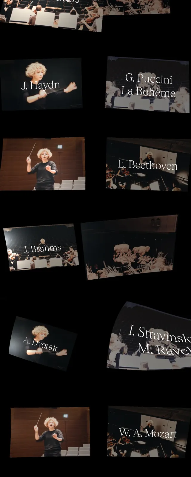
A dark, editorial landing page for a conductor brand built from tilted performance photos, sparse serif typography, and theatrical spacing.
Summary
A dark, editorial landing page for a conductor brand built from tilted performance photos, sparse serif typography, and theatrical spacing.
Visual description
The page uses a black background with thin white serif headings placed in opposite corners, creating a sparse, theatrical first impression. Large tilted image tiles of an orchestra conductor and performance scenes overlap down the page like a collage. Navigation and footer content are minimal, with contact details and small text links anchored at the edges. The overall composition feels like an arts portfolio or personal brand site with strong visual rhythm.
Key takeaway
The strongest pattern here is an editorial hero built from asymmetrical, overlapping imagery and restrained typography. It works well for creative portfolios that want to feel cultured, selective, and cinematic.
Reuse notes
Reuse the tilted photo-card stack for a project showcase or artist profile. Keep the type hierarchy minimal and corner-anchored to preserve the quiet, gallery-like tone.