Preview image. Unlock full-res
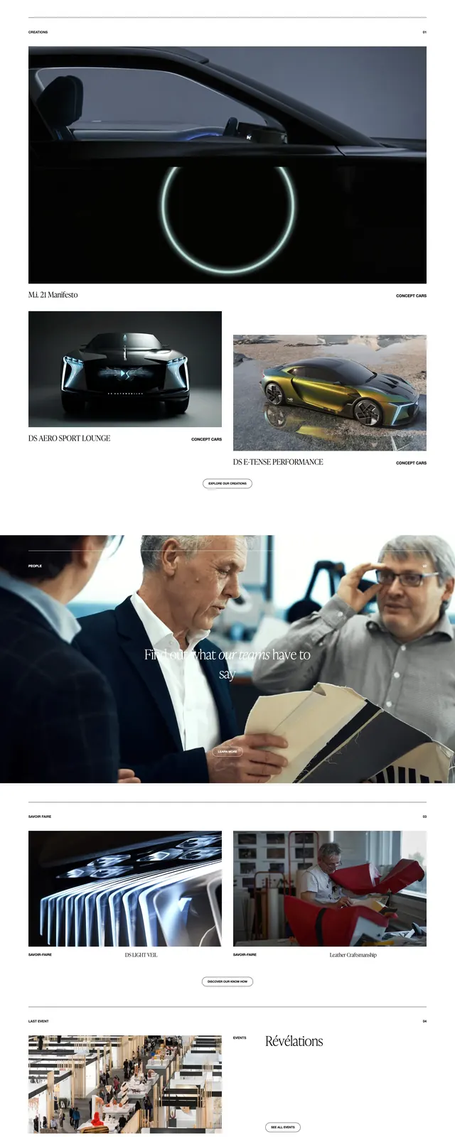
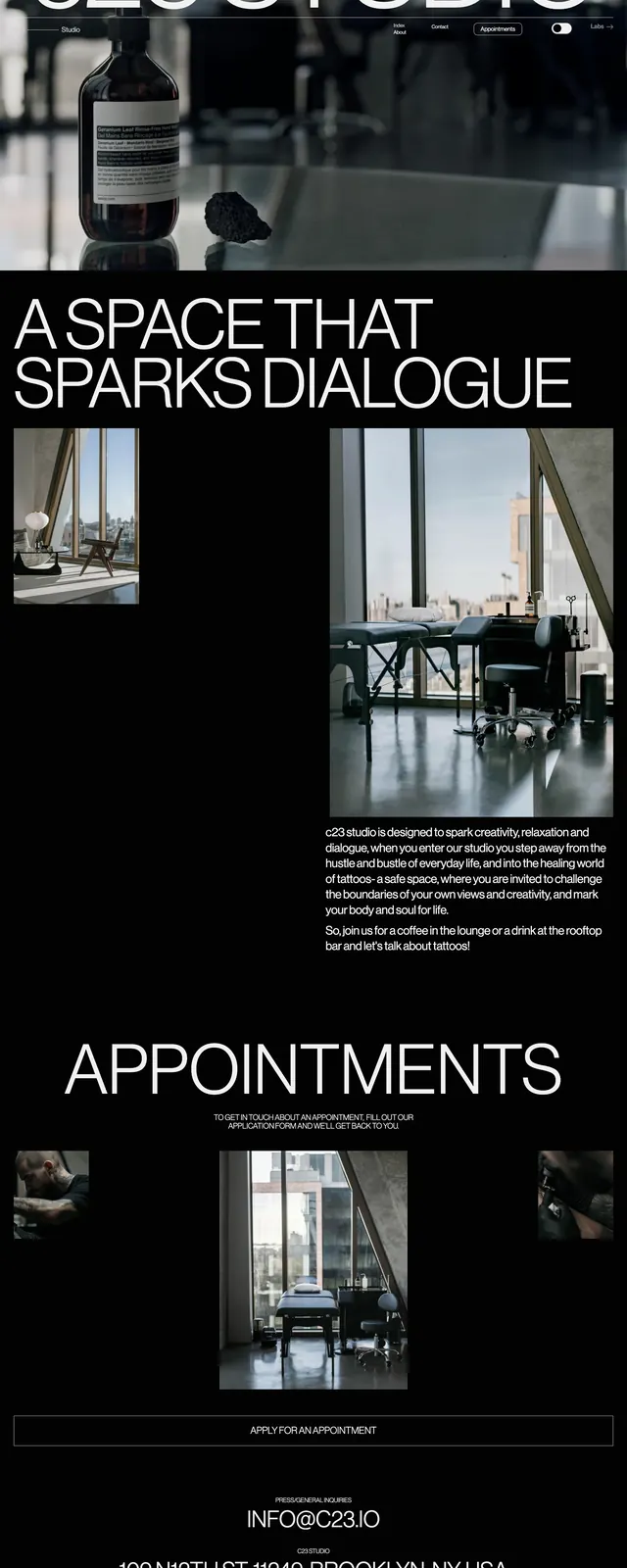
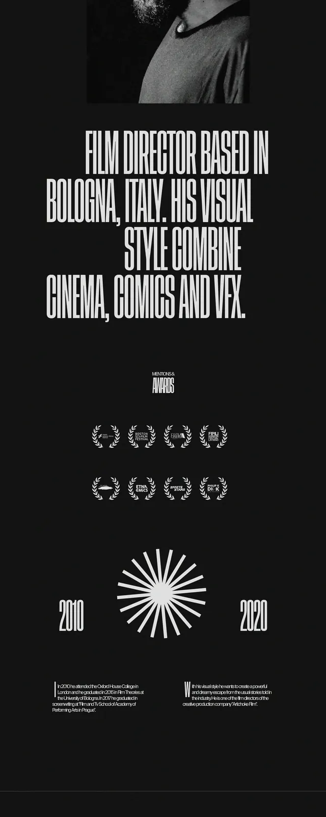
A stark, full-page dark landing page with oversized white hero typography, sparse navigation, and high-contrast image blocks.
Summary
A stark, full-page dark landing page with oversized white hero typography, sparse navigation, and high-contrast image blocks.
Visual description
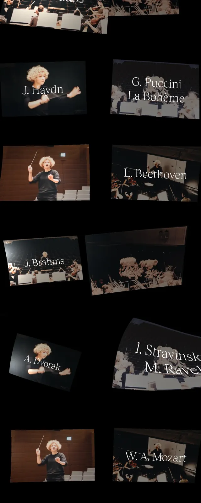
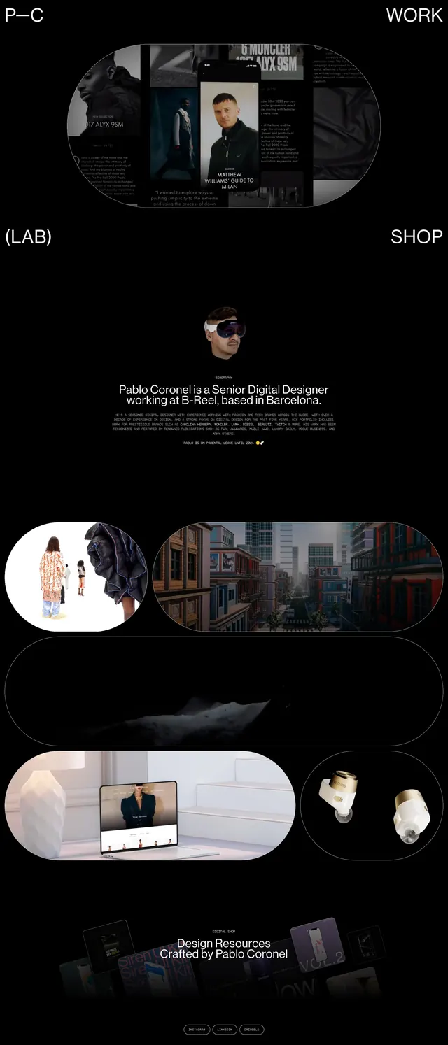
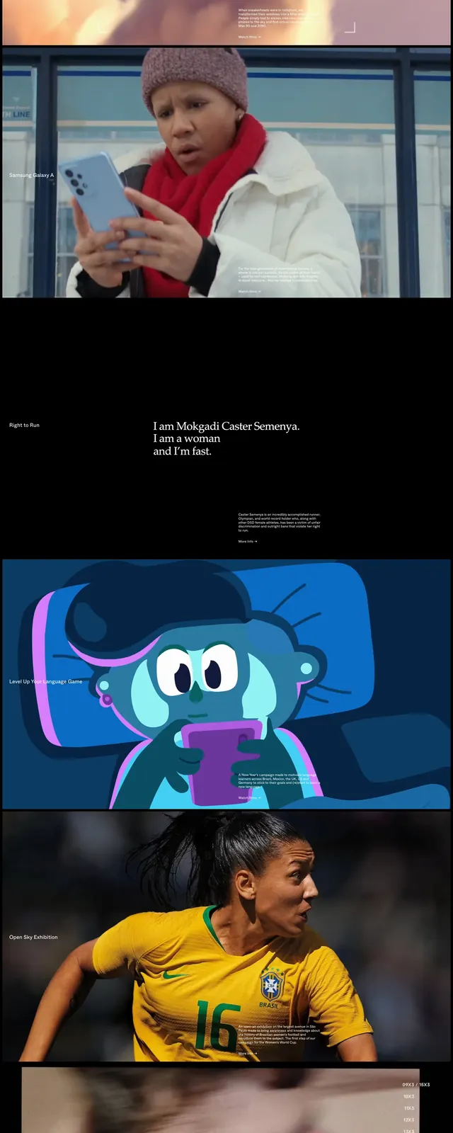
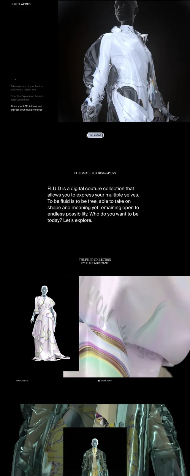
The page uses a near-black background with a small logo at top left and two compact buttons at top right. A large centered headline, "We're global.", dominates the first screen, preceded by a short intro line. Below the hero are wide photographic strips and stacked editorial sections, including a large portrait image, a short statement block, and a minimal footer with small links and dot indicators.
Key takeaway
The main reuseable move is the extreme contrast between tiny chrome and huge headline typography. The page also shows how to combine editorial spacing with cinematic, cropped imagery to keep a minimalist layout feeling dramatic.
Reuse notes
Use this pattern for launch pages, creative agencies, or brand storytelling sites that need a premium, artsy feel. It works best on dark backgrounds with bold type and carefully cropped images, not dense product-focused interfaces.