Preview image. Unlock full-res
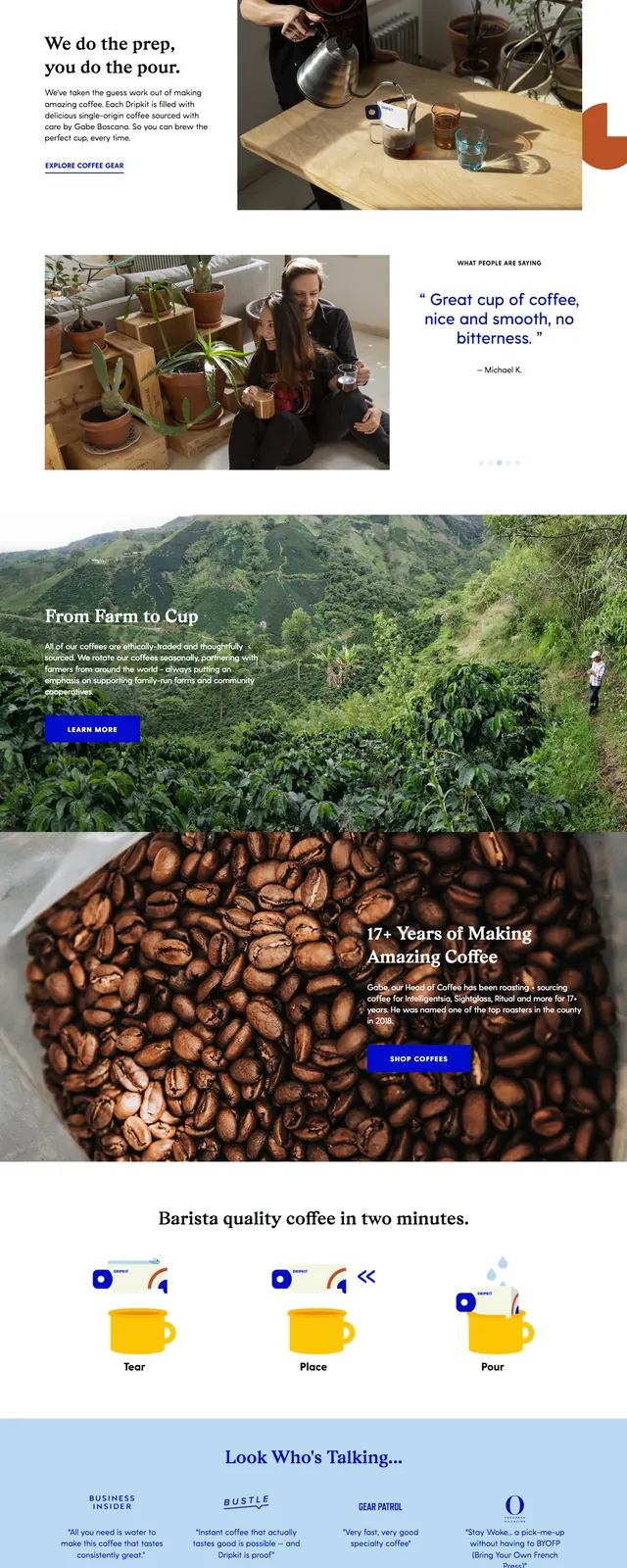
A bright ecommerce coffee landing page with a bold hero, farm-to-cup storytelling, product imagery, and a newsletter signup.
Summary
A bright ecommerce coffee landing page with a bold hero, farm-to-cup storytelling, product imagery, and a newsletter signup.
Visual description
The page opens with a white header bar, centered DRIPKIT logo, left and right navigation links, and a large hero image of coffee brewing tools and food on a bright tabletop. The hero pairs a large serif headline and a blue primary button on the left with a wide photographic composition on the right. Lower sections alternate between image-led storytelling blocks, a full-bleed coffee farm scene, a coffee bean close-up with overlaid text and CTA, a tiled image gallery, and a newsletter signup above a multi-column footer. Blue buttons and accents repeat throughout, with generous white space and strong use of photography.
Key takeaway
The strongest reusable idea is the contrast between clean white ecommerce framing and rich, tactile coffee photography. The page uses bold serif headlines and saturated blue CTAs to make a lifestyle brand feel premium but approachable.
Reuse notes
Useful for consumer food or beverage brands that need a storefront feel with editorial storytelling. The structure works best when you have strong photography and a simple accent color that can carry the CTA system across sections.