Preview image. Unlock full-res
A bold coffee brand landing page mixing oversized serif headlines, cream-and-black contrast, and product-first merchandising.
Summary
A bold coffee brand landing page mixing oversized serif headlines, cream-and-black contrast, and product-first merchandising.
Visual description
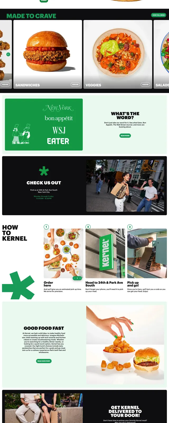
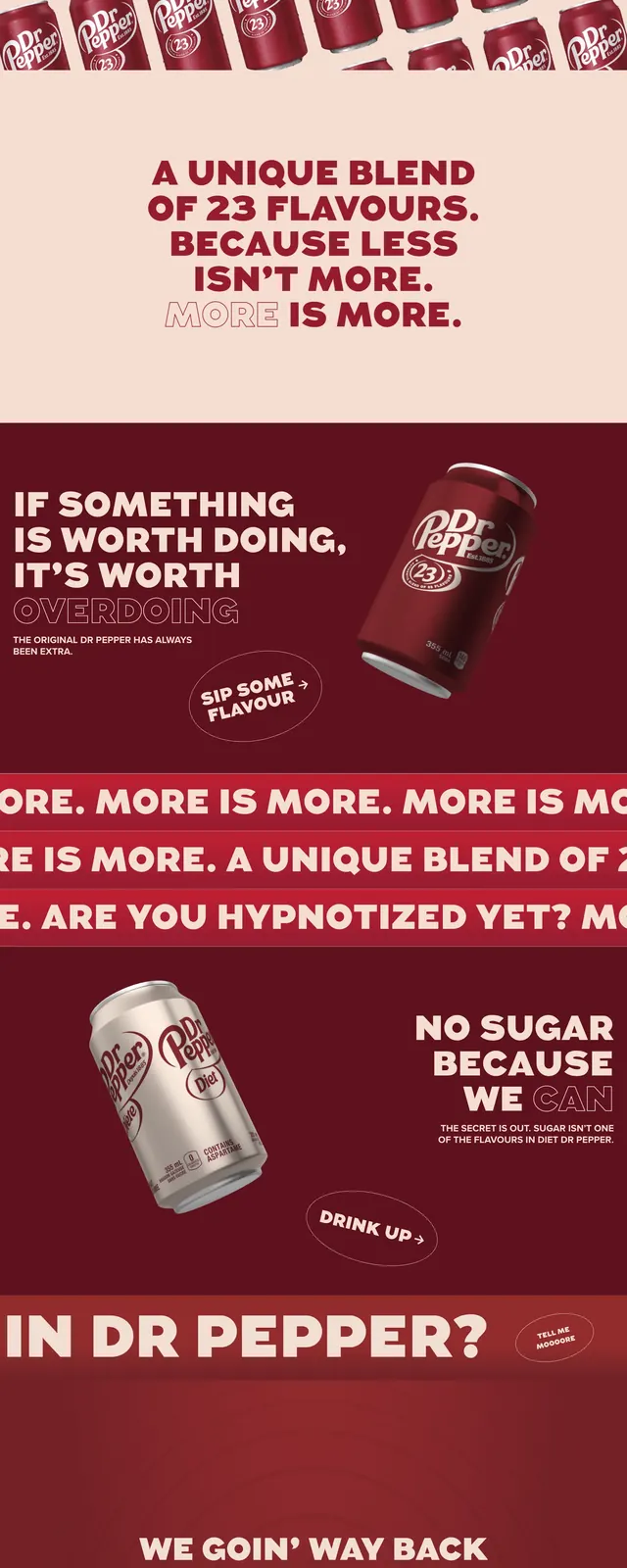
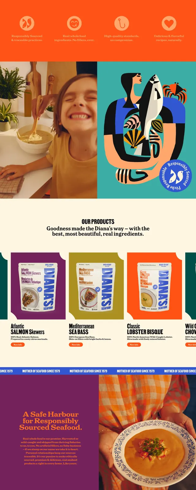
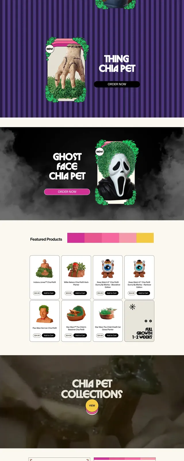
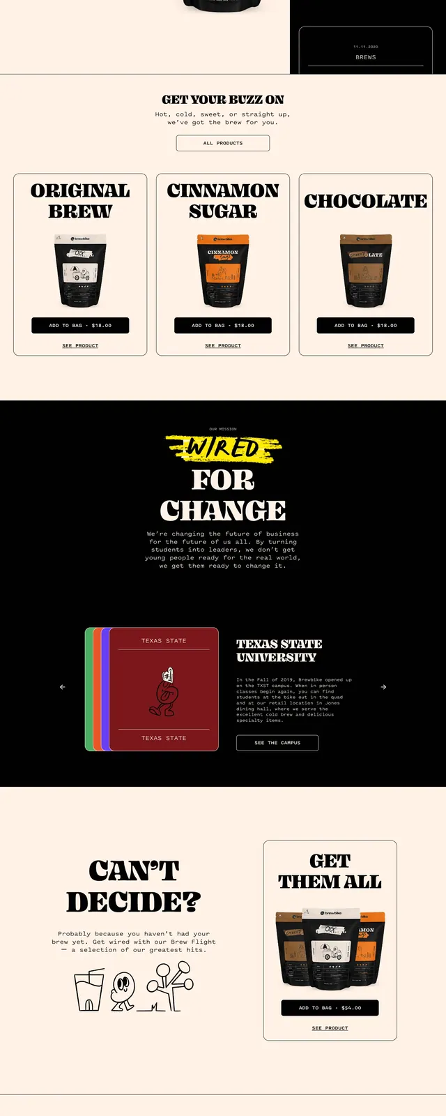
The page uses a split hero with a light cream product area on the left and a black promotional panel on the right. Large slab-serif headlines such as "COLD BREW." and "BOLD CREW." dominate the first screen, with a centered coffee bag product image and outlined call-to-action buttons. Further down, the layout alternates between editorial black sections, product cards, illustrated accents, and a newsletter sign-up form on a warm neutral background.
Key takeaway
The strongest move is the contrast between soft cream surfaces and stark black editorial blocks, which gives the brand a loud but controlled personality. Oversized serif type and simple outlined buttons make the page feel handmade and merch-focused.
Reuse notes
Use this pattern for lifestyle or DTC product brands that want a playful premium look with strong visual hierarchy. It works best when paired with a single hero product and a limited color palette anchored by black, cream, and one accent tone.