Preview image. Unlock full-res
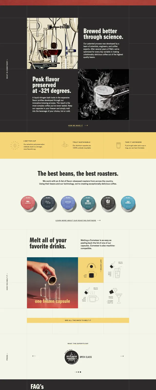
Editorial coffee brand landing page with a dark photographic hero, bright yellow feature band, product lineup, and FAQ section.
Summary
Editorial coffee brand landing page with a dark photographic hero, bright yellow feature band, product lineup, and FAQ section.
Visual description
The page opens with a full-bleed hero showing a coffee mug on a warm gradient floor, with a centered oversized headline and a short signup form beneath it. A thin top navigation bar spans the width with a small circular badge on the left, the Cometeer wordmark in the center, and utility links on the right. Below the hero are stacked sections: a dark band with a split image/text feature, a yellow three-column benefits row, a roaster logo showcase, a light product narrative block, a press/carousel area, and a dark FAQ section with accordion rows.
Key takeaway
The strongest reusable move is the contrast between a cinematic photographic hero and tightly structured utility sections below it. The palette shift from dark, moody top sections to warm yellow and cream content blocks gives the page clear pacing and strong brand character.
Reuse notes
Use this pattern for premium consumer products that need both atmosphere and explanation. It works best when you have strong product photography, a simple lead capture form, and several modular sections that can alternate between dark and light backgrounds.