Preview image. Unlock full-res
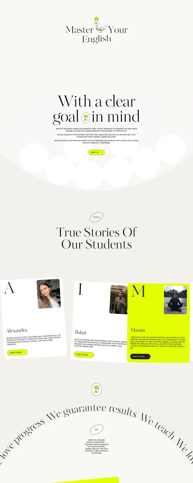
An editorial, illustrated landing page for Duck English with oversized serif headlines, neon accent badges, and playful duck imagery on a soft cream background.
Summary
An editorial, illustrated landing page for Duck English with oversized serif headlines, neon accent badges, and playful duck imagery on a soft cream background.
Visual description
The page uses a pale cream canvas with a centered hero composition, thin top navigation, and a large serif headline reading like an art-directed poster. Neon yellow pill badges and small playful UI labels float over the headline, while a hand-drawn duck illustration with a crown anchors the middle of the page. Lower sections show oversized story cards, bright lime content blocks, and another centered CTA area with the same whimsical branding.
Key takeaway
The strongest pattern is a premium editorial layout softened by playful illustration and high-visibility neon accents. It combines minimal spacing with expressive typography to make a simple educational offer feel distinctive and memorable.
Reuse notes
Reuse this approach for brands that need a refined but playful landing page: centered hero, oversized serif headline, and a single strong illustration. The neon badge system and floating micro-labels are especially useful for adding energy without crowding the layout.