Preview image. Unlock full-res
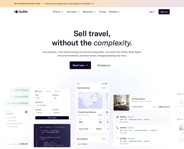
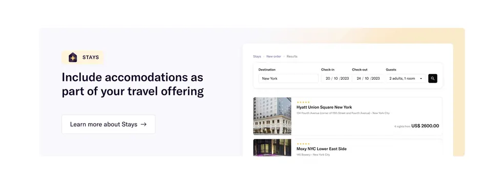
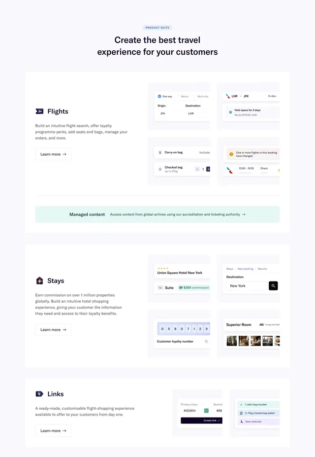
Duffel header with announcement banner, primary nav, and three-product sub-row with purple icons for Flights, Stays, and Links.
Summary
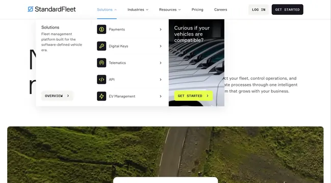
Duffel desktop header showing Stays launch banner, main nav with chevrons, auth buttons, and expanded product sub-navigation row.
Visual description
Peach gradient announcement banner top. White nav bar: Duffel logo left, center links (Product, Use cases, Resources, Pricing, Company) with dropdown chevrons, Log in ghost and Sign up navy buttons right. Below, three product tiles: Flights (plane icon), Stays (house-star icon), Links (lightning hex icon), each with title arrow and one-line API description on dark purple rounded squares.
Key takeaway
Product sub-row immediately under nav instead of hidden mega-menu for a three-SKU platform. Consistent purple icon tiles unify distinct product lines.
Reuse notes
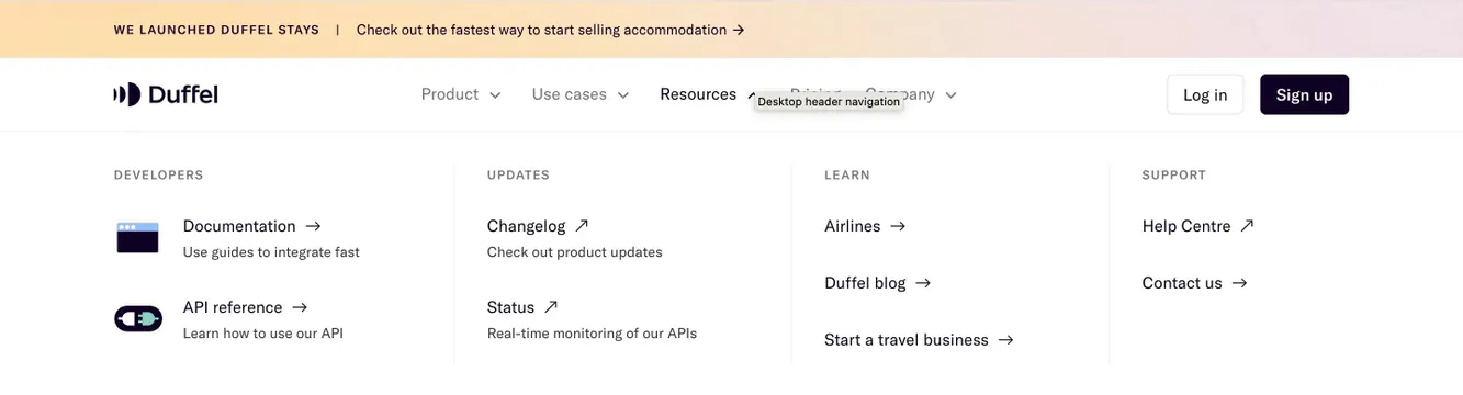
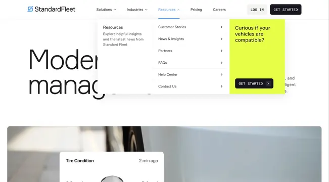
Works when product count is small (2-4). More products need a full mega-menu pattern like the Resources variant.