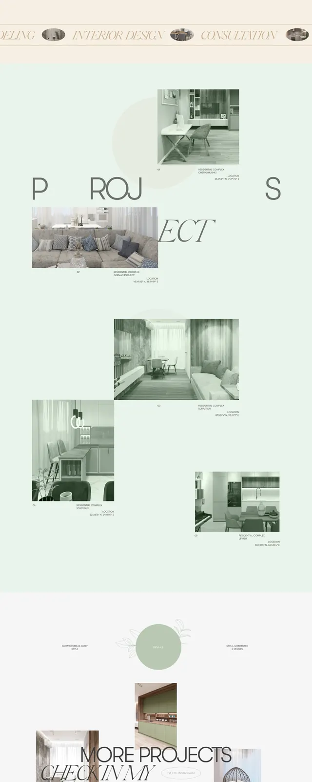
Preview image. Unlock full-res
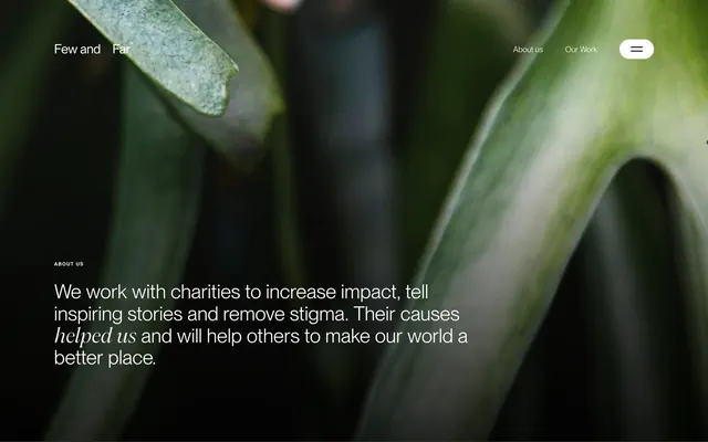
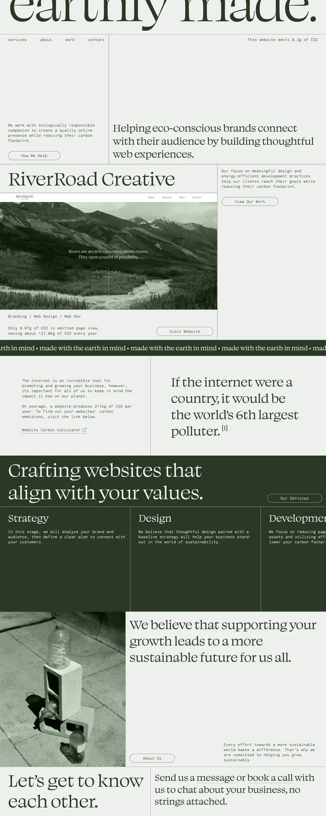
A muted, earthy editorial landing page with oversized serif typography, thin borders, and sustainability-focused messaging for a creative agency.
Summary
A muted, earthy editorial landing page with oversized serif typography, thin borders, and sustainability-focused messaging for a creative agency.
Visual description
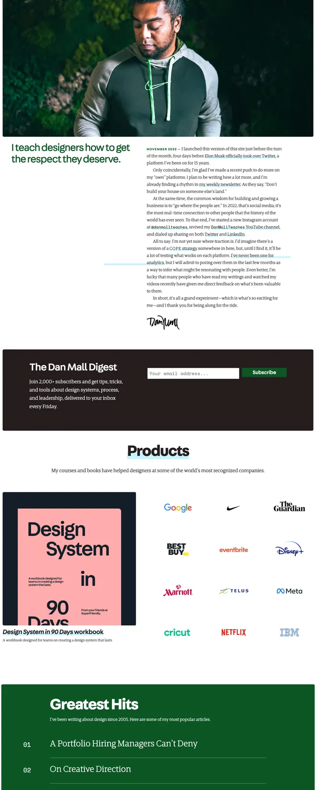
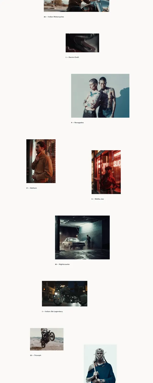
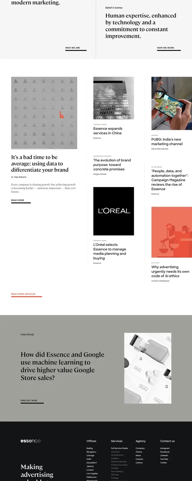
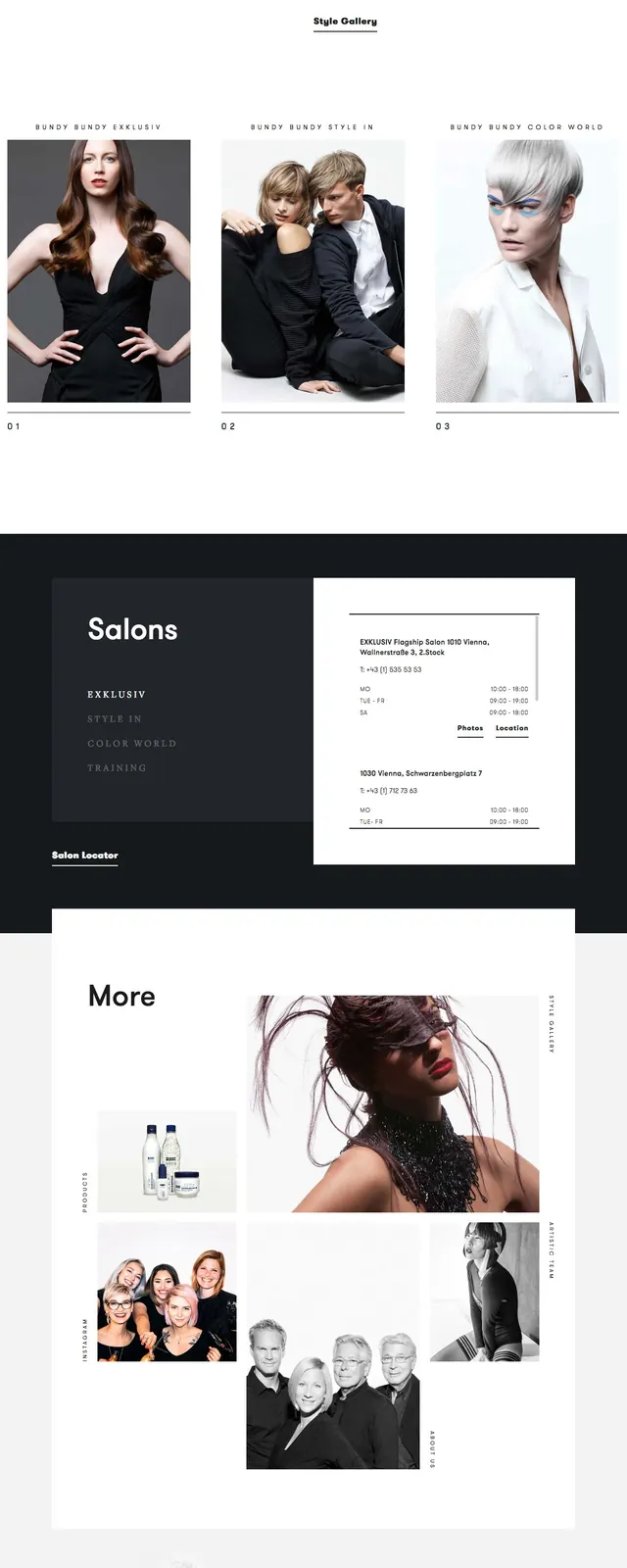
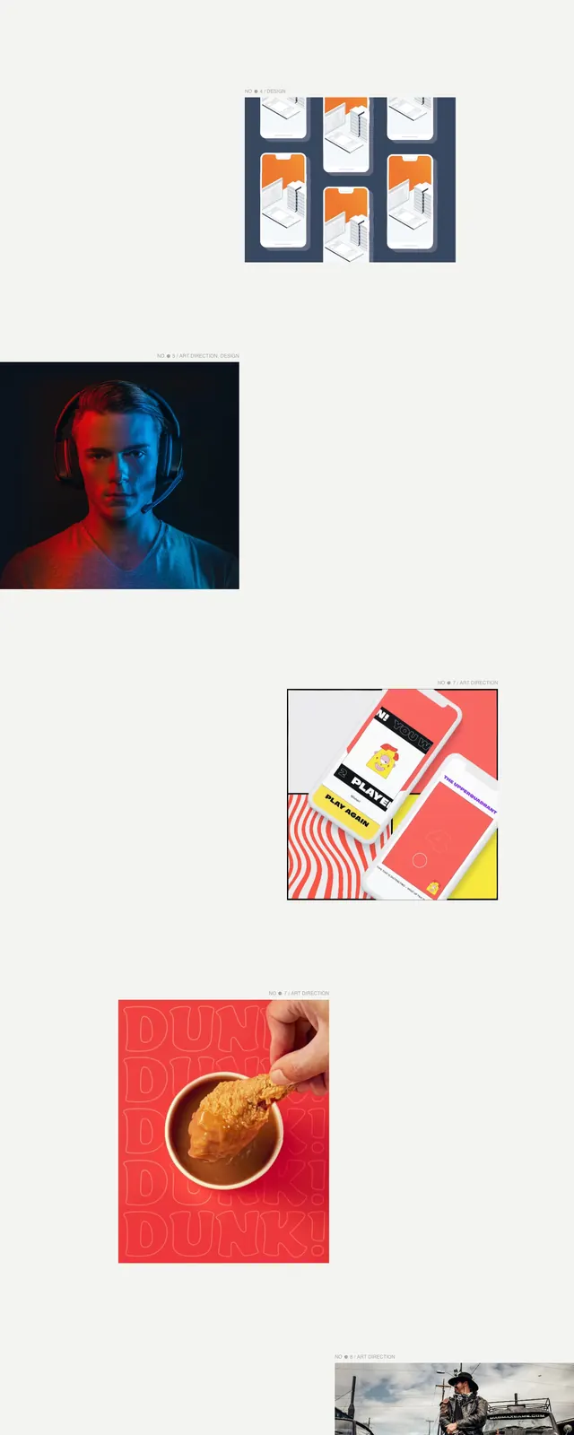
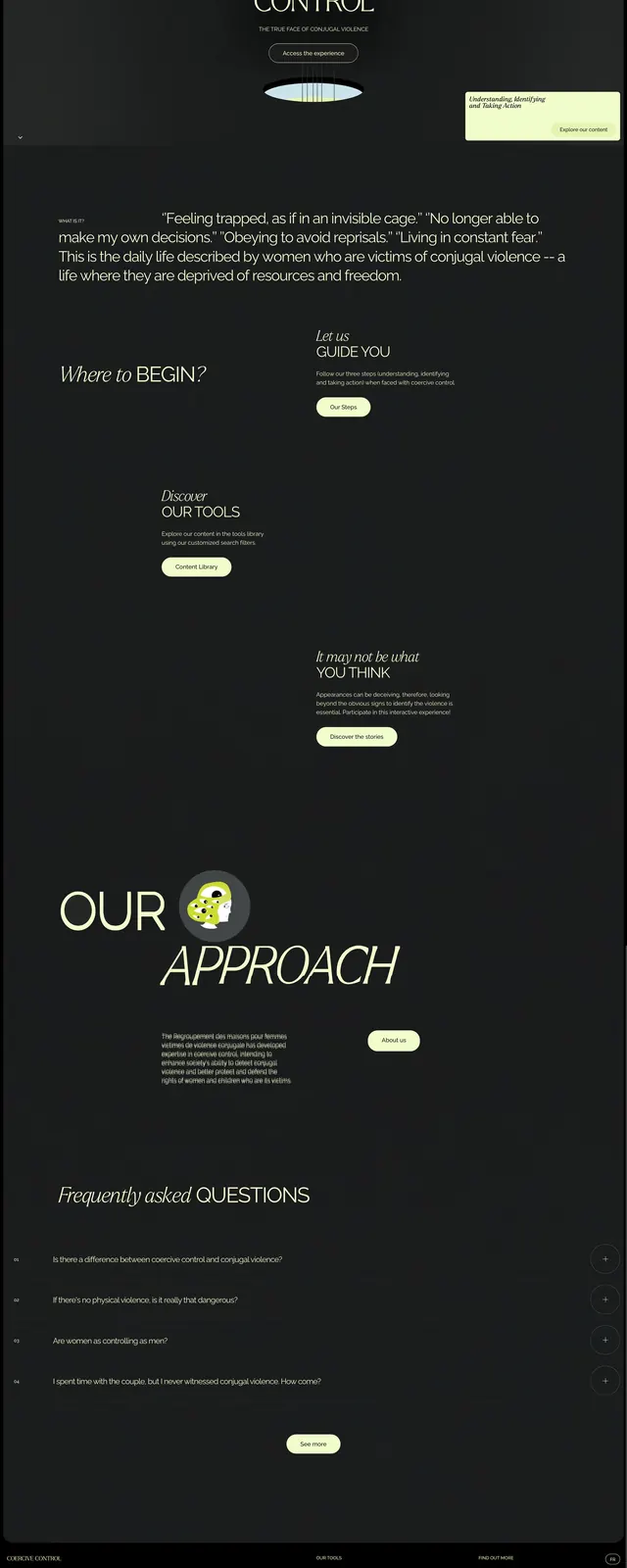
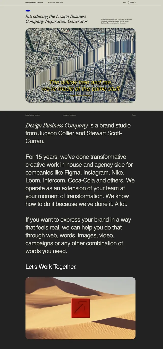
The page uses a pale background with deep forest-green type and very large serif headlines. Thin divider lines create a structured editorial grid, while small navigation links and outline buttons keep the interface restrained. Several stacked sections mix large typography, short descriptive copy, and wide landscape imagery with a sustainability theme. The overall presentation feels like a long-form brand story rather than a conventional product landing page.
Key takeaway
The strongest reusable pattern is the oversized serif hero paired with a sparse split layout and understated CTA buttons. It works well for eco, creative, or values-led brands that want to feel refined and purposeful.
Reuse notes
Reuse the grid-based editorial structure, muted palette, and thin outlined controls for a premium minimalist site. The imagery and copy blocks can be adapted into agency, studio, or mission-driven landing pages.