Preview image. Unlock full-res
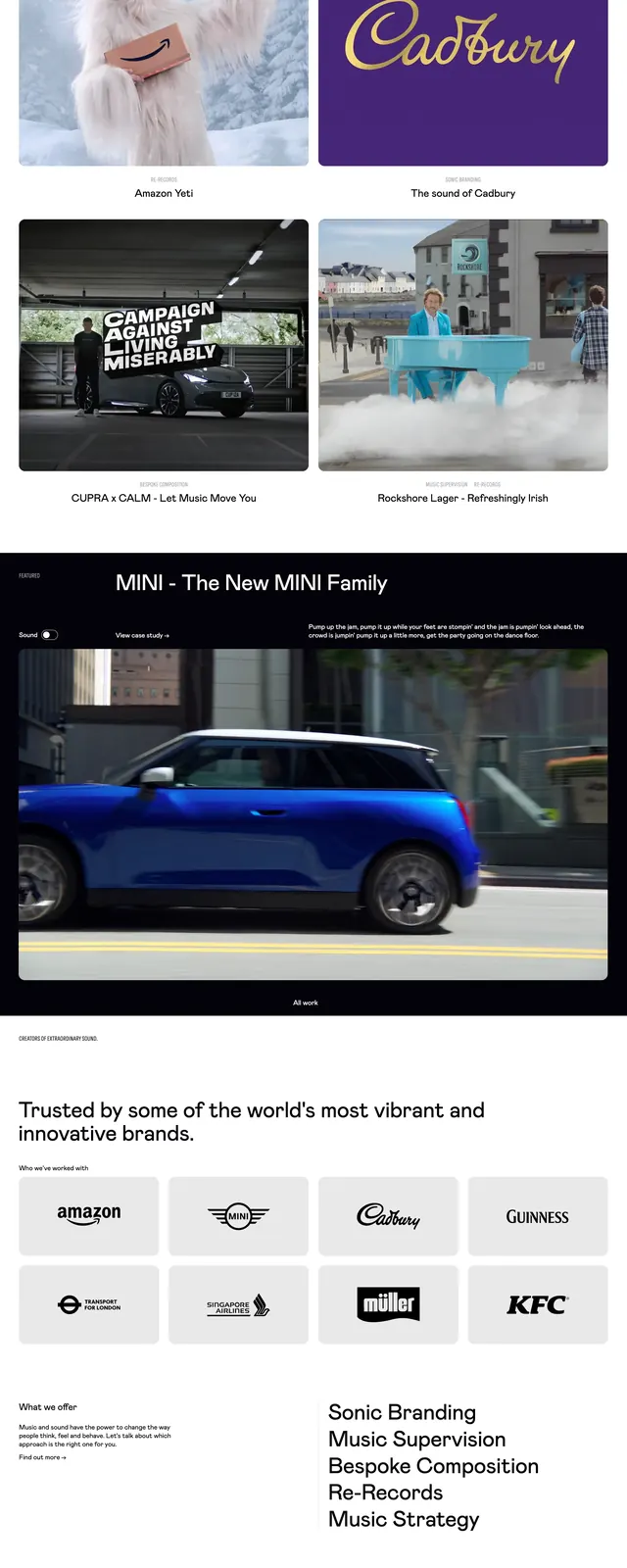
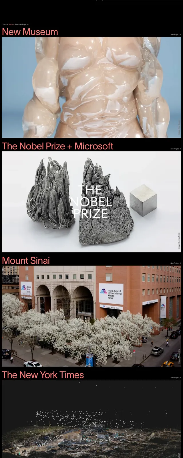
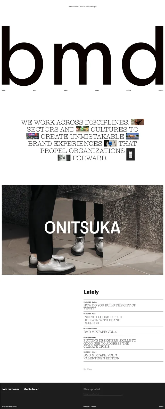
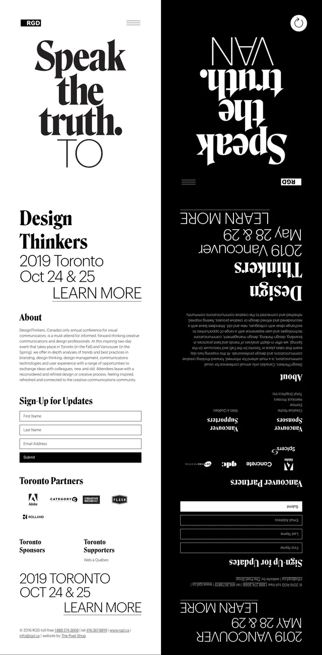
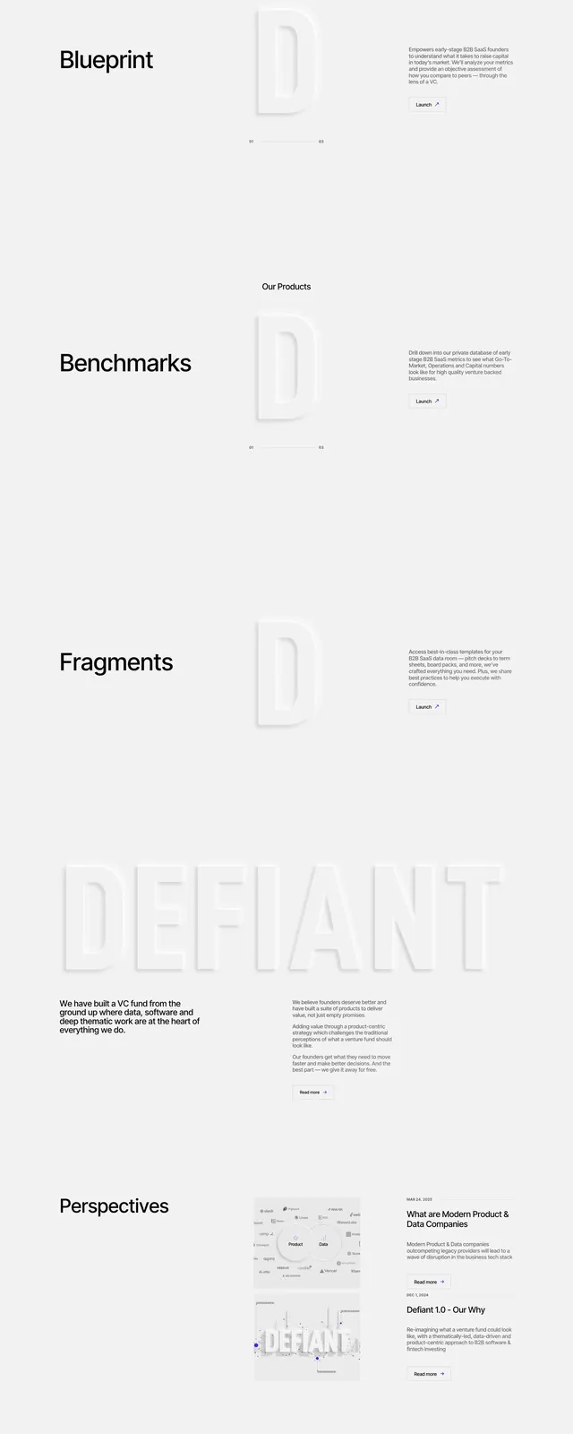
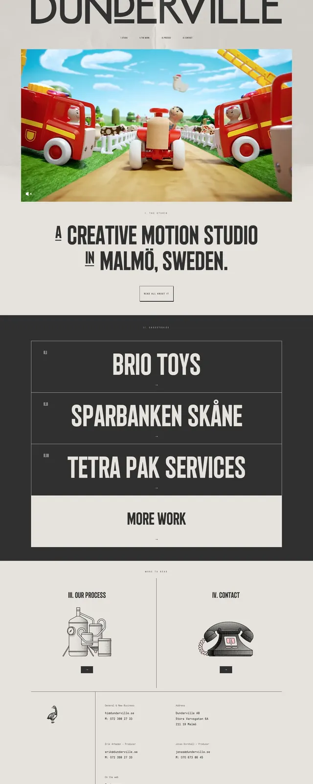
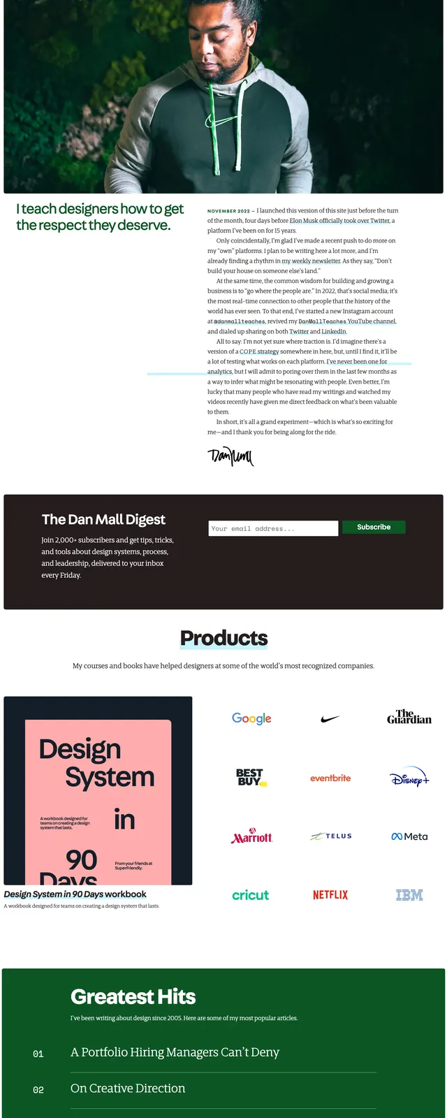
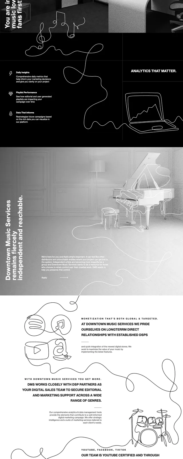
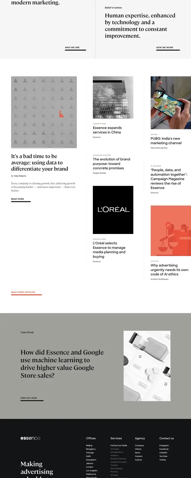
A minimalist, editorial agency homepage with oversized serif headlines, sparse navigation, and a grid of content blocks.
Summary
A minimalist, editorial agency homepage with oversized serif headlines, sparse navigation, and a grid of content blocks.
Visual description
The top section uses a large asymmetrical grid with one dominant text panel on the left and two stacked panels on the right. Typography is mostly serif for headlines with small sans-serif labels and understated navigation elements. Lower sections transition into a content-heavy article grid with image cards, a muted gray callout banner, and a dark footer with multiple link columns. The overall presentation is spacious, restrained, and highly editorial.
Key takeaway
This layout is effective for positioning an agency as thoughtful and authoritative while keeping the interface visually quiet. The strong typography and modular content blocks make it easy to reuse for editorial homepages or brand-led service sites.
Reuse notes
Reuse the split-grid hero with oversized serif headlines and small all-caps labels for a refined agency landing page. The article-card grid and dark footer can be adapted for case studies, insights, or company news.