Preview image. Unlock full-res
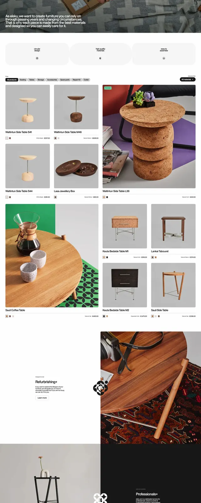
An editorial ecommerce homepage for sustainable furniture with oversized branding, product-heavy imagery, and bold color blocking.
Summary
An editorial ecommerce homepage for sustainable furniture with oversized branding, product-heavy imagery, and bold color blocking.
Visual description
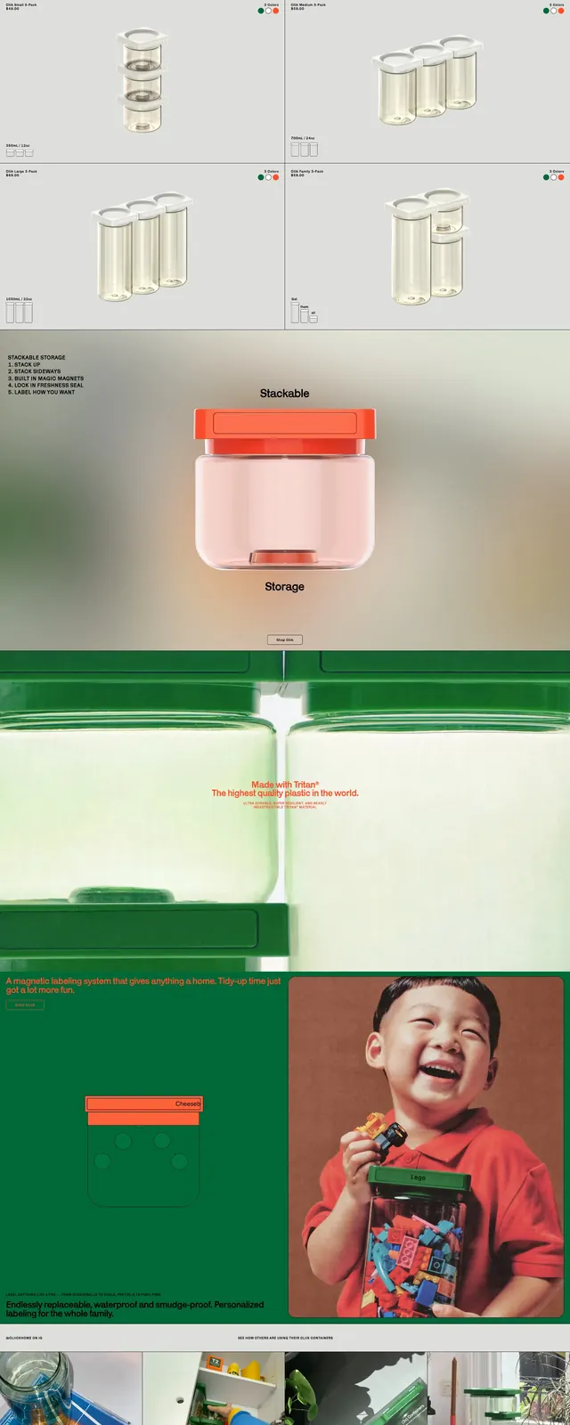
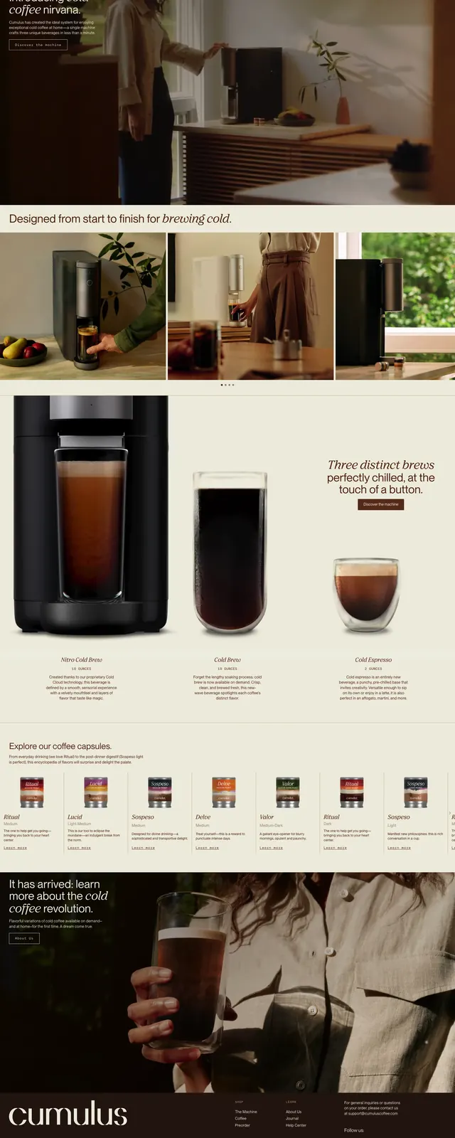
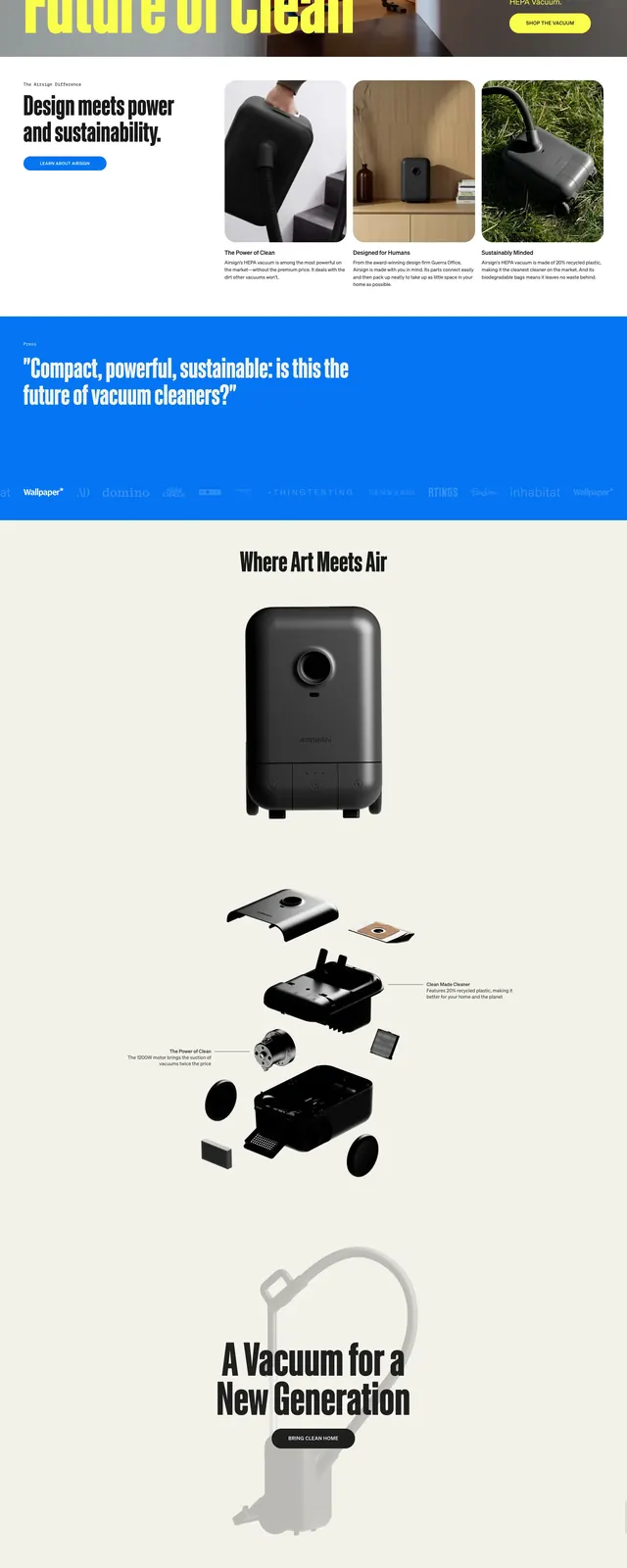
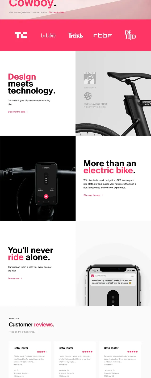
The page opens with a sparse white header, a very large lowercase wordmark, and compact navigation links aligned across the top. Below it, a wide hero shows furniture products staged against neutral backdrops with a small text block and CTA on the left, plus a large sculptural product image spanning the width. Further down, the layout shifts into a product showcase grid with multiple image cards, prices, and short product names, followed by an about section with centered copy and side images, then a bright green footer-like band with additional product thumbnails and links.
Key takeaway
The strongest move is the combination of oversized branding, clean whitespace, and product photography arranged like an editorial spread. The layout keeps commerce functional while making the brand feel design-led and distinctive.
Reuse notes
Use this structure for premium ecommerce brands that want a gallery-like homepage rather than a standard store template. It works best when the product photography is strong and consistent, since the layout depends on large images and minimal copy.