Preview image. Unlock full-res
A bright SaaS landing page for recruiting automation with a split hero, illustrated product scenes, and stacked feature and testimonial sections.
Summary
A bright SaaS landing page for recruiting automation with a split hero, illustrated product scenes, and stacked feature and testimonial sections.
Visual description
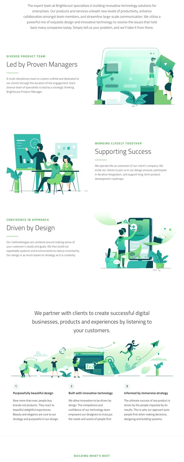
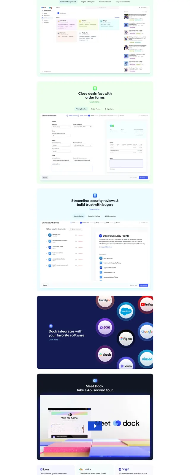
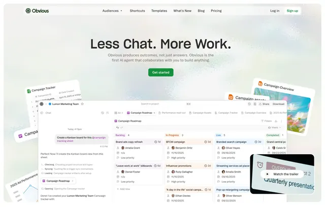
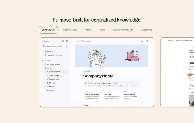
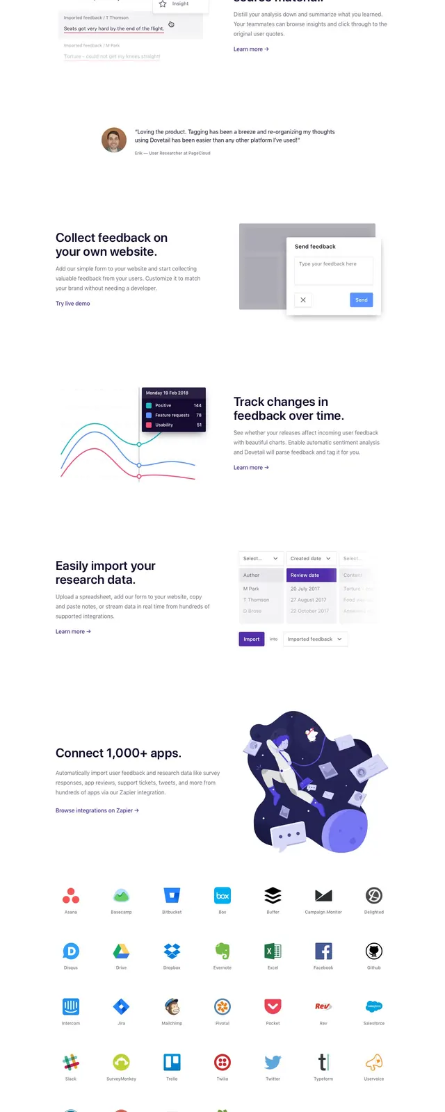
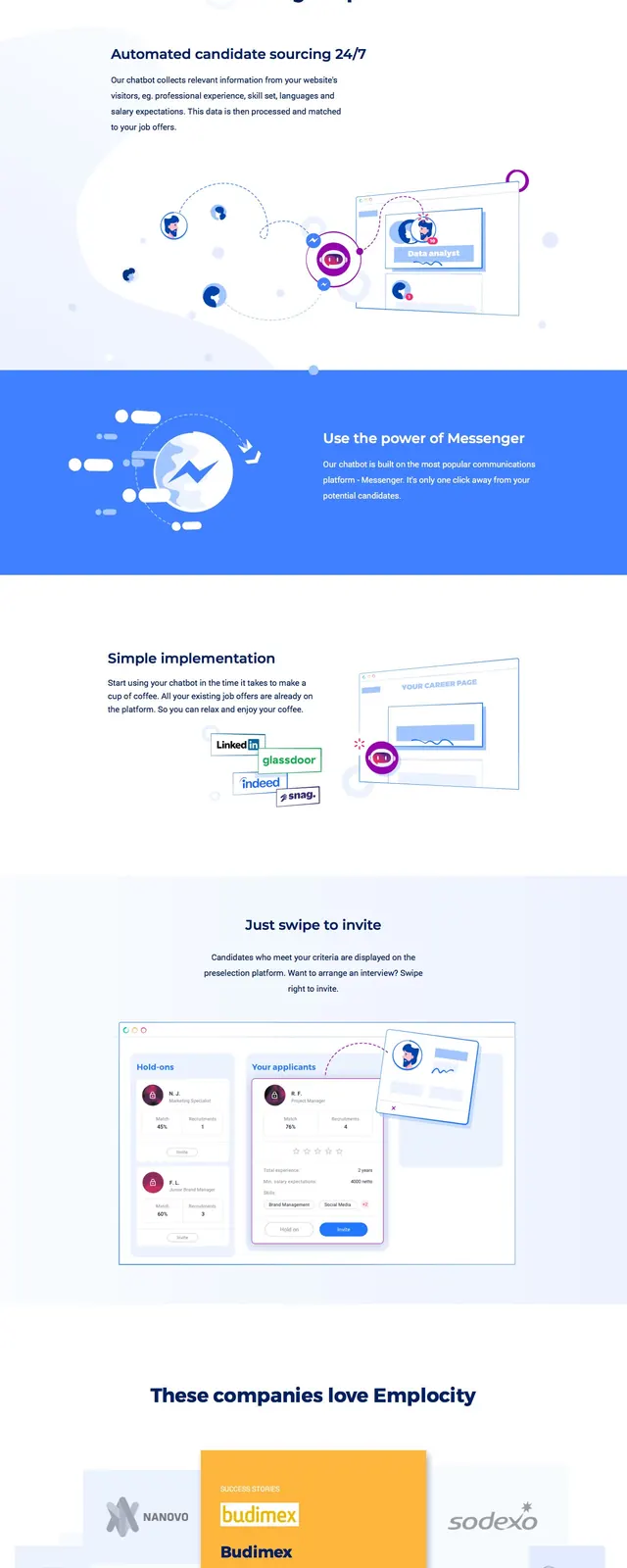
The page opens with a clean top navigation, a large left-aligned hero headline, supporting copy, an email input, and a pink request-demo button. On the right, a large illustrated recruiting interface sits in a soft white and pale-blue field with floating UI accents. Lower on the page, a centered 'Sourcing simplified' section introduces feature blocks, followed by a wide blue divider band and another feature section with small platform logos. Further down, there is a testimonial-style card cluster with overlapping brand tiles, then a bottom CTA panel with another email field above a dark navy footer.
Key takeaway
The strongest reuse idea is the airy split hero paired with approachable illustration to make a B2B HR product feel simple and friendly. The page also uses generous white space, soft gradients, and repeated conversion prompts to keep the layout light while still pushing demo signups.
Reuse notes
Use this structure for SaaS or HR products that need to explain automation clearly without feeling dense. It works best when paired with custom illustrations, a short proof-driven feature sequence, and one primary conversion action repeated near the top and bottom.