Preview image. Unlock full-res
A dark, full-bleed conference landing page hero with oversized white headline type over snowy mountain imagery and a bright ticket CTA.
Summary
A dark, full-bleed conference landing page hero with oversized white headline type over snowy mountain imagery and a bright ticket CTA.
Visual description
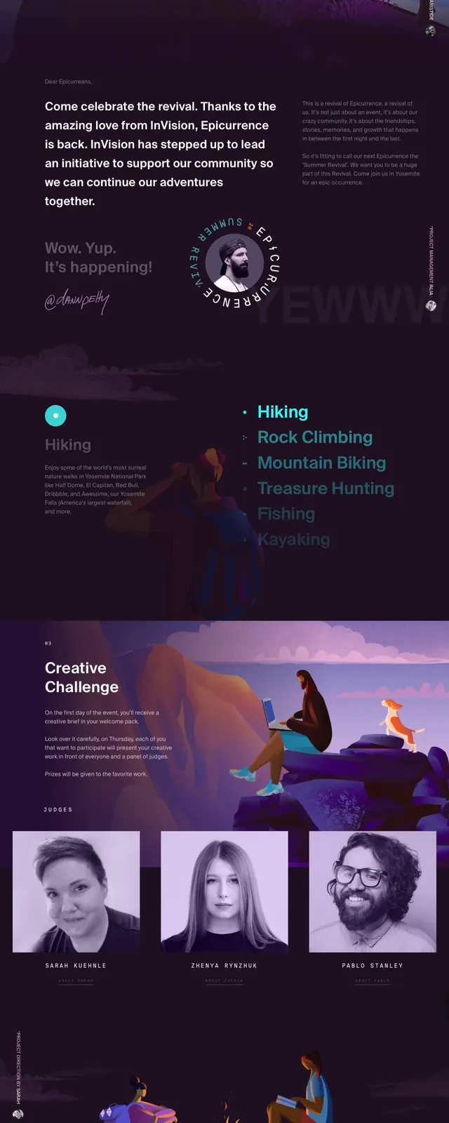
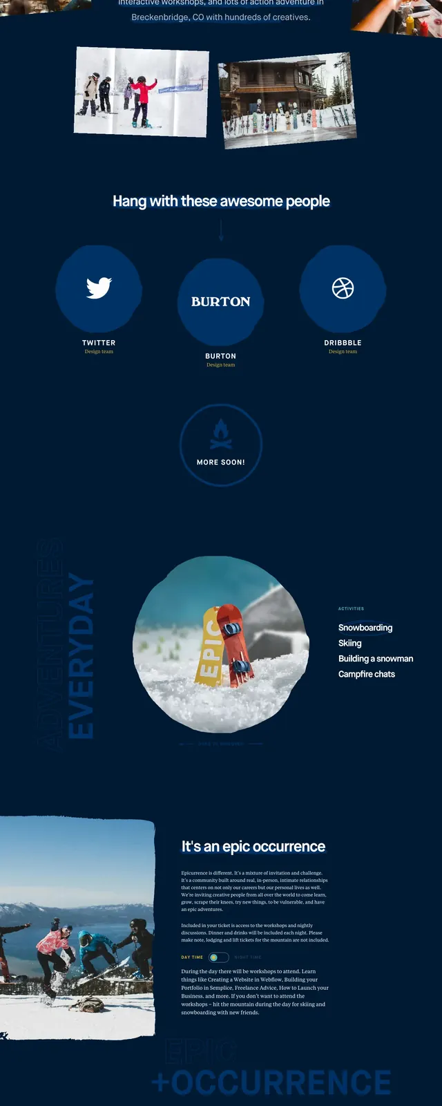
The page opens with a centered hero on a dark navy background, using a large white all-caps headline over a photographic winter mountain scene. Small navigation and social links sit at the top, while a ticket button appears in the upper right and again lower on the page. Below the hero, the layout continues into stacked event details, sponsor/logo bands, a circular image callout, activity lists, and another CTA section with snowy photography and glowing warm accents.
Key takeaway
The strongest move is the contrast between playful oversized type and moody photographic winter visuals. Repeating ticket CTAs and sponsor/logo blocks makes the page feel like a real event microsite rather than a generic promo landing page.
Reuse notes
Reuse this structure for event, festival, or conference pages that want a bold, experiential first impression. It works best when you have strong environmental photography, sponsor logos, and a compact set of dates, location, and pricing details.