Preview image. Unlock full-res
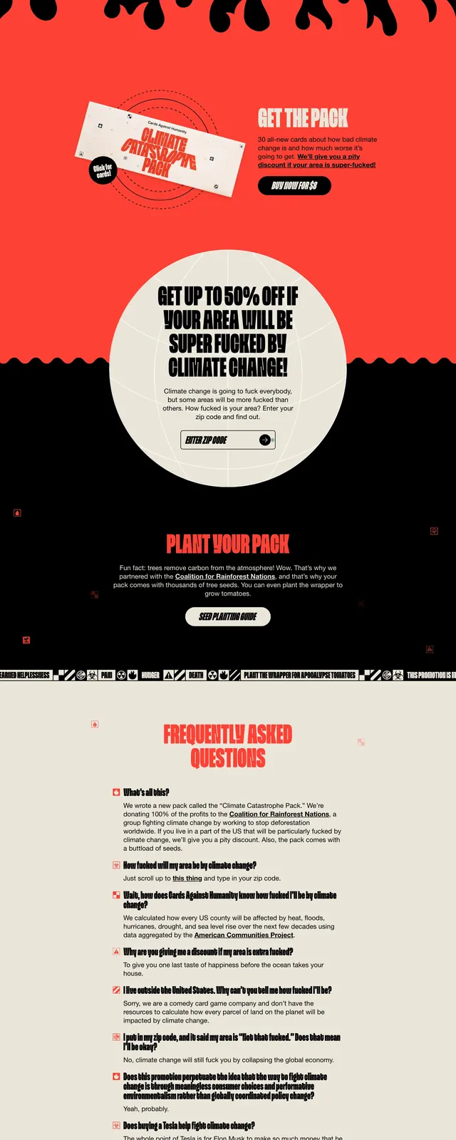
A dark, satirical campaign landing page for Cards Against Humanity with oversized condensed type, a centered hero, and stacked informational sections below.
Summary
A dark, satirical campaign landing page for Cards Against Humanity with oversized condensed type, a centered hero, and stacked informational sections below.
Visual description
The page opens on a black full-bleed hero with concentric red rings and small red icon markers scattered across the background. A huge condensed all-caps title dominates the center, with a short paragraph of body copy beneath it in small white type. Lower on the page, a circular off-white panel contains a zip code input and button, followed by a second dark section with a bright red call-to-action headline, then a light FAQ block and a large footer logo.
Key takeaway
The strongest move is the contrast between oversized, poster-like typography and tiny utilitarian UI elements like the zip code form. The alternating dark and light bands give the page a campaign-poster rhythm that is easy to reuse for punchy microsites.
Reuse notes
Use this structure for advocacy, satirical, or launch pages that need a bold editorial voice. It works best when the message can carry heavy typography and strong contrast; the style would be too aggressive for neutral product marketing.