Preview image. Unlock full-res
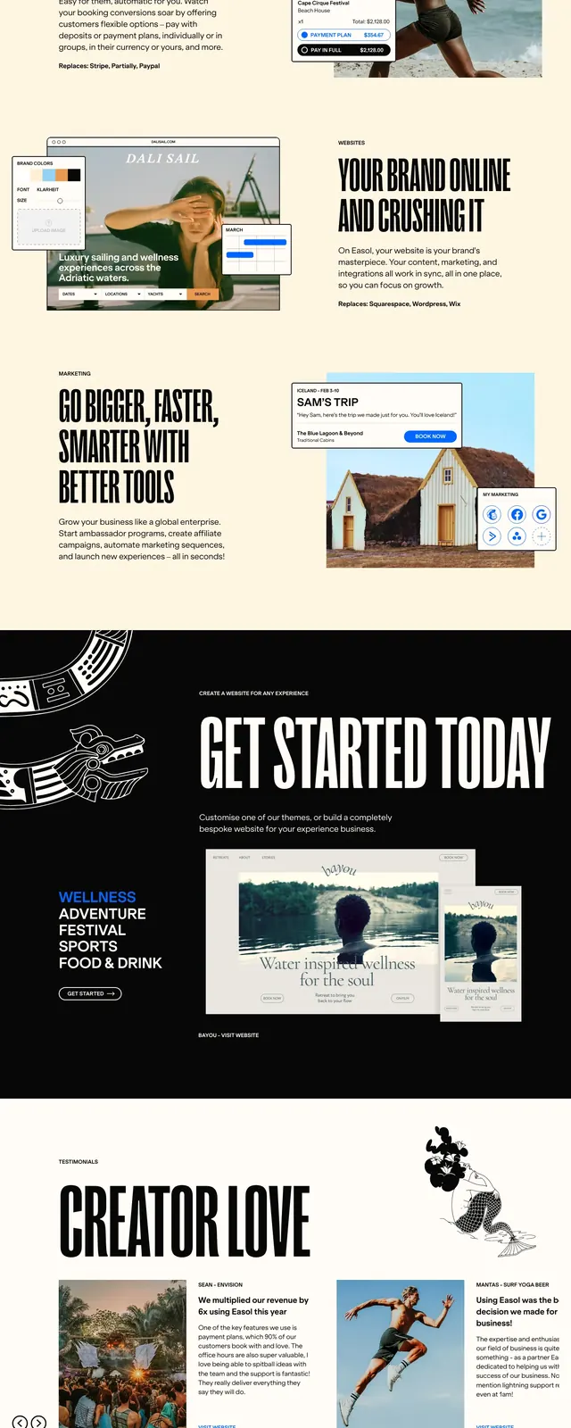
A dark, magazine-like homepage hero for Easol built around oversized all-caps messaging, stacked imagery, and a bold CTA path.
Summary
A dark, magazine-like homepage hero for Easol built around oversized all-caps messaging, stacked imagery, and a bold CTA path.
Visual description
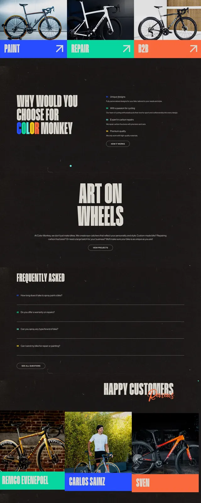
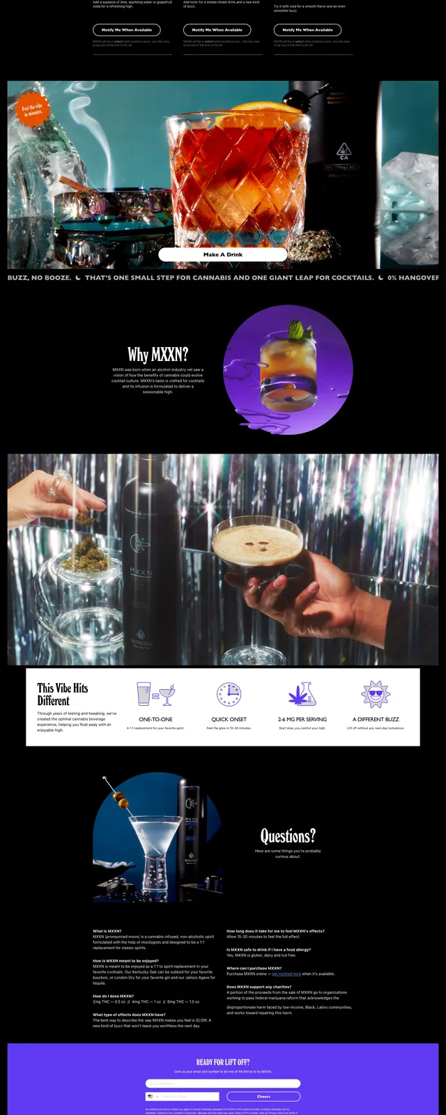
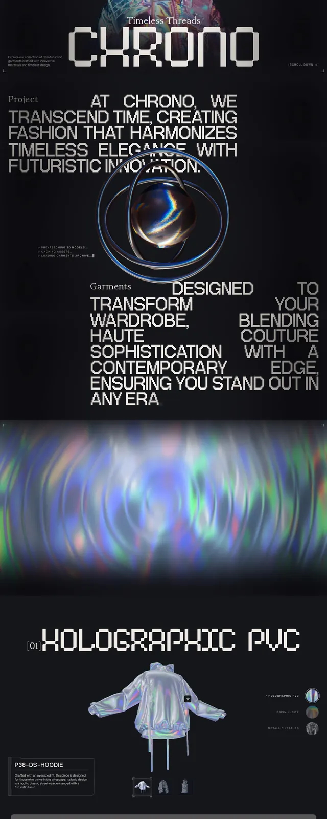
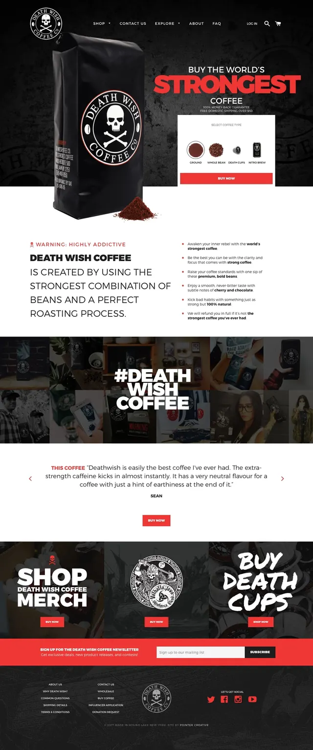
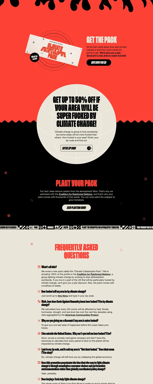
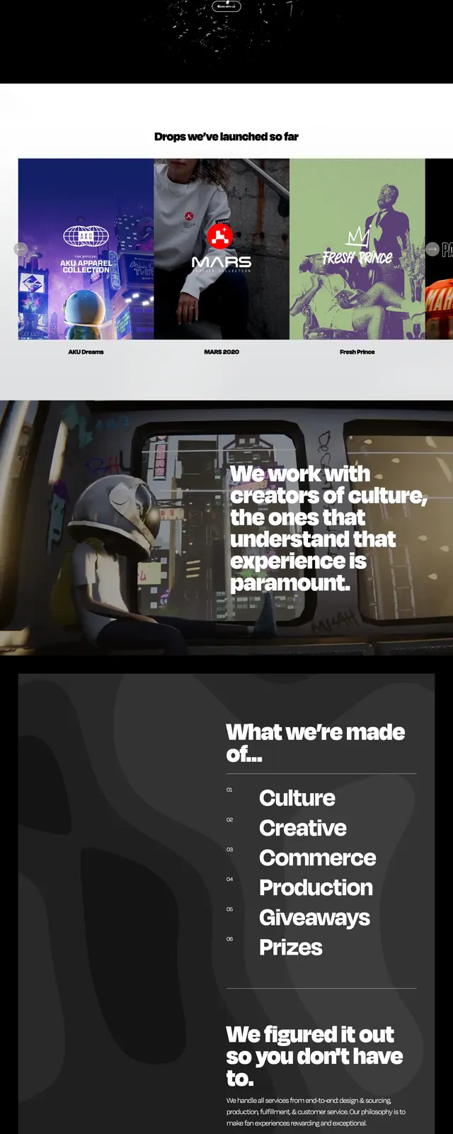
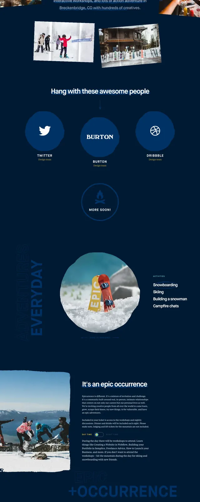
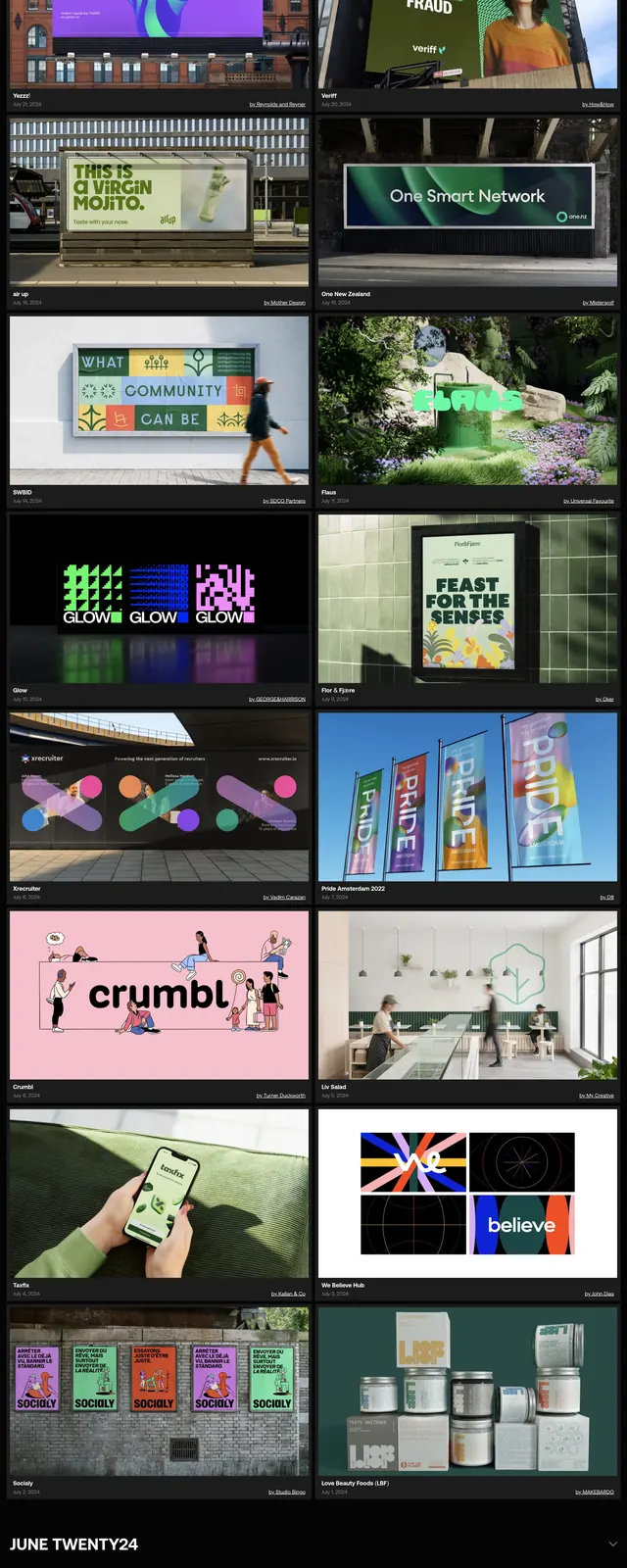
The page opens on a black background with a compact top navigation, a small logo at left, and two CTA buttons at right. A huge condensed headline spans the width in white all-caps text, broken up by multiple lifestyle and travel photos arranged in an asymmetrical collage. Below the hero copy are category labels, a short supporting paragraph, and brand logos, followed by a cream-colored section with more editorial imagery and an illustrated line drawing. The lower slices continue the same pattern with large type, image blocks, and a dark footer-like closing area.
Key takeaway
The main idea is to mix oversized editorial typography with a dense photo collage to make the homepage feel like an energetic campaign page rather than a standard SaaS layout. The contrast between black, cream, and photography gives the section strong rhythm and premium presence.
Reuse notes
Use this pattern for travel, creator, or experience-led brands that need a strong visual identity above the fold. It works best when you have several compelling photos and want the hero to feel branded, cinematic, and slightly chaotic rather than minimal.