Preview image. Unlock full-res
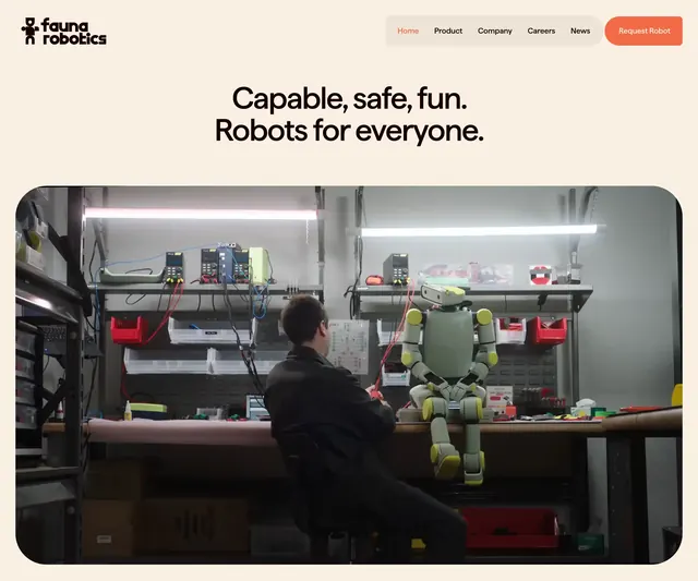
A long-form editorial landing page for robotics with oversized headlines, generous whitespace, and documentary-style imagery.
Summary
A long-form editorial landing page for robotics with oversized headlines, generous whitespace, and documentary-style imagery.
Visual description
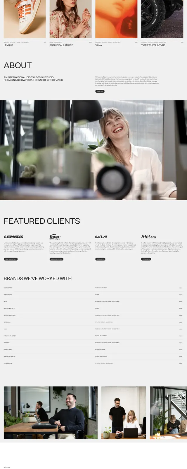
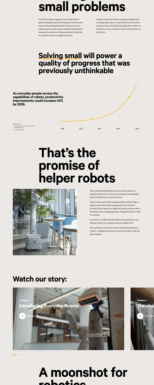
The page uses a pale warm background with a compact top navigation, a very large bold headline on the left, and a short explanatory paragraph on the right. Below the hero sits a wide photographic image spanning the content area, followed by small timeline-style year markers and a second section with another oversized headline paired with a split image-and-text layout. Further down, the composition shifts into a dark full-width call-to-action block with a huge single word and a simple footer-style link grid.
Key takeaway
The main pattern is strong editorial hierarchy: giant type, sparse copy, and large supporting images. It feels like a brand manifesto or research story rather than a conventional product landing page.
Reuse notes
Use this structure for brands that need credibility and narrative depth, especially in hardware, AI, or innovation storytelling. It works best when you have strong imagery and want the page to feel calm, premium, and editorial rather than salesy.