Preview image. Unlock full-res
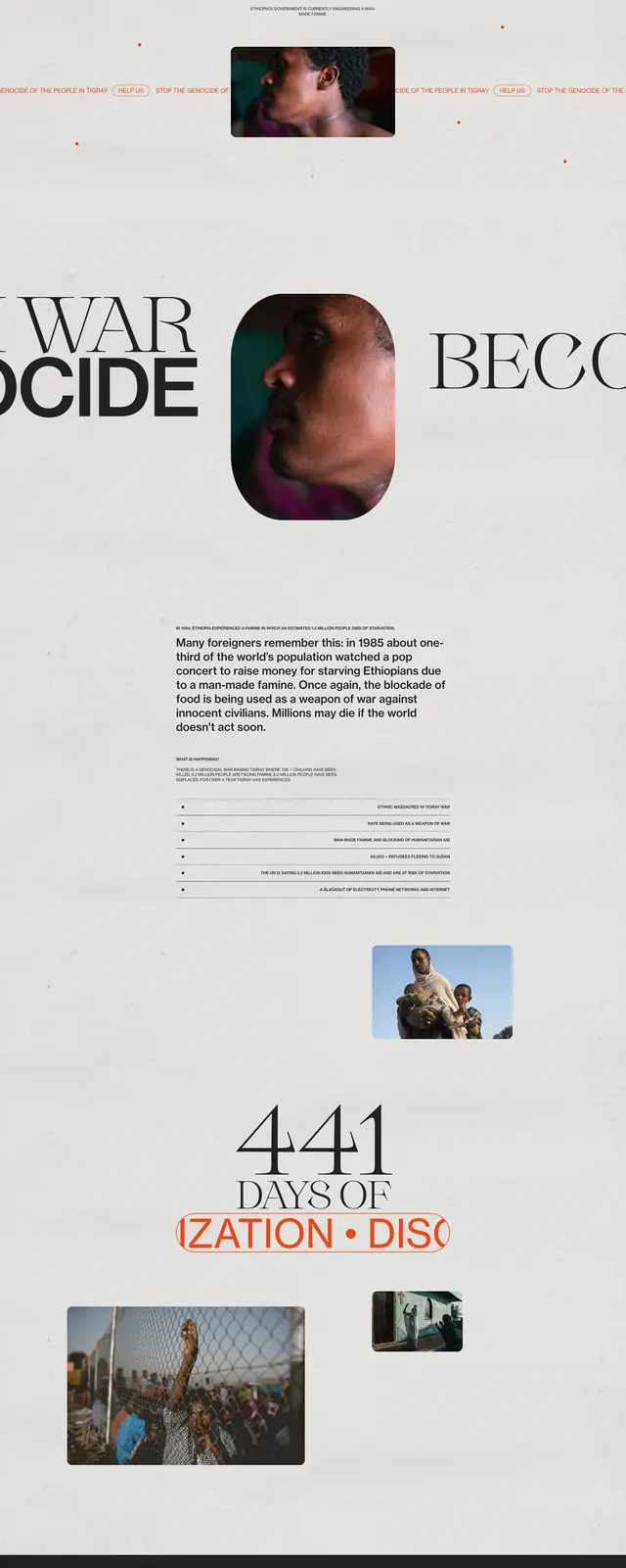
A stark nonprofit-style landing page with oversized serif headlines, sparse imagery, and a restrained grayscale layout with orange accents.
Summary
A stark nonprofit-style landing page with oversized serif headlines, sparse imagery, and a restrained grayscale layout with orange accents.
Visual description
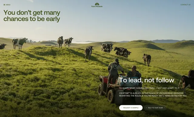
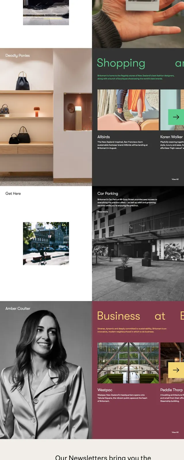
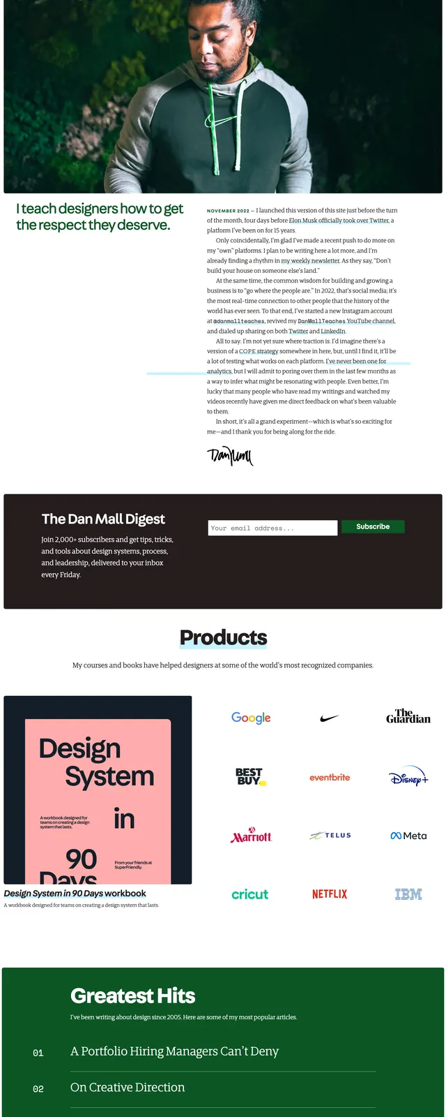
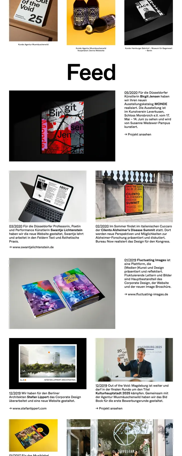
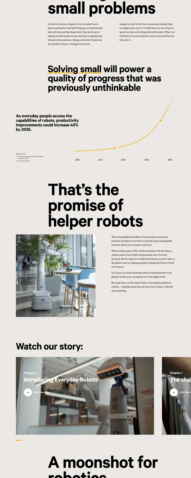
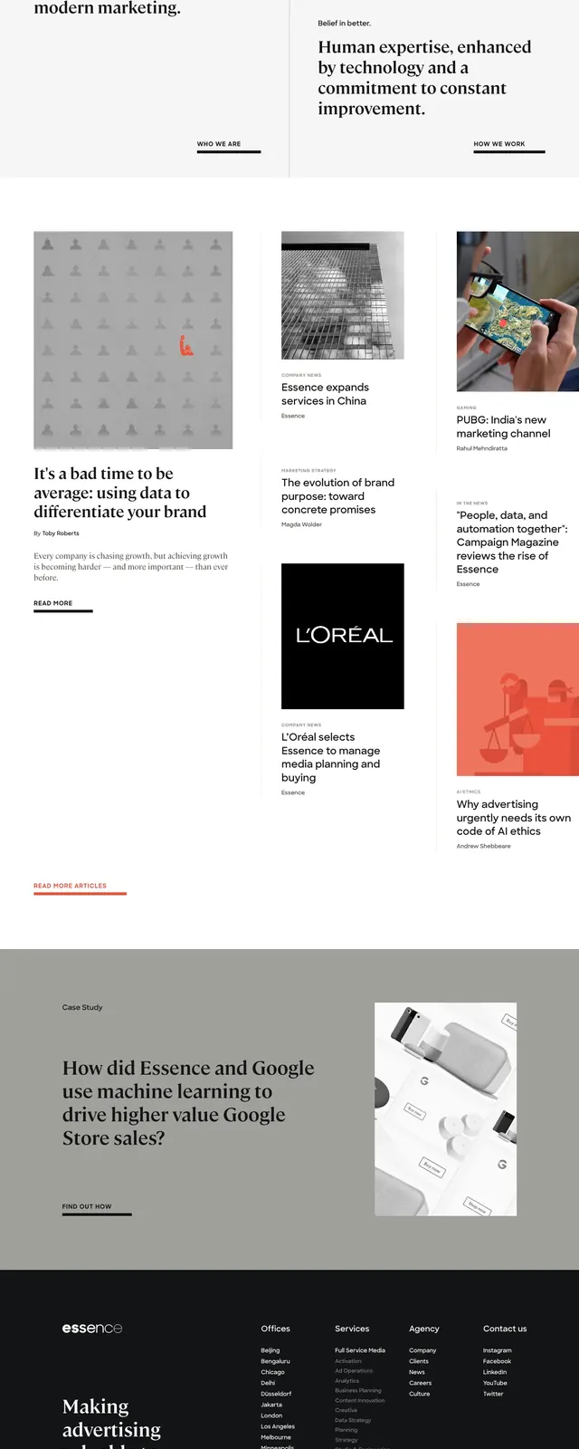
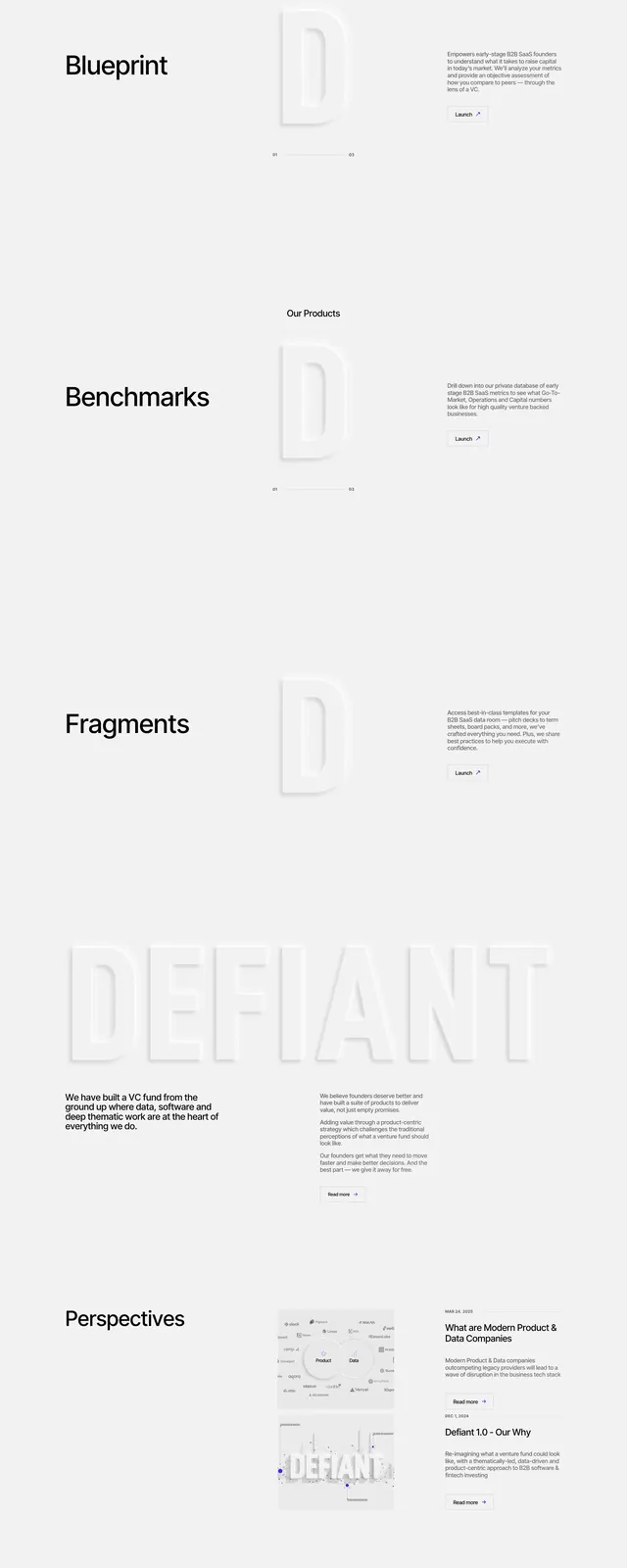
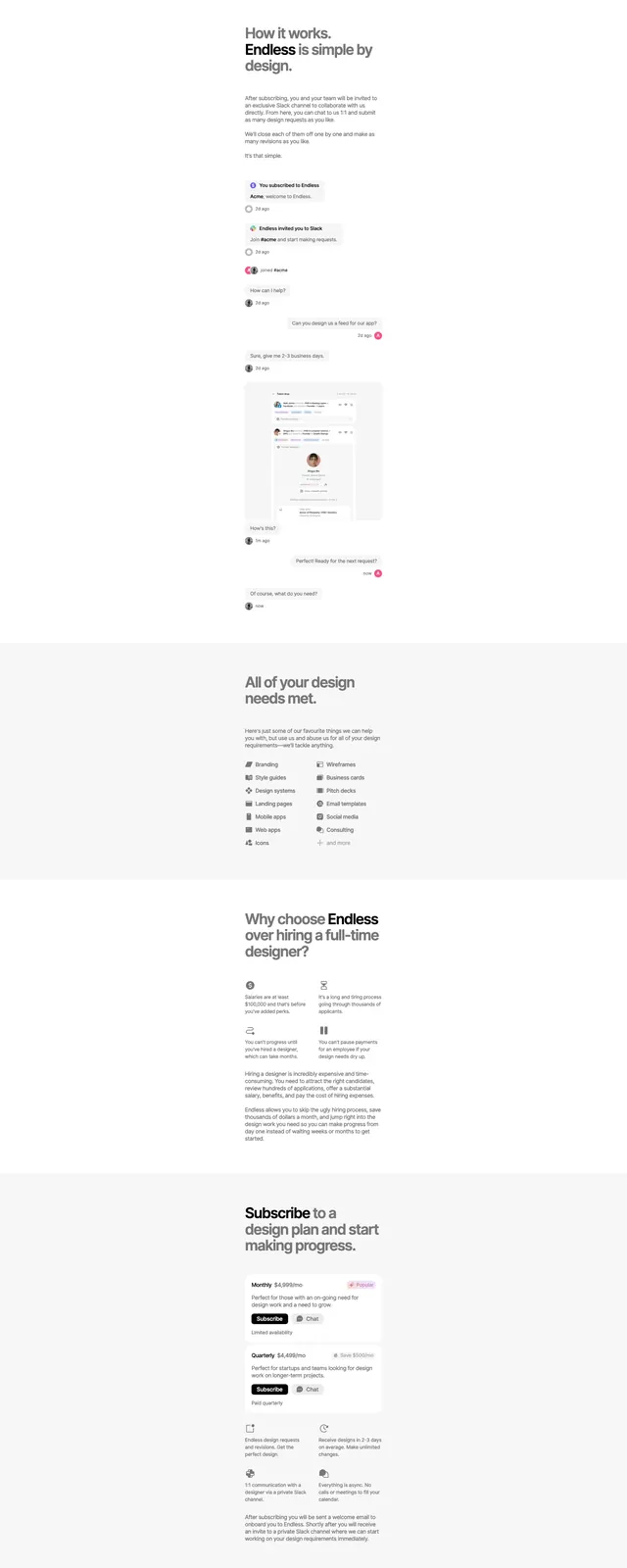
The page uses a very light textured background with scattered small orange dots and a centered, oversized serif headline paired with bold sans-serif emphasis. Multiple cropped documentary-style photos are placed as floating rectangles and rounded frames, creating a layered editorial composition. Lower sections switch to large text blocks, a short explanatory paragraph, a slim list-style information area, and a dark newsletter signup footer with a compact form. The overall structure feels like a campaign site built from repeating typographic and image-driven sections.
Key takeaway
Strong contrast between elegant editorial typography and documentary imagery gives the page a serious, activist tone. The sparse layout and generous whitespace make the message feel deliberate and urgent.
Reuse notes
Reuse this pattern for cause-driven campaigns that need a high-impact hero, strong typographic hierarchy, and selective photo moments. The orange accent and textured background can be applied lightly to preserve the restrained, print-like feel.