Preview image. Unlock full-res
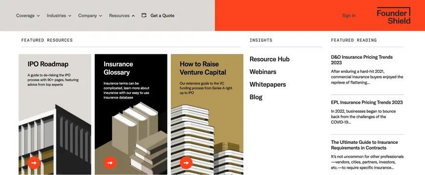
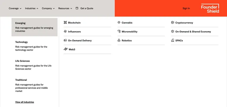
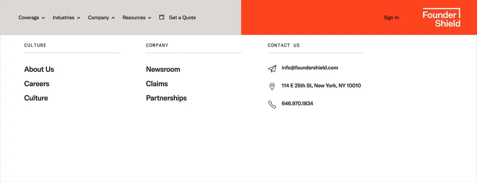
Two-tone horizontal navbar with gray nav links on the left and an orange brand block with stacked wordmark on the right.
Summary
A full-width navbar split vertically between a light gray link rail and a saturated orange brand panel with a framed stacked wordmark.
Visual description
The bar divides sharply at roughly 55/45 width. Left panel in warm light gray holds black sans-serif links: Coverage, Industries, Company, and Resources each followed by a small down chevron; Get a Quote follows a square external-link icon. Right panel is solid orange-red with Sign In in black text and the Founder Shield logo at the far right: Founder stacked above Shield in bold white sans-serif, partially enclosed by a white L-shaped bracket along the top and right edges. All items are vertically centered with generous horizontal padding.
Key takeaway
The hard color split turns a standard nav into a brand billboard without sacrificing link clarity. Stacking the wordmark inside a bracket frame gives identity weight in a narrow header zone.
Reuse notes
Works for B2B or insurance sites that want a confident, non-minimal header. The orange block needs enough width for logo and account actions; collapsing to mobile will require a different pattern. Pair with white page bodies and bold accent CTAs elsewhere on the site.