Preview image. Unlock full-res
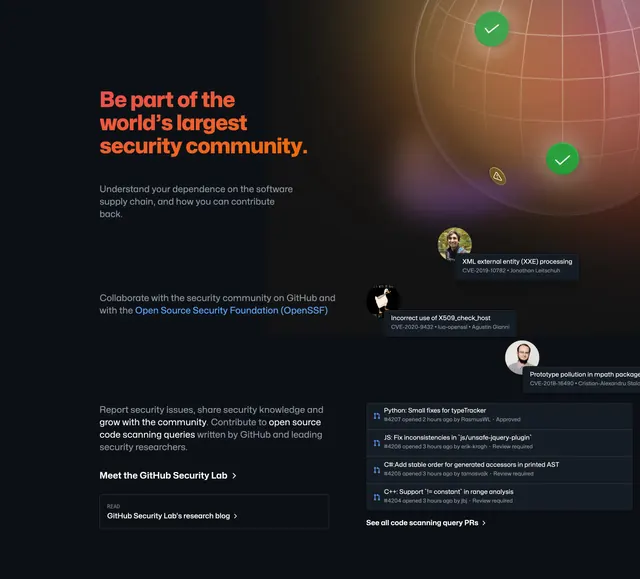
Split dark section pairing orange community headline and OpenSSF links with a globe visualization, CVE cards, and code-scanning PR feed.
Summary
A two-column community block contrasts long-form copy and research links on the left with a wireframe globe, floating CVE cards, and a live-style PR list on the right.
Visual description
Dark background with subtle warm gradient. Left column: large orange headline about joining the world's largest security community, followed by three paragraphs in white and gray covering supply chain dependence, OpenSSF collaboration (linked in blue), and open source code scanning queries. Two text links follow: Meet the GitHub Security Lab and a bordered READ card pointing to the Security Lab research blog. Right column: a large dark sphere with grid lines and green check plus yellow alert markers. Three stacked cards float over the globe, each showing an avatar, vulnerability title, CVE id, and researcher name. Below, a dark panel lists recent code scanning query PRs by language with status labels (Approved, Review required) and a See all link at the bottom.
Key takeaway
The orange headline breaks from the page's otherwise white type, signaling a community tone shift without changing layout. Real CVE and PR feed content makes open-source participation feel active rather than generic. The READ pill card gives a secondary editorial CTA distinct from inline text links.
Reuse notes
Use when a security or open-source product needs credibility through community scale, not just product features. Requires genuine activity data; fake PR lists erode trust. Orange accent should stay isolated to one headline so it does not compete with primary CTAs elsewhere. Pairs well after a product-heavy security grid.