Preview image. Unlock full-res
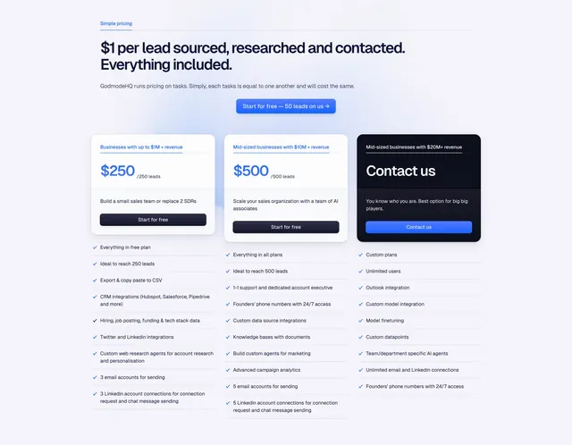
Light three-column pricing where two pale blue priced tiers sit beside a dark contact-sales card, each over a long feature checklist.
Summary
A clean three-column pricing block segmented by company revenue, with two pale-blue priced cards and a third dark "Contact us" card breaking the pattern. The defining detail is the very large price figures over an aligned feature checklist running the full width beneath.
Visual description
An eyebrow "Simple pricing" sits above a two-line oversized dark headline and one muted sub-line, with a blue pill CTA ("Start for free") centered below. Three cards follow: two light blue ($250 and $500, each with a small revenue qualifier and a filled "Start for free" button) and one near-black card with a large "Contact us" and an inverted button. Under all three, three columns of check-marked feature lists align row for row, growing from basic to enterprise capabilities.
Key takeaway
Using the dark card to mark the enterprise or contact-sales tier so it stands apart without a "most popular" badge. Oversized prices for instant scannability, and a continuous three-column checklist that lets buyers compare tiers line by line beneath the cards.
Reuse notes
Best when tiers map to customer size or revenue and the top tier is sales-assisted rather than self-serve. The long checklist suits feature-rich B2B products; trim it for simpler tools. Keep the dark card to a single column or it loses its contrast role.
More pricing sections
See all











More like this





Keep what you find
A free account saves references to boards and can send you a weekly email of picks based on what you save.
To see every result, go Pro.