Preview image. Unlock full-res
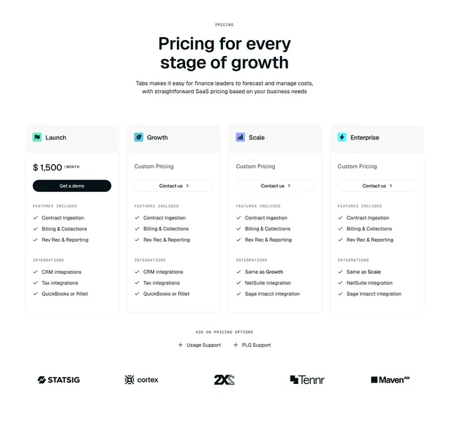
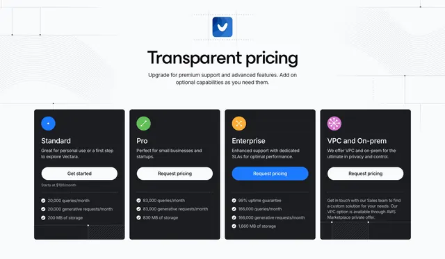
Four dark pricing cards on a light background, each with a colored circular icon, plan details and a single CTA.
Summary
A four-tier pricing block with dark cards on a light page, each topped by a distinct colored circular icon and ending in one button. The contrast of black cards against near-white is the defining look.
Visual description
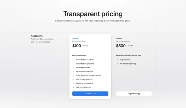
Centered black title "Transparent pricing" with a small blue app icon above it and a two-line muted sub-headline. Below sit four dark charcoal cards in a row: Standard, Pro, Enterprise and "VPC and On-prem". Each card opens with a small colored round icon (blue dot, green check, orange cross, pink flower), the plan name in white, a one-line description, then a full-width pill button. Standard and the others use white buttons; Enterprise uses a filled blue button to draw the eye. Standard, Pro and Enterprise list checkmarked specs (queries/month, generative requests/month, storage) with faint divider lines, while the VPC card carries a short paragraph instead. A faint topographic line texture sits in the light background corners.
Key takeaway
Dark cards floating on a light page for instant contrast, with one colored icon per plan as the only differentiator at the top. Highlighting a single mid-tier with a blue button instead of resizing the card is a clean way to steer choice.
Reuse notes
Works for a developer or AI tool with three self-serve tiers plus a custom enterprise option that breaks the pattern with prose. The colored icon badges keep four similar cards scannable. Keep the highlighted plan to one to avoid diluting the cue.