Preview image. Unlock full-res
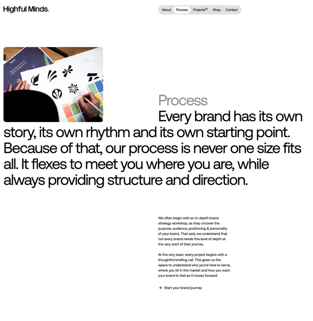
A split layout with workspace photography, oversized Process headline, and flexible-agency copy with brand journey CTA.
Summary
Process page intro pairs a rounded workspace photo with a massive grey "Process" label, bold manifesto headline, and briefing copy ending in a brand journey link.
Visual description
White background. Top: Highful Minds. logo left, grey pill nav right with Process tab outlined active. Left: rounded photo of hands sketching logo marks and color palettes on a desk. Right: large light-grey "Process" word, then bold black multi-line headline about flexible non-template process. Bottom-right: two paragraphs on strategy workshops and briefing calls, plus "? Start your brand journey" text link. Monochrome palette with photo as only color.
Key takeaway
Using an oversized faded section label beside the real headline creates depth without extra UI. Pairing process philosophy with raw workspace photography signals craft over templates.
Reuse notes
Strong for boutique agency Process pages. Needs authentic studio photography. Large-type headline works when copy is confident and specific.
More process sections
See all
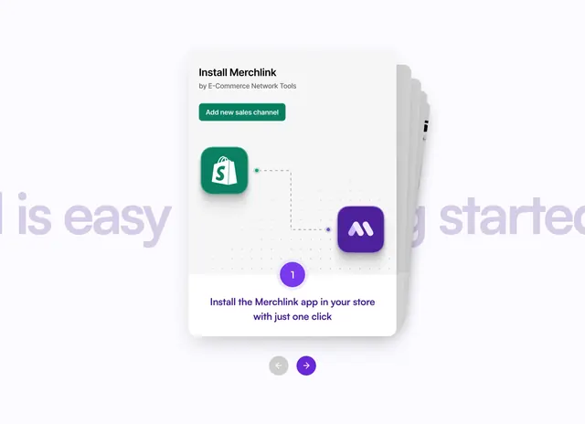
More like this
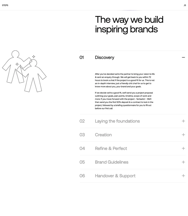
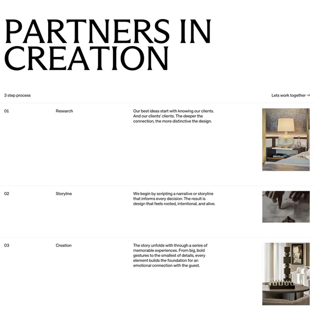
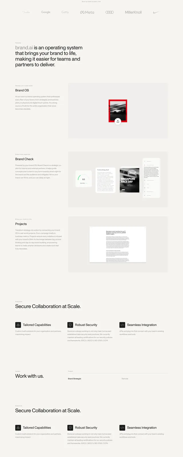
Keep what you find
A free account saves references to boards and can send you a weekly email of picks based on what you save.
To see every result, go Pro.