Preview image. Unlock full-res
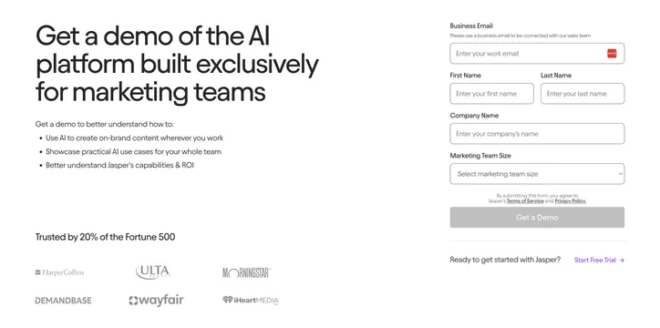
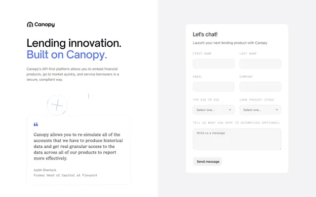
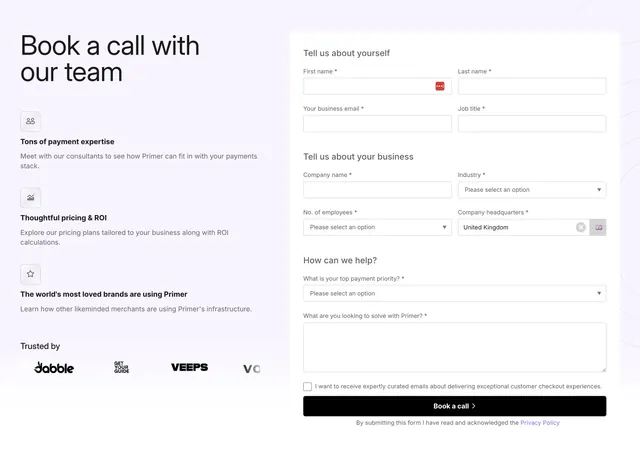
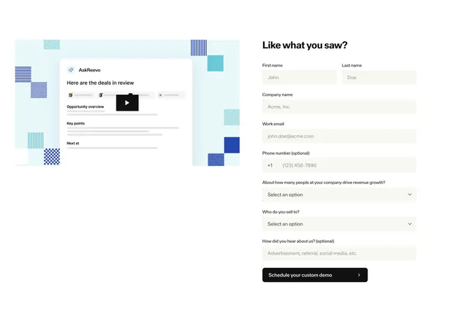
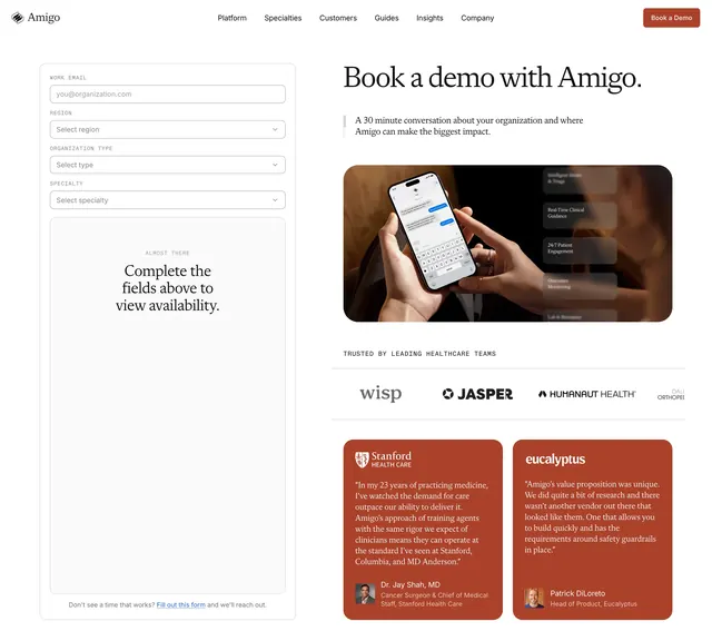
Two-column book-a-demo section with an oversized headline and bullet list on the left and a multi-field lead form on the right over white.
Summary
A two-column demo-request section that pairs a giant left-aligned headline and a three-item value bullet list with a complete lead-capture form on the right, all on plain white. The defining move is the size contrast between the oversized headline and the quiet utilitarian form.
Visual description
The left column carries a very large three-line black sans-serif headline, a short intro line, and three bulleted benefits, then drops to a "Trusted by 20% of the Fortune 500" line above a two-row greyscale logo wall (HarperCollins, Ulta, Morningstar, Demandbase, Wayfair, iHeartMedia). The right column is a boxed form with outlined inputs for business email, first and last name (side by side), company name, and a marketing team size dropdown. A full-width grey "Get a Demo" button sits below a small terms line, followed by a divider and a "Ready to get started" line with a violet "Start Free Trial" link.
Key takeaway
Letting the headline run oversized while keeping the form visually plain creates a clear primary message and a low-friction secondary action. Anchoring the bottom with Fortune 500 proof plus a logo wall adds trust right at the point of conversion. Offering a "Start Free Trial" escape hatch under the form catches users not ready to talk to sales.
Reuse notes
A strong default for B2B SaaS sales-led demo pages where the form must stay above the fold on the right. Works best on a clean light background so the form reads as the functional half. Keep field count modest; this layout starts to feel heavy if the form grows much longer than shown.
More book a demo sections
See all
More like this




Keep what you find
A free account saves references to boards and can send you a weekly email of picks based on what you save.
To see every result, go Pro.