Preview image. Unlock full-res
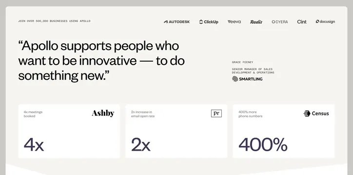
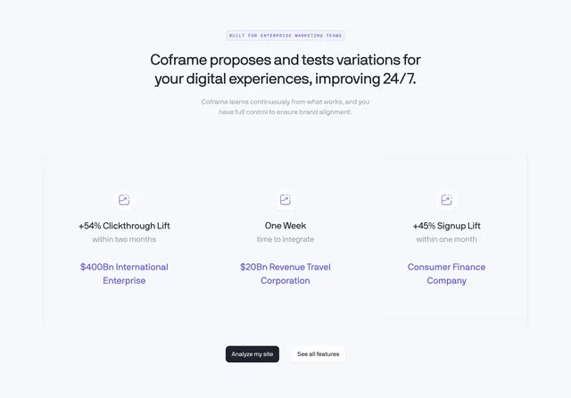
Centered light value-proposition section pairing a headline with a three-column grid of result stats over a faint ruled background.
Summary
A centered value-proposition block that states a claim, then proves it with three customer result stats laid out in a faint ruled grid. The defining detail is the near-invisible grid lines that frame three metric columns.
Visual description
On a light blue-grey field, a small bordered all-caps monospace eyebrow reads "BUILT FOR ENTERPRISE MARKETING TEAMS", above a bold two-line near-black headline and a muted two-line subhead. Below sits a wide area bordered by extremely faint thin grid lines that divide it into three columns. Each column centers a small violet line-icon in a rounded tile, then a bold metric (+54% Clickthrough Lift, One Week, +45% Signup Lift), a muted qualifier line, and a two-line violet customer label ($400Bn International Enterprise, $20Bn Revenue Travel Corporation, Consumer Finance Company). At the bottom center, a dark filled "Analyze my site" button sits beside a white outlined "See all features" button.
Key takeaway
Turning a value proposition into three named-customer result stats makes the claim concrete and credible. The barely-there grid lines organize the three columns and add a subtle technical, blueprint quality without heavy dividers. Coloring the customer names in the accent violet links each stat to a real account.
Reuse notes
Good for an enterprise B2B or AI SaaS page that has real metrics and customer wins to show. Needs genuine numbers; vague stats undercut the format. The faint grid styling reads best on a light, near-white background and may disappear on darker fills.