Preview image. Unlock full-res
Four-column feature grid of outlined cards with corner icons and arrow links, under a split oversized headline and intro paragraph.
Summary
A four-pillar feature section that introduces the platform with a split header (oversized headline left, paragraph and button right) and then lists four outlined cards, each with a large title, corner icon, body copy, and an arrow link. The header-then-four-cards rhythm is the reusable pattern.
Visual description
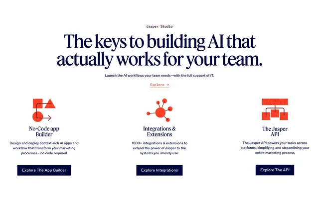
The top header splits an oversized two-line black headline "Built for marketing success" on the left against a paragraph of intro copy and an outlined "Explore the Platform" button on the right, under a small underlined "The Jasper Platform" eyebrow. Below sits a single row of four equal outlined cards with very subtle rounded corners: Jasper Studio, Marketing AI Toolkit, Knowledge & Context, and Trust Foundation. Each card sets its name large in two lines at top-left with a thin line icon in the top-right corner, a short description beneath, and an oversized right arrow at the bottom-left. The whole block is monochrome on white.
Key takeaway
The split header (big headline versus calm paragraph plus button) reads clearly and gives the four cards a confident lead-in. Putting the icon in the card corner instead of above the title keeps the type as the hero. The oversized bottom arrow makes each card feel clickable without a full button.
Reuse notes
A clean, neutral way to present four product pillars or capability areas, ideal when each links to a deeper page. Works on light backgrounds where the hairline card outlines provide the structure. Best with exactly four items; more than that and the single row will crowd at this card width.