Preview image. Unlock full-res
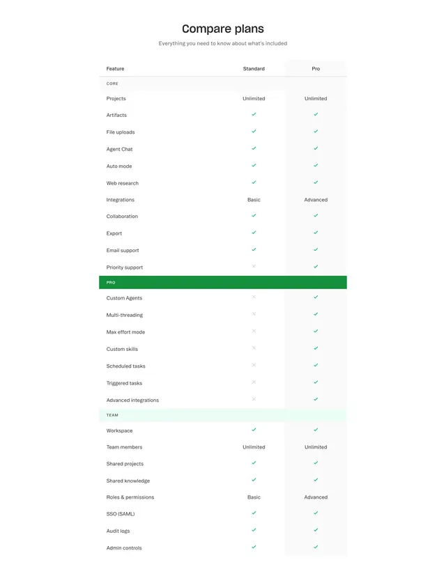
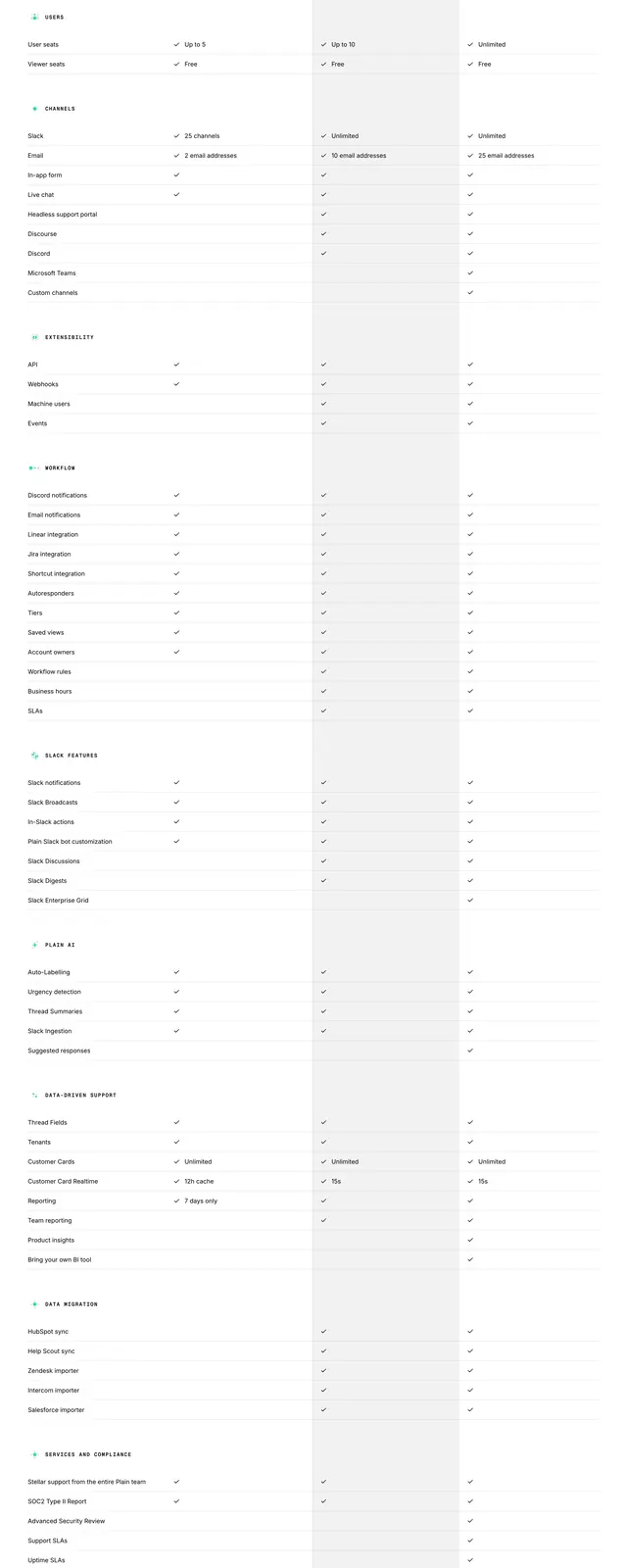
Light feature comparison table with CORE, PRO, and TEAM section headers and checkmark matrix.
Summary
Compare plans table pits Standard against highlighted Pro across CORE, PRO, and TEAM grouped feature rows.
Visual description
White section with bold "Compare plans" title and gray subtitle. Three-column table: Feature, Standard, Pro with Pro column on pale gray background. Section rows use colored headers: gray CORE, green PRO, mint TEAM. Rows mix green checkmarks, gray X marks, and text values like Unlimited, Basic, Advanced for projects, agents, collaboration, SSO, and admin controls.
Key takeaway
Color-coded section headers break a long matrix into scannable chapters. Subtle Pro column tint guides the eye without a heavy recommended badge.
Reuse notes
SaaS pricing pages with tiered complexity. Table density needs responsive fallback; green PRO bar works when Pro is the growth tier.
More comparison sections
See all











More like this

Keep what you find
A free account saves references to boards and can send you a weekly email of picks based on what you save.
To see every result, go Pro.