Preview image. Unlock full-res
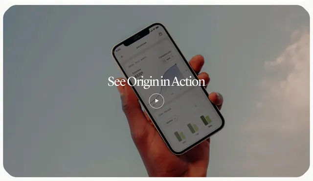
Full-bleed how-it-works section built from a single hand-holding-phone photograph with a centered serif overlay title and play button inviting a product video.
Summary
A how-it-works section that is essentially one full-bleed lifestyle photograph of a hand holding a phone against a hazy sky, with a centered serif overlay title and a play button cueing a product video. The defining move is using a single atmospheric photo with a video play affordance instead of a stepped explainer.
Visual description
A wide rounded-corner image fills the frame: a dark-skinned hand holds a phone up against a soft grey-blue overcast sky with faint clouds. The phone screen shows an Origin "Breakdown" view with a monthly spend figure, a purple area chart, a compare control, and small green time-period bars. Centered over the photo is a white serif title "See Origin in Action," and directly beneath it a white circular outline play button. The overall palette is muted and cool, with the warm skin tones and small green and purple UI accents as the only saturation.
Key takeaway
Compressing an entire how-it-works idea into one calm lifestyle photo plus a single play button, letting the video carry the explanation. Floating a centered serif title and play control directly over real product UI held in-hand to tie the brand, the app, and the human moment together. The hazy sky as a quiet, premium backdrop that keeps focus on the device.
Reuse notes
Best when you have a strong product demo video and a polished in-context phone shot. Works as a single restful beat between denser sections. The play button is a clear motion cue, so a video tag is warranted; the calm cool palette suits lifestyle and finance brands more than loud SaaS.