Preview image. Unlock full-res
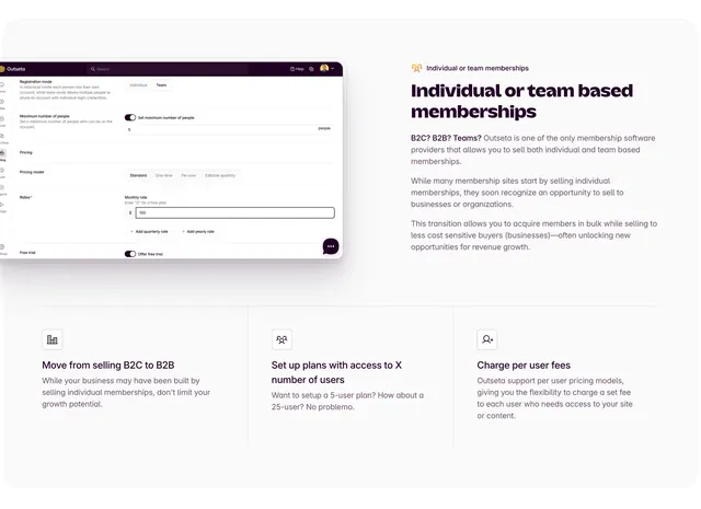
Split feature section pairing a plan-configuration UI screenshot with B2B membership copy and a three-column supporting benefits grid.
Summary
An Outseta payments feature block explaining individual versus team memberships, with a product plan-setup screenshot on the left, long-form copy on the right, and a ruled three-column benefits row below.
Visual description
White background with generous padding. Top half is a two-column split: left shows a floating rounded screenshot of a Plan configuration screen with purple sidebar nav, Individual/Team registration toggle (Team selected), a max-users toggle set to 5, pricing model tabs (Standard, One-time, Per user, Editable quantity), and a $100 monthly rate field. Right column has a small orange people icon label "Individual or team memberships", a large dark headline, and three paragraphs of grey body copy about B2C-to-B2B growth. A thin horizontal rule separates the lower third: three equal columns divided by vertical rules, each with a line icon, bold subhead, and short paragraph covering B2B selling, user-limit plans, and per-user fees.
Key takeaway
Using an actual admin UI screenshot as the proof point instead of an illustration. The stacked pattern (split feature + ruled triptych) lets one section cover a primary story and three supporting proof points without feeling repetitive. Small icon labels above headlines give scannable section identity.
Reuse notes
Strong reference for billing or membership SaaS selling team plans and seat-based pricing. The screenshot must show a coherent, readable settings screen. The three-column footer works when each benefit is genuinely distinct and similarly short.
More feature detail sections
See all



More like this
Keep what you find
A free account saves references to boards and can send you a weekly email of picks based on what you save.
To see every result, go Pro.