Preview image. Unlock full-res
Two equal split cards on black, each routing entrepreneurs or partners to a dedicated path with photo or product UI backgrounds.
Summary
A closing homepage CTA built as two side-by-side audience cards on pure black, splitting entrepreneurs and partners into separate visual worlds with identical Explore pill buttons.
Visual description
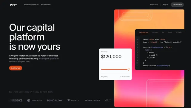
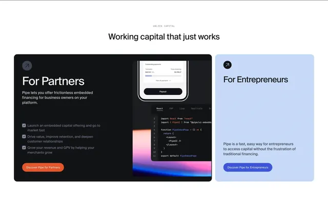
Two large rounded rectangles sit edge to edge on a black canvas. The left card uses a warm lifestyle photo of a person at a wooden desk holding food and papers; small Pipe wordmark and a bold white For Entrepreneurs headline sit over the image, with a white Explore pill centered near the bottom and a circular arrow icon in the top-right corner. The right card uses a pink-to-orange gradient background with a dark code editor showing a React PipeUI import on the left and a phone mockup of statements and outstanding payments on the right; Pipe Embedded label, For Partners headline, matching Explore button, and the same corner arrow icon repeat the pattern.
Key takeaway
The symmetric card grammar that makes two product lines feel equal weight without a shared hero headline. Each card carries its own background language (lifestyle photo vs gradient plus code plus UI) so the audience self-selects visually. Repeating one pill CTA and one corner affordance on both cards keeps the pair cohesive.
Reuse notes
Strong when a company sells to both end users and platform partners from one homepage. Needs two distinct visual assets and clear one-line audience labels. Works on true black; the cards should stay large enough for photography and UI detail to read at a glance.