Preview image. Unlock full-res
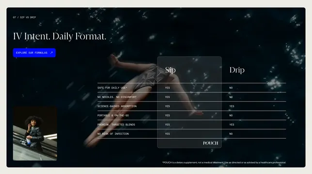
Dark full-bleed comparison section pitting Pouch Sip against IV Drip in a highlighted table over underwater photography.
Summary
A dark IV-vs-oral comparison with oversized Sip and Drip column headers, a highlighted Pouch column, and lifestyle photography layered over an underwater scene.
Visual description
Deep navy underwater photo of a swimmer fills the background with bokeh light spots. Top left shows a numbered section label, a large serif headline IV Intent. Daily Format., and a bright blue Explore Our Formulas button. Center-right is a three-column comparison table with Sip and Drip headers, six YES/NO rows on safe daily use, needles, absorption, portability, blends, and infection risk, and the Pouch logo anchoring the highlighted Sip column in a semi-transparent dark panel. A small vertical lifestyle inset of a woman on an escalator holding a pouch sits bottom left; an FDA disclaimer runs along the bottom edge.
Key takeaway
Highlighting your product column with a translucent panel makes the table readable over photography without a flat overlay. Pairing a dramatic hero image with a small inset lifestyle shot adds credibility without cluttering the comparison grid.
Reuse notes
Works for any product category where you can frame a binary choice against an incumbent format. Requires strong photography and a short, decisive feature list; more than six rows will fight the full-bleed image.