Preview image. Unlock full-res
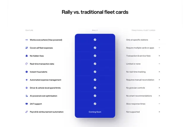
Light three-column comparison table that wins by spotlighting the brand's own column as a tall, glowing blue panel of checkmarks against a greyed-out competitor.
Summary
A three-column feature comparison ("Rally vs traditional fleet cards") that makes the brand column the hero: a tall, rounded, glowing blue panel of white checkmarks sitting between a plain feature list and a greyed-out competitor column.
Visual description
White background, centered bold heading. Three aligned columns: a left "Feature" list with small line icons (works everywhere, no hidden fees, real-time data, fraud alerts, and so on), a center "Rally" column rendered as a tall royal-blue rounded panel with a soft drop shadow and a white checkmark in every row, and a right "Traditional fleet cards" column in muted grey text with dash and cross marks. Ten rows; the final Rally row reads "Coming Soon" instead of a check. The colored panel visually lifts the brand column off the page while the competitor stays flat.
Key takeaway
Turning a comparison table into a single strong focal point: give your own column a colored, elevated, full-height panel so the eye reads "all checks here" before parsing any text. Dashes plus crosses (not just crosses) on the competitor side reads as fair rather than hostile.
Reuse notes
Best when your differentiation is breadth of capability and you can honestly out-check a category incumbent. Keep the feature list to about ten rows so the panel stays a clean rectangle. The single colored column carries the whole section, so commit to one accent color.
More comparison sections
See all











More like this





Keep what you find
A free account saves references to boards and can send you a weekly email of picks based on what you save.
To see every result, go Pro.