Preview image. Unlock full-res
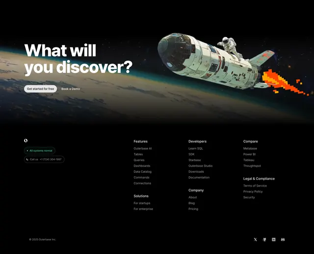
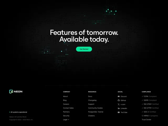
Dark five-column link footer capped by a giant blueprint-style wordmark bleeding off the bottom edge.
Summary
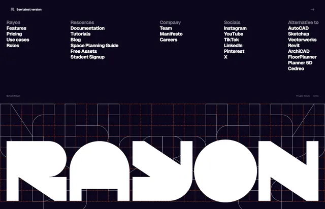
A dark footer with five columns of text links above a massive white "RAYON" wordmark that sits over a red architectural blueprint grid and bleeds off the bottom.
Visual description
The top of the footer is a deep indigo-black band carrying a small "See latest version" pill at top-left, then five link columns in white bold sans-serif: Rayon (Features, Pricing, Use cases, Roles), Resources, Company, Socials, and "Alternative to" (AutoCAD, Sketchup, Revit, and similar). A thin row with copyright and legal links closes the band. Below, an enormous geometric "RAYON" wordmark fills the full width in white, set over a faint red blueprint construction grid (dashed guide lines and arcs) that suggests CAD drafting, with the type cropped off the bottom edge.
Key takeaway
The oversized, full-bleed brand wordmark as a footer anchor, paired with a faint blueprint grid that reinforces the architecture/CAD positioning. The contrast between tidy small link columns and the giant cropped logotype.
Reuse notes
Great closing footer for a design or technical-tool brand that wants its name to land hard on exit. The blueprint grid is on-theme for CAD/architecture; swap it for a neutral texture elsewhere. The "Alternative to" column is a smart SEO/comparison move. Needs a distinctive logotype to carry the giant treatment.