Preview image. Unlock full-res
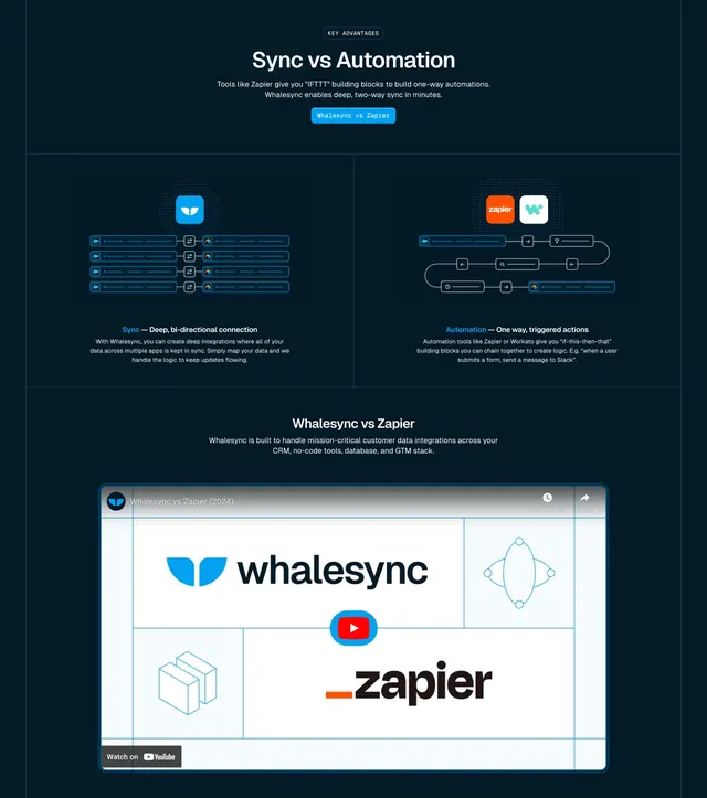
Dark two-column comparison of Sync vs Automation, each illustrated by a wireframe diagram, above a video-embed Whalesync vs Zapier block.
Summary
A dark comparison section contrasting "Sync" and "Automation" side by side, each with its own wireframe diagram, then a video-embed block framing Whalesync versus Zapier. The paired technical diagrams over deep navy define it.
Visual description
On a deep navy background, a small monospace "KEY ADVANTAGES" eyebrow sits above a centered white heading "Sync vs Automation", two lines of grey sub-copy, and a small pill labeled "Whalesync vs Zapier". Below, two bordered panels split the row: the left shows a blue Whalesync mark feeding stacked rows of nodes connected by bidirectional sync glyphs, captioned "Sync - Deep, bi-directional connection"; the right shows Zapier and Whalesync icons over a branching one-way flowchart, captioned "Automation - One way, triggered actions". Each caption carries a short grey paragraph. Beneath a divider, a centered "Whalesync vs Zapier" heading and sub-copy sit above a wide embedded video player thumbnail showing the Whalesync and Zapier logos quartered around a red YouTube play button, with a "Watch on YouTube" chip at the bottom left.
Key takeaway
Two custom wireframe diagrams placed side by side to make an abstract distinction (two-way sync vs one-way automation) instantly legible, plus monospace labels reinforcing the technical tone. The framed video thumbnail with quartered logos is a tidy way to host a comparison video.
Reuse notes
Best when your differentiation is conceptual and benefits from a visual rather than a feature table, especially against a named competitor. The diagrams need to be custom-drawn to land. Works only on dark and pairs well with a downstream feature table.
More comparison sections
See all











More like this




Keep what you find
A free account saves references to boards and can send you a weekly email of picks based on what you save.
To see every result, go Pro.