Preview image. Unlock full-res
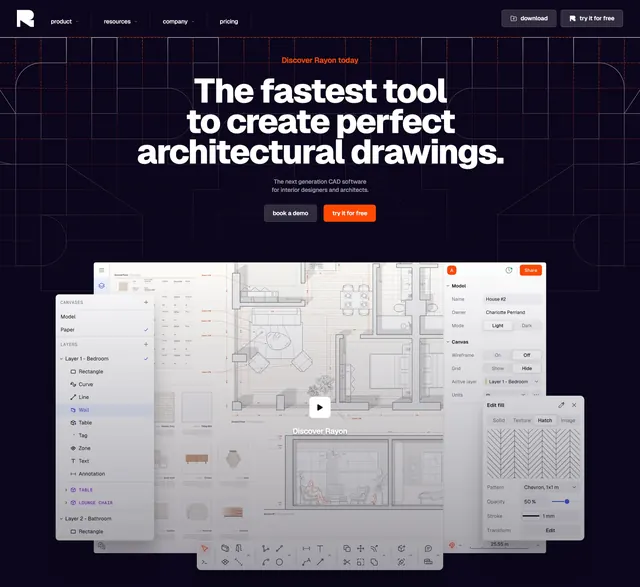
Dark centered SaaS hero with oversized type over a blueprint grid, anchored by a large floating CAD product UI with detached tool panels.
Summary
A dark, centered hero for an architectural CAD tool, leading with a three-line oversized headline over a faint blueprint grid and grounded by a large product screenshot whose tool palettes float free of the canvas. The detached, layered UI panels are the signature.
Visual description
A slim top nav carries a white R mark, product/resources/company/pricing links, and a "download" plus filled "try it for free" button pair. Centered below, a small orange "Discover Rayon today" eyebrow sits above a bold three-line white headline ending in "architectural drawings.", then two lines of muted sub-copy and two buttons: a dark "book a demo" and a filled orange "try it for free". The background is near-black printed with thin blueprint-style guide lines and rounded corner marks. Filling the lower half is a large floating screenshot of the CAD app: a faint architectural plan, a central play button labeled "Discover Rayon", and several detached panels (a Canvases/Layers list on the left, a Model properties panel and an "Edit fill" pattern picker on the right) stacked over a bottom toolbar of drawing tools.
Key takeaway
Floating the product's tool panels off the main canvas as separate cards makes one screenshot read as a live, multi-panel workspace. The blueprint grid background is on-theme set dressing that adds texture without competing with the type. A centered play button quietly promises a product demo.
Reuse notes
Strong default for a technical or design-tooling SaaS that wants to show interface depth above the fold. Only works on dark, and depends on a detailed product UI to carry the lower half. The exploded-panel treatment fits CAD, design, and dashboard products; less suited to simple consumer apps.