Preview image. Unlock full-res
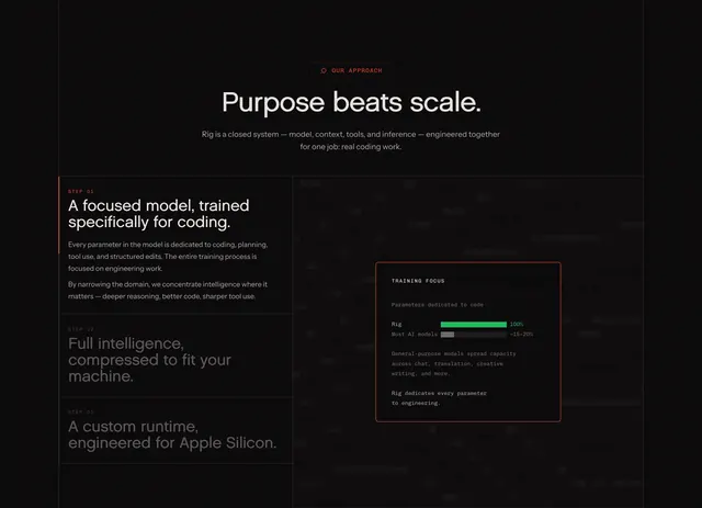
Dark split feature section with a three-step left rail, active red accent, and a comparison bar chart card on the right.
Summary
Dark split feature section with a three-step left rail, active red accent, and a comparison bar chart card on the right.
Visual description
Black background with a centered red-bordered pill badge "OUR APPROACH" and magnifier icon, then a large white headline "Purpose beats scale." and gray subcopy describing Rig as a closed system for real coding work. Below, a two-column layout: left rail lists three steps separated by thin gray rules. Step 01 is active with a vertical red bar, red "STEP 01" label, white headline about a coding-focused model, and two gray body paragraphs. Steps 02 and 03 show gray labels and muted headlines about compression and Apple Silicon runtime. Right panel has a faint dashed horizontal pattern suggesting code lines. A bordered dark card titled "TRAINING FOCUS" shows "Parameters dedicated to code" with a bright green full-width bar labeled 100% for Rig versus a short patterned gray bar at roughly 15-20% for most AI models, plus small monospaced explanatory copy below.
Key takeaway
Use a step rail where only the active item gets color and body copy, paired with one proof chart that quantifies the claim. The 100% versus ~15-20% bar makes a model-training argument instantly scannable.
Reuse notes
Strong for technical products explaining a proprietary stack or methodology. Needs a real metric or comparison for the chart; without data the pattern feels decorative.