Preview image. Unlock full-res
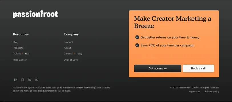
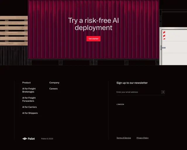
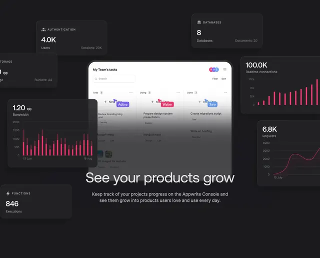
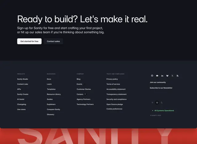
Dark footer that stacks a CTA band over five link columns and a social row, then closes with an oversized red SANITY wordmark bleeding off the bottom.
Summary
A dark footer that opens with a closing CTA band, drops into a dense multi-column link directory with a social and utility cluster, and is anchored by a huge red SANITY wordmark cropped at the bottom edge.
Visual description
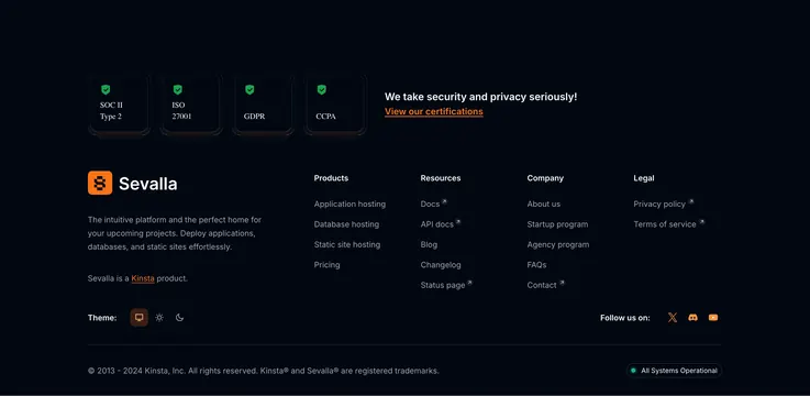
The top band sits on near-black with an oversized white headline "Ready to build? Let's make it real.", two lines of muted sub-copy, then a white "Get started for free" button beside a dark "Contact sales" button. A faint horizontal seam separates it from the footer proper, which is slightly lighter charcoal. Four labeled link columns (PRODUCTS, RESOURCES, COMPANY, TRUST AND COMPLIANCE) list grey link text, with small count badges next to Events and Careers, while a fifth right-hand cluster holds a row of round social icons, "Join our community" and "Subscribe to our Newsletter" links, a three-icon light/system/dark theme toggle, a green "All Systems Operational" status pill, and a "© SANITY 2025" line. Across the very bottom, a giant red lowercase-cap SANITY wordmark in a brighter red panel bleeds off-canvas.
Key takeaway
The giant brand wordmark bleeding off the bottom edge as a footer signature, turning dead space into identity. Also the utility cluster that bundles social, newsletter, theme toggle and a live status pill into one tidy right column.
Reuse notes
Reach for this when a footer needs to carry a final CTA, a full sitemap and brand presence in one block. The oversized wordmark needs a strong brand color to land and enough bottom bleed to read as deliberate. The status pill and theme toggle suit a developer-facing product; drop them for simpler sites.