Preview image. Unlock full-res
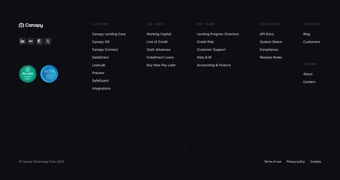
Dark footer pairing a residual CTA on a faint grid with a wide multi-column link area, brand logo, social and compliance badges.
Summary
A dark footer that carries the tail end of a centered lime CTA at the top, then transitions into a wide link area with the brand mark, social and compliance badges on the left and five labeled link columns on the right. The defining trait is folding the closing CTA directly into the footer above the navigation.
Visual description
Very dark blue-black background with a faint grid. The upper portion repeats the centered CTA (oversized white "Your next lending product awaits" headline, muted subheading, and a lime "Start now" pill). Below a subtle divide, the footer proper begins: at left, the "Canopy" wordmark with logo, a row of four square social icons (LinkedIn, Webflow, a brand mark, X), and two circular compliance badges (PCI-DSS in green, AICPA SOC in blue). To the right, five small-caps column headers (PLATFORM, USE CASES, FOR TEAMS, DEVELOPERS, RESOURCES) each with a vertical list of muted link items; a COMPANY group with About and Careers sits under Resources. A faint grid continues into the lower area. A bottom row holds the copyright ("Canopy Technology Corp. 2025") at left and Terms of use, Privacy policy, Cookies links at right.
Key takeaway
Letting the final CTA bleed into the top of the footer so the conversion ask and the sitemap share one continuous dark panel. The compliance badges next to social icons quietly reinforce trust for a fintech audience.
Reuse notes
Well suited to fintech and B2B SaaS with a broad product sitemap and certifications to display. Dark-only as drawn. The multi-column link grid is dense, so rely on the small-caps headers to keep groups scannable; keep the residual CTA short so it does not crowd the navigation.