Preview image. Unlock full-res
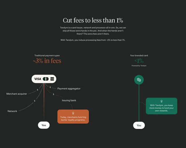
Dark comparison diagram contrasting traditional card-network fee branches with Tandym direct green path to merchant, with trophy callout boxes.
Summary
Dark comparison diagram contrasting traditional card-network fee branches with Tandym direct green path to merchant, with trophy callout boxes.
Visual description
Charcoal background. Centered serif Cut fees to less than 1% headline and two intro paragraphs. Below, left orange path from Visa Mastercard Amex pill through dashed fee nodes (acquirer, network, aggregator, issuer) to You button with orange trophy callout about bank loyalty programs. Right green path from Tandym icon directly to You with green trophy callout about keeping rewards.
Key takeaway
Branching dashed fees versus one solid line visualizes middlemen removal before users read copy.
Reuse notes
Payment or infrastructure SaaS explaining cost structure. Color-code problem and solution paths consistently.
More comparison sections
See all











More like this







Keep what you find
A free account saves references to boards and can send you a weekly email of picks based on what you save.
To see every result, go Pro.