Preview image. Unlock full-res
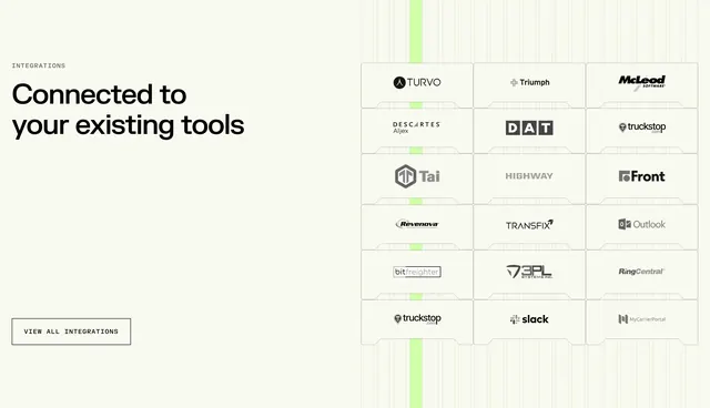
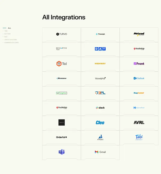
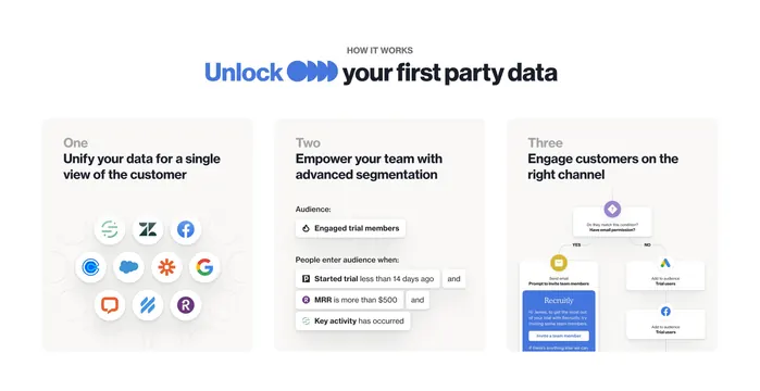
Cream split section with integrations headline on the left and a three-by-six notched logo grid on the right.
Summary
Cream split section with integrations headline on the left and a three-by-six notched logo grid on the right.
Visual description
Off-white page with INTEGRATIONS label and large left headline Connected to your existing tools plus an outlined View All Integrations button. Right side shows an eighteen-logo grid in three columns with faint vertical grid lines and a soft green glow column. Each logo sits in a card with notched top and bottom edges.
Key takeaway
Notched partner cards plus a single glowing grid column to suggest connection flow.
Reuse notes
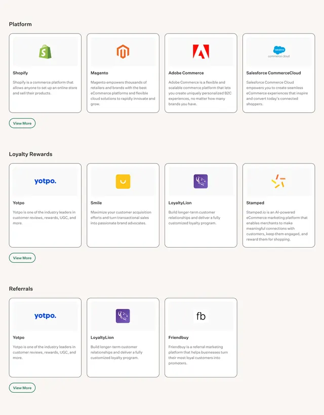
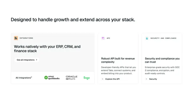
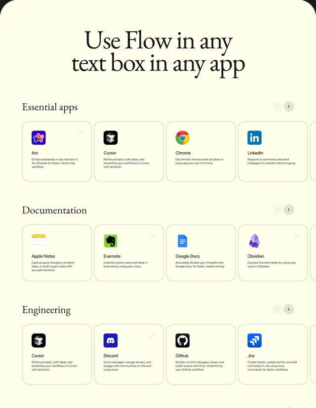
Integration overview sections that must show many partners without a flat logo dump.
More integrations sections
See all


More like this
Keep what you find
A free account saves references to boards and can send you a weekly email of picks based on what you save.
To see every result, go Pro.