Preview image. Unlock full-res
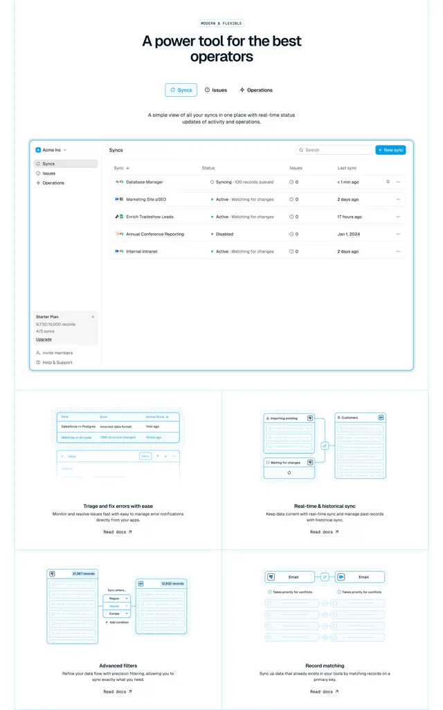
Product features section with tabbed navigation, a large dashboard screenshot, and a 2x2 bento grid of illustrated feature quadrants with doc links.
Summary
MODERN & FLEXIBLE section shows a tabbed Syncs/Issues/Operations header, a full dashboard screenshot, and a 2x2 bento of illustrated feature blocks each with Read docs links.
Visual description
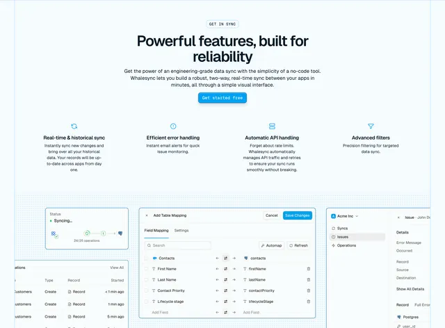
White background with light blue accents. Centered MODERN & FLEXIBLE pill, headline "A power tool for the best operators," and three pill tabs (Syncs active). Subcopy about real-time status. Large dashboard screenshot with light blue glow: left sidebar (Acme Inc, Syncs, Issues, Operations, Starter Plan usage), main table listing syncs with status indicators (Syncing, Active, Disabled), issues count, and last sync times. Below, 2x2 grid divided by thin grey lines: Triage errors (error log UI illustration), Real-time & historical sync (flow diagram), Advanced filters (filter dropdown UI), Record matching (email field mapping diagram). Each quadrant has headline, description, and Read docs arrow link.
Key takeaway
Tabs above the screenshot suggest multiple product views without showing all at once. Bento grid mixes UI screenshots and abstract diagrams for different feature types. Read docs links on every quadrant serve power users without cluttering primary CTAs.
Reuse notes
Strong for developer tools with a real dashboard worth showing. Screenshot must be polished; weak UI undermines the section. Bento works when features are genuinely distinct sub-products.
More product showcase sections
See all

More like this
Keep what you find
A free account saves references to boards and can send you a weekly email of picks based on what you save.
To see every result, go Pro.